The bar graph below shows the number of car accidents occurring in one city in each of the years 2001 through 2006. The number of accidents dropped in 2003 after a new speed limit was imposed. Why is the graph misleading? How would you redesign the graph so that it is less misleading? What impression is conveyed by
the graph? 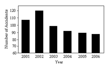
Correct Answer:
Verified
View Answer
Unlock this answer now
Get Access to more Verified Answers free of charge
Q76: Answer the question.
-The mayor of one city
Q105: The graph below shows the approximate annual
Q106: Andrew creates a bar graph to
Q107: Create a graphical display for the
Q108: Create a graphical display for the
Q109: A parcel delivery service lowered its prices
Q110: A newly formed political party has taken
Q111: A newly formed political party has taken
Q112: The graph below shows estimated world
Q114: Create a graphical display for the
Unlock this Answer For Free Now!
View this answer and more for free by performing one of the following actions

Scan the QR code to install the App and get 2 free unlocks

Unlock quizzes for free by uploading documents