The graph below shows the approximate annual percentage growth rate in world population for the years 1960 through 2010. Data is estimated by the UN Census Bureau. Annual Growth Rate (Percentage) 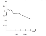
Why must the graph be interpreted with care? If the graph is not interpreted with care what misleading impression might one have of world population during the period 1960-2010? In which year during the period 1960-2010 is estimated world population the greatest? During which years did world population increase at the fastest rate?
Summarize the overall trends in world population during the period 1960-2010.
Correct Answer:
Verified
View Answer
Unlock this answer now
Get Access to more Verified Answers free of charge
Q100: Answer the question using the graphical display.
Q101: Create a graphical display for the
Q102: Create a graphical display for the
Q103: The bar graph below shows the average
Q104: A television manufacturer sold three times as
Q106: Andrew creates a bar graph to
Q107: Create a graphical display for the
Q108: Create a graphical display for the
Q109: A parcel delivery service lowered its prices
Q110: A newly formed political party has taken
Unlock this Answer For Free Now!
View this answer and more for free by performing one of the following actions

Scan the QR code to install the App and get 2 free unlocks

Unlock quizzes for free by uploading documents