What does the data in the chart demonstrate? 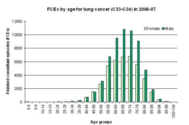
A) The incidence of cancer is highest among women aged 55-59.
B) The incidence of childhood cancer is highest in girls.
C) Cancer affects everyone.
D) A higher incidence of cancer occurs in men across most age groups.
Correct Answer:
Verified
Q1: To answer this question visit HYPERLINK "http://www.performance.doh.gov.uk/hospitalactivity/data_requests/download/total_time_ae/ae_08_q4_pt3.xls"
Q2: Quantitative research involves the use of which
Q4: The research process is comprised of five
Q5: To answer this question visit HYPERLINK "http://www.performance.doh.gov.uk/hospitalactivity/data_requests/download/total_time_ae/ae_08_q4_pt3.xls"
Q6: To answer this question visit HYPERLINK "http://www.performance.doh.gov.uk/hospitalactivity/data_requests/download/total_time_ae/ae_08_q4_pt3.xls"
Q7: Based on the following chart, the statement
Q8: To answer this question visit HYPERLINK "http://www.performance.doh.gov.uk/hospitalactivity/data_requests/download/total_time_ae/ae_08_q4_pt3.xls"
Q9: Looking at the distribution of data on
Unlock this Answer For Free Now!
View this answer and more for free by performing one of the following actions

Scan the QR code to install the App and get 2 free unlocks

Unlock quizzes for free by uploading documents