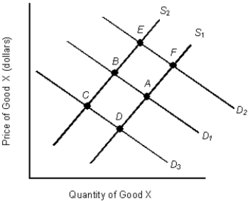
The figure given below shows the demand and supply curves in the market for coffee. S1 and D1 are the original demand and supply curves.Figure 3.5
-Assume that at the current market price of $4 per unit of a good, you are willing and able to buy 20 units. Last year at a price of $4 per unit, you would have purchased 30 units. What is most likely to have happened over the last year?
A) Demand has increased
B) Demand has decreased
C) Supply has increased
D) Supply has decreased
E) Quantity supplied has decreased
Correct Answer:
Verified
Q38: The table given below reports the quantity
Q39: The table given below reports the quantity
Q40: The table given below reports the quantity
Q41: The figure given below shows the demand
Q42: The table given below reports the quantity
Q44: The figure given below shows the demand
Q45: The table given below reports the quantity
Q46: The table given below reports the quantity
Q47: The table given below reports the quantity
Q48: In the figure given below, D1 and
Unlock this Answer For Free Now!
View this answer and more for free by performing one of the following actions

Scan the QR code to install the App and get 2 free unlocks

Unlock quizzes for free by uploading documents