The following figure shows the revenue and cost curves of a monopolist. Figure 10.3 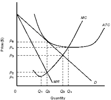
D: Average Revenue
MR: Marginal Revenue
ATC: Average Total Cost
MC: marginal Cost
-Consider the monopolist described in Figure 10.3.The firm can maximize profit by producing:
A) zero units.
B) Q1 units.
C) Q2 units.
D) Q3 units.
E) Q4 units.
Correct Answer:
Verified
Q44: The table given below shows the price,
Q48: The table given below shows the price,
Q50: The ability of a firm to charge
Q51: The table given below shows the price,
Q52: The following figure shows the revenue and
Q53: Which of the following is not a
Q55: The table given below shows the price,
Q57: The table given below shows the price,marginal
Q58: The following table shows the marginal revenues
Q59: A monopolist can charge a high price
Unlock this Answer For Free Now!
View this answer and more for free by performing one of the following actions

Scan the QR code to install the App and get 2 free unlocks

Unlock quizzes for free by uploading documents