Marketing Dashboard Map -In the Marketing Dashboard Map Above,the Annual Growth Rate in Above,the
Marketing Dashboard Map
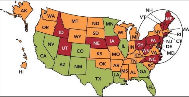
-In the Marketing Dashboard Map above,the annual growth rate in each state is shown,with green (which looks gray on gray scale) meaning good and red (which looks black on gray scale) meaning very poor.If you were a marketing manager faced with this dashboard,which of the following would be the best action?
A) Focus on the shortfalls in Idaho and Utah.
B) Revise the relevant goals for both the East and West Coast.
C) Conduct additional market research in the southern United States.
D) Examine your distribution system in the northeastern United States.
E) Change the marketing metric being used to evaluate the states individually.
Correct Answer:
Verified
Q171: Open innovation helps organizations overcome _, one
Q190: New-product strategy development is
A) the stage of
Q191: There are seven stages of the new-product
Q192: In which stage of the new-product development
Q194: If an organization's 2017 sales for the
Q197: There are seven stages of the new-product
Q198: There are seven stages of the new-product
Q199: Marketing dashboards are useful in measuring actual
Q199: There are seven stages of the new-product
Q201: Dell used _ to develop an online
Unlock this Answer For Free Now!
View this answer and more for free by performing one of the following actions

Scan the QR code to install the App and get 2 free unlocks

Unlock quizzes for free by uploading documents