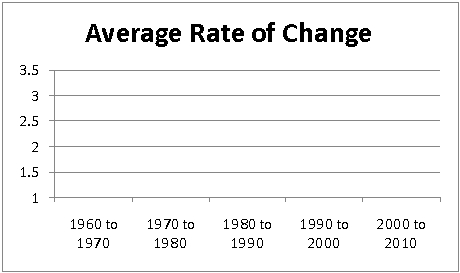
The following table gives information about the population of Barron County by decade.
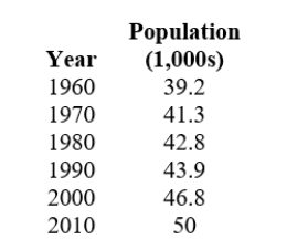
Construct a graph of the average rate of change by decade.
Correct Answer:
Verified
Q27: Choose the graph that is described by
Q28: The following table shows the size of
Q29: The following table shows the size of
Q30: The following table shows the size of
Q31: The following table shows the size of
Q33: The following table gives information about the
Q34: The average costs, by year, of a
Q35: The average costs, by year, of a
Q36: Which choice best describes the slope of
Q37: Which graph has a negative slope
A)
Unlock this Answer For Free Now!
View this answer and more for free by performing one of the following actions

Scan the QR code to install the App and get 2 free unlocks

Unlock quizzes for free by uploading documents