Use the graph below to identify which of the statements below are correct.(Note that the UK breast cancer screening programme began in 1988.) (Select all that apply) 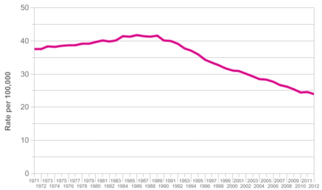 Age‐standardised breast cancer mortality rates in the UK, 1971‐2012 (From Cancer
Research UK - Breast cancer mortality statistics;
Http://www.cancerresearchuk.org/health‐professional/cancer‐statistics/statistics‐
By‐cancer‐type/breast‐cancer/mortality#heading‐Two accessed October 8, 2015.
A) It is clear from this graph that the introduction of breast cancer screening into the UK has led to a consequent decline in deaths from breast cancer
B) Using simple descriptive data like those in this figure is too crude to be a useful way to assess whether the screening programme is working
C) The graph can be described as follows: "This figure shows the trends in the annual age‐standardised mortality rate for breast cancer in the UK between 1971 and 2012.
From a level of ~37 deaths per 100,000 women in 1971 the rate rose steadily to
About 1984 where it peaked at around 42, remaining fairly stable for 5 years before
Starting a steady decline; this slowed slightly after about a decade, to reach a rate of
~24÷100,000 in 2012"
D) Without seeing overall mortality trends the graph cannot be interpreted correctly
E) If we knew the incidence rates of breast cancer over the same period we could fully interpret the mortality data to decide if the screening programme was responsible
For the improvements over the past 2 decades
Correct Answer:
Verified
Q1: Potential harms from being screened include (select
Q2: Which of the following conditions need to
Q3: Which of the following types of study
Q4: Which of the following activities should be
Q5: Which of the following statements about screening
Q6: Which of the factors listed below are
Q7: Which of the following characteristics of a
Q8: Use the data in the following table
Q9: About 20% of men who come to
Unlock this Answer For Free Now!
View this answer and more for free by performing one of the following actions

Scan the QR code to install the App and get 2 free unlocks

Unlock quizzes for free by uploading documents