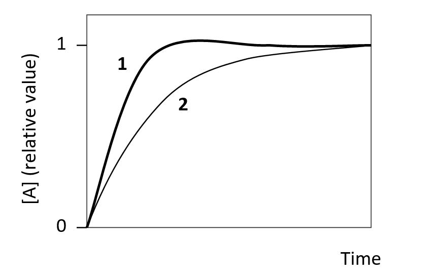
The following graph shows the change in the concentration of a protein (A) over time as a fraction of the final steady-state level. The two curves (1 and 2) in the graph are simulations with similar parameters except that one of them involves a negative feedback loop in which A activates the expression of a repressor protein which in turn represses the expression of A. Which curve (1 or 2) corresponds to the simulation with the negative feedback loop? Write down 1 or 2 as your answer.
Correct Answer:
Verified
View Answer
Unlock this answer now
Get Access to more Verified Answers free of charge
Q81: Which equation better describes the steady-state concentration
Q82: Some feed-forward motifs are capable of generating
Q83: The schematic graph below represents the nullclines
Q84: Consider the transcriptional circuits depicted in the
Q85: You have set up a system of
Q87: Indicate whether each of the following better
Q88: Indicate which of the following network motifs
Q89: Bistability in a biological system can be
Q90: Consider a genetic network consisting of gene
Q91: In the schematic graphs below, the red
Unlock this Answer For Free Now!
View this answer and more for free by performing one of the following actions

Scan the QR code to install the App and get 2 free unlocks

Unlock quizzes for free by uploading documents