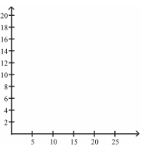
The frequency table below shows the amount of weight loss during the first month of a
diet program for a group of men. Constructing a frequency polygon. Applying a loose
interpretation of the requirements for a normal distribution, do the pounds of weight loss appear
to be normally distributed? Why or why not? 
Correct Answer:
Verified
View Answer
Unlock this answer now
Get Access to more Verified Answers free of charge
Q41: Suppose that a data set has a
Q44: Describe how a data point labeled as
Q45: The graph below shows the number of
Q48: The following data set represents Heather's
Q50: Describe the differences between a histogram and
Q52: Define the difference between a Relative Frequency
Q52: In a survey, 26 voters were
Q53: The following data set represents Heather's
Q54: The data shows the roundtrip mileage
Q55: A bar chart and a Pareto chart
Unlock this Answer For Free Now!
View this answer and more for free by performing one of the following actions

Scan the QR code to install the App and get 2 free unlocks

Unlock quizzes for free by uploading documents