The stacked line chart shows the value of each of Danny's investments. The stacked line chart contains three regions. The uppermost unshaded region represents the value of Danny's investment in individual stocks. The center shaded region represents the value of Danny's investment in mutual funds and the bottom region in black represents the value of Danny's investment in a CD. The thickness of a region at a particular time tells you its value at that time. 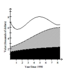 Use the graph to answer the question.
-In which year was the value of Danny's investment in individual stocks the least?
A) 1998
B) 1990
C) 1991
D) 1997
Correct Answer:
Verified
Q83: Answer the question using the graphical display.
Q84: Use the graph to answer the question.
-This
Q85: The stacked line chart shows the value
Q86: Use the graph to answer the question.
-
Q87: Answer the question using the graphical display.
Q89: Answer the question using the graphical display.
Q90: Answer the question using the graphical display.
Q91: The stacked line chart shows the value
Q92: Provide an appropriate response.
-Shortly before an
Q93: Use the graph to answer the question.
-
Unlock this Answer For Free Now!
View this answer and more for free by performing one of the following actions

Scan the QR code to install the App and get 2 free unlocks

Unlock quizzes for free by uploading documents