-A graph that shows the value of an economic variable for different groups in a population at a given time is called a
A) scatter diagram.
B) time-series graph.
C) pie chart.
D) cross-section graph.
E) fixed-time diagram.
Correct Answer:
Verified
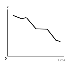
Q156: A time series graph
A) shows how a
Q157: A scatter diagram can be used to
Q158: A graph of the value of one
Q159: To show how a variable _,we typically
Q160: A time series graph
A) shows how a
Q162: Demonstrating how an economic variable changes from
Q163: A time series graph reveals whether there
Unlock this Answer For Free Now!
View this answer and more for free by performing one of the following actions

Scan the QR code to install the App and get 2 free unlocks

Unlock quizzes for free by uploading documents