Multiple Choice
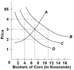 Refer to the following table which shows the quantities of corn demanded at various levels of corn price (hypothetical data) .
 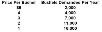 Which curve in the graph shown above best represents the data in the table?
A) A
B) B
C) C
D) D
Correct Answer:
Verified
Related Questions

