Refer to the graph, showing a continual increase in CO2 since measurements began about 1960. 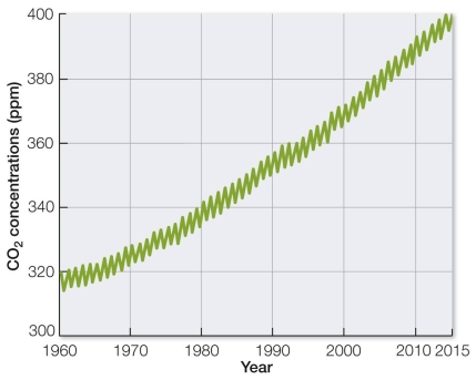 In addition to the data plotted in the graph, data from air trapped in ice caps show that CO2 levels have been strongly correlated with atmospheric temperatures for hundreds of thousands of years.What is one conclusion that might be drawn from these two sets of data?
A) Adding CO2 to the atmosphere is raising global temperatures.
B) Adding CO2 to the atmosphere is lowering global temperatures.
C) CO2 levels can be controlled by stopping CO2 measurements.
D) CO2 levels can be controlled by controlling global temperatures.
E) The most likely way to control CO2 is by controlling rates of photosynthesis.
Correct Answer:
Verified
Q162: In a very cold northern climate, the
Q163: Refer to the graph. Q164: A desert environment has a very low Q165: During photosynthesis, carbon in the atmosphere (in Q166: Refer to the figure. Q168: Moving carbon, nitrogen, and other nutrients around Q169: As atmospheric CO2 levels rise, much of Q170: Compare the climates in two African ecosystems: Q171: Refer to figure. Q172: In the diagram, boxes represent pools, and Unlock this Answer For Free Now! View this answer and more for free by performing one of the following actions Scan the QR code to install the App and get 2 free unlocks Unlock quizzes for free by uploading documents![]()
![]()
![]()

