The following graph shows the labor market. The vertical axis measures wage in dollars, and the horizontal axis measures labor in hours. The opportunity cost in equilibrium is represented by the area _____.
Figure 11.1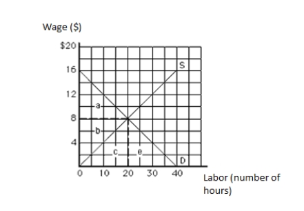
A) a
B) b
C) c
D) a + b
E) b + c
Correct Answer:
Verified
Q61: The following graph shows the labor market.
Q62: The following graph shows the labor market.
Q63: The following graph shows the labor market.
Q64: The following graph shows the demand and
Q65: The following graph shows the labor market.
Q67: The following graph shows the demand and
Q68: The following graph shows the demand and
Q69: The following graph shows the labor market.
Q70: The following graph shows the demand and
Q71: The following graph shows the labor market.
Unlock this Answer For Free Now!
View this answer and more for free by performing one of the following actions

Scan the QR code to install the App and get 2 free unlocks

Unlock quizzes for free by uploading documents