Below are two line charts where the percentage return for a stock is shown over time.The two graphs are made from the same data set. 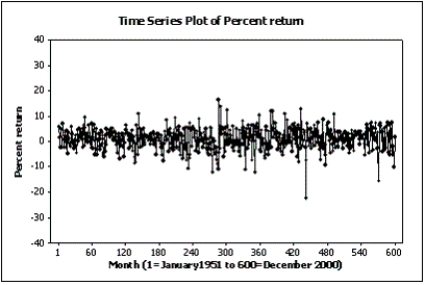
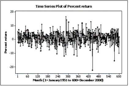 Explain why these two line charts look different.
Correct Answer:
Verified
View Answer
Unlock this answer now
Get Access to more Verified Answers free of charge
Q140: Possible methods of graphical deception include:
A)A graph
Q141: Slopes and trends in a line chart
Q142: Credit Hours The College of Business at
Q143: Home Care Data are collected on
Q144: An online dating service has a quick
Q146: Home Care Data are collected on
Q147: Briefly explain why the histogram below is
Q148: Credit Hours The College of Business at
Q149: In its 2000 report,a company presented the
Q150: Home Care Data are collected on
Unlock this Answer For Free Now!
View this answer and more for free by performing one of the following actions

Scan the QR code to install the App and get 2 free unlocks

Unlock quizzes for free by uploading documents