The following graph shows pepper prices throughout a 12-month period. 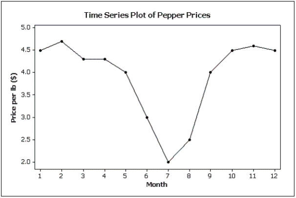 Suppose you made a new graph of the same data,where the maximum value on the Y-axis was changed from 5.0 to 10.0.(Assume everything else stays the same.) Your new graph would appear to have ____ variability in pepper prices compared to the original graph shown above.
A) more
B) less
C) the same
D) unknown
Correct Answer:
Verified
Q134: Which of the following statements is true?
A)Graphical
Q135: Which of the following is a characteristic
Q136: Is it fair to depict Texas as
Q137: The number of crimes per capita is
Q138: Differences in the frequencies of a histogram
Q140: Possible methods of graphical deception include:
A)A graph
Q141: Slopes and trends in a line chart
Q142: Credit Hours The College of Business at
Q143: Home Care Data are collected on
Q144: An online dating service has a quick
Unlock this Answer For Free Now!
View this answer and more for free by performing one of the following actions

Scan the QR code to install the App and get 2 free unlocks

Unlock quizzes for free by uploading documents