The line chart below shows tomato prices each month from January (month 1)to December last year ($ per pound).By looking at this chart you can see the lowest tomato prices occurred in July. 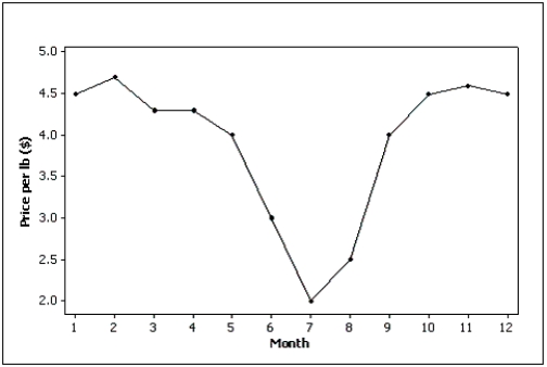
Correct Answer:
Verified
Q67: Beef prices throughout the year (month 1
Q68: Explain the difference between a histogram and
Q69: A department store's monthly sales (in thousands
Q70: Observations that are measured at successive points
Q71: What type of graph depicts the data
Q73: Which of the following statements describe(s)the line
Q74: Observations that are taken during successive points
Q75: Observations that are measured at the same
Q76: Which of the following statements describes a
Q77: Time-series data are often graphically depicted how?
A)Bar
Unlock this Answer For Free Now!
View this answer and more for free by performing one of the following actions

Scan the QR code to install the App and get 2 free unlocks

Unlock quizzes for free by uploading documents