The following graph shows the percentage of cars produced each decade by country.
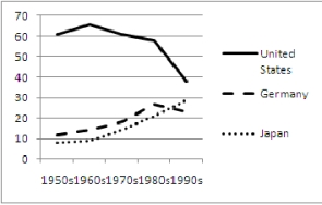 The graph gives the impression that production drastically decreased in the 1990s while this is not really true. What flaw in the construction of the graph leads to this impression?
Correct Answer:
Verified
View Answer
Unlock this answer now
Get Access to more Verified Answers free of charge
Q72: Use the following to answer questions
The
Q73: Use the following to answer questions
The
Q74: Use the following to answer questions
The
Q75: Use the following to answer questions
The
Q76: The following graphs shows the number of
Q78: Determine whether the following data is linear.
Q79: Identify A) the slope and B) the
Q80: Identify A) the slope and B) the
Q81: A) Rewrite the equation in slope-intercept form,
Q82: The function, ![]()
Unlock this Answer For Free Now!
View this answer and more for free by performing one of the following actions

Scan the QR code to install the App and get 2 free unlocks

Unlock quizzes for free by uploading documents