(Figure: Demand and Average Cost Curves) Which of the following diagrams represents the demand and average cost curves of a firm in the long run, given free entry and exit?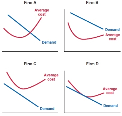
A) Firm A
B) Firm B
C) Firm C
D) Firm D
Correct Answer:
Verified
Q75: When there is free entry and exit
Q76: When the typical seller in a market
Q77: When the typical seller in a market
Q78: What is the dominant factor determining market
Q79: When free entry and free exit exist
Q81: In the long run, a company's ability
Q82: In the long run, a company can
Q83: _ allow a profitable company to maintain
Q84: Creating _ to _ is key to
Q85: A company produces a particular cell phone
Unlock this Answer For Free Now!
View this answer and more for free by performing one of the following actions

Scan the QR code to install the App and get 2 free unlocks

Unlock quizzes for free by uploading documents