The line graph shows the recorded hourly temperatures in degrees Fahrenheit at an airport. 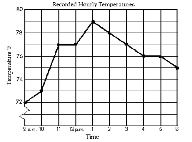
-During which hour did the temperature increase the most?
A) 10 a.m. to 11 a.m.
B) 9 a.m. to 10 a.m.
C) 1 p.m. to 2 p.m.
D) 12 p.m. to 1 p.m.
Correct Answer:
Verified
Q19: The following pictograph shows the number of
Q20: Use the information given to draw
Q21: The histogram shows the scores of each
Q22: The circle graph shows the results of
Q23: The line graph shows the recorded hourly
Q25: The circle graph shows the results of
Q26: The line graph shows the recorded hourly
Q27: The circle graph shows the results of
Q28: The list shows the scores for
Q29: The histogram shows the scores of each
Unlock this Answer For Free Now!
View this answer and more for free by performing one of the following actions

Scan the QR code to install the App and get 2 free unlocks

Unlock quizzes for free by uploading documents