The following figure is a contour diagram for the demand for pork as a function of the price of pork and the price of beef. Which axis corresponds to the price of beef? 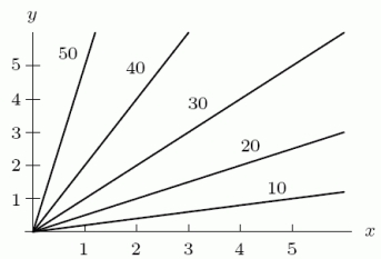
A) The x-axis
B) The y-axis
Correct Answer:
Verified
Q14: Your monthly payment, C(s, t), on a
Q15: The fuel cost, C, for a 3000
Q16: A company sells two products. The fixed
Q16: Your monthly payment, C(s, t), on a
Q17: Lift ticket sales, S, at a ski
Q18: Yummy Potato Chip Company has manufacturing plants
Q21: Which of the following describes the contour
Q22: You build a campfire while up in
Q23: Which of the following describes the contour
Q24: For a function ![]()
Unlock this Answer For Free Now!
View this answer and more for free by performing one of the following actions

Scan the QR code to install the App and get 2 free unlocks

Unlock quizzes for free by uploading documents