The following multiple line graph shows the numbers of death due to cancer in four geographic regions of the U.S. that occurred in three ethnic groups in 2003. 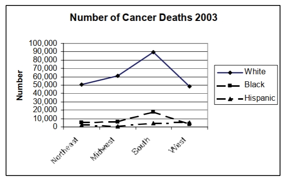
In which geographic area was the number of cancer deaths among whites the highest in 2003?
Correct Answer:
Verified
Q39: Find the original data from the
Q40: Construct a frequency table for the numbers
Q41: 2|9
3| 12
3| 67788
4| 0233
4| 5567
5| 124
5|
6| 0
Q42: The stacked bar chart below shows the
Q43: The 47 businesses on four blocks
Q44: The stem and leaf plot below shows
Q45: Alan tossed a die 50 times and
Q46: Construct a Pareto chart for the NCAA
Q47: The histogram below shows the ages of
Q49: ![]()
Unlock this Answer For Free Now!
View this answer and more for free by performing one of the following actions

Scan the QR code to install the App and get 2 free unlocks

Unlock quizzes for free by uploading documents