The following table presents the rate of population growth of a suburb of Atlanta, Georgic of the years 1990 through 2009 . Construct a time-series plot of the growth rate.
A) 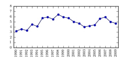
B) 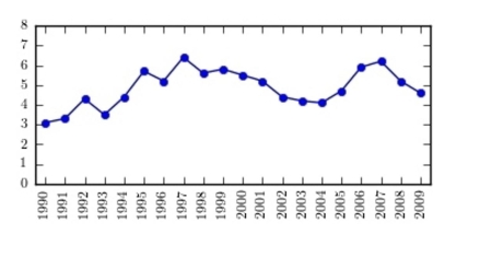
a for each
C) 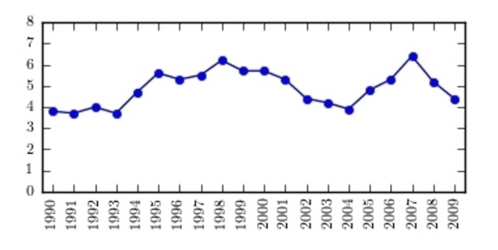
D) 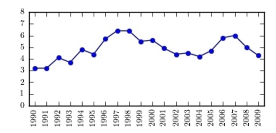
Correct Answer:
Verified
Q97: A time series graph is useful for
Q98: A pie graph would best represent the
Q99: Given the following two sets of data,
Q100: If a data set showing types
Q101: A Pareto chart arranges data from largest
Q102: When making Pareto charts, data should be
Q103: The following time-series plot presents the
Q104: Graphs give a visual representation that may
Q105: When two sets of data collected over
Q107: The following time-series plot presents the population
Unlock this Answer For Free Now!
View this answer and more for free by performing one of the following actions

Scan the QR code to install the App and get 2 free unlocks

Unlock quizzes for free by uploading documents