Which choice displays the best graphic display of the amount of nitrous oxide (NO) 1) ____________ explained by the amount of carbon monoxide (CO) emissions in million metric tons over a
Ten year period in the United States? The data set is below:
A) Nitrous Oxide (NO) and Carbon Monoxide (CO)
Emissions in the U.S. over Ten Years
B) Nitrous Oxide (NO) and Carbon Monoxide (CO)
Emissions in the U.S. over Ten Years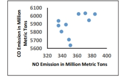
C) Nitrous Oxide (NO) and Carbon Monoxide (CO)
Emissions in the U.S. over Ten Years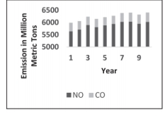
D) Nitrous Oxide (NO) and Carbon Monoxide (CO)
Emissions in the U.S. over Ten Years 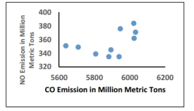
Correct Answer:
Verified
Q15: The following data show the number
Q16: The following frequency distribution analyzes the
Q17: Analysis of the data from 25
Q18: The scatterplot below displays the amount of
Q19: Identify the cumulative frequency distribution that
Q21: The frequency distribution below summarizes employee
Q23: A nurse measured the blood pressure
Q24: Identify the cumulative frequency distribution that
Q25: The following frequency distribution depicts the
Q28: Smoking and the episodes of lung cancer
Unlock this Answer For Free Now!
View this answer and more for free by performing one of the following actions

Scan the QR code to install the App and get 2 free unlocks

Unlock quizzes for free by uploading documents