Figure 2-19
In the following graph the x-axis shows the number of times a commuter rail train stops at a station per hour and the y-axis shows the number of commuter rail passengers per hour.
Commuter Rail Passengers by Frequency of Service 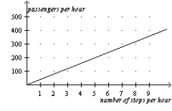
-Refer to Figure 2-19.A policymaker observes this graph and concludes that increasing the frequency of commuter rail service is a certain way to get more commuters to choose the commuter rail instead of driving their own cars.You warn the policymaker about making a reverse causality mistake with which of the following statements?
A) Higher gas prices are causing more people to choose the commuter rail over driving.
B) The service frequency was increased in response to an increase in the number of passengers per hour.
C) There is a positive relationship between frequency of stops and number of passengers.
D) None of the above is correct.
Correct Answer:
Verified
Q58: The slope of a line passing through
Q59: The slope of a line that passes
Q60: The slope of a line that passes
Q61: Figure 2-20
Relationship Between Years of Education and
Q62: In the early 19th century,the Russian government
Q63: The argument that purchases of minivans cause
Q64: Alfonso has noticed that increases in unemployment
Q65: Figure 2-20
Relationship Between Years of Education and
Q66: Figure 2-20
Relationship Between Years of Education and
Q68: Figure 2-19
In the following graph the x-axis
Unlock this Answer For Free Now!
View this answer and more for free by performing one of the following actions

Scan the QR code to install the App and get 2 free unlocks

Unlock quizzes for free by uploading documents