Figure 8-20
On the vertical axis of each graph,DWL is deadweight loss. 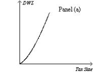
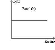
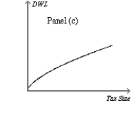
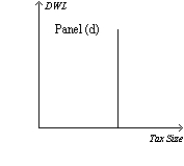
-Refer to Figure 8-20.Which graph correctly illustrates the relationship between the size of a tax and the size of the deadweight loss associated with the tax?
A) Panel (a)
B) Panel (b)
C) Panel (c)
D) Panel (d)
Correct Answer:
Verified
Q42: Figure 8-21 Q43: Figure 8-21 Q44: Which of the following ideas is the Q45: The Laffer curve illustrates that Q46: Figure 8-23.The figure represents the relationship between Q48: In the early 1980s,which of the following Q49: Figure 8-21 Q50: Figure 8-22 Q52: If the tax on gasoline increases from Q56: Figure 8-22 Unlock this Answer For Free Now! View this answer and more for free by performing one of the following actions Scan the QR code to install the App and get 2 free unlocks Unlock quizzes for free by uploading documents![]()
![]()
A)deadweight loss rises![]()
![]()
![]()

