The figure given below depicts the relationship between the social benefits and social costs associated with different levels of pollution. The two curves are Social Marginal Cost (SMC) and Social Marginal Benefit (SMB) . The other terminologies are P = Price of the commodity, MC = Marginal Cost (private) , and MB = Marginal Benefit (private) . For pollution level 'a', _____, therefore the country should _____ pollution. 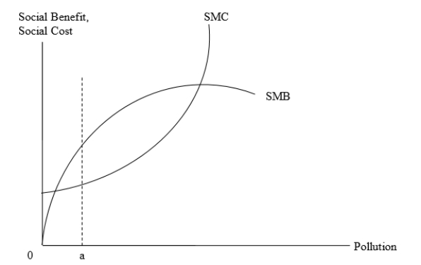
A) SMB > SMC; increase
B) SMC = SMC; decrease
C) SMB < SMC; increase
D) SMC < MC = P = MB; decrease
Correct Answer:
Verified
Q21: An example of the specificity rule in
Q22: Which of the following was signed in
Q23: If domestic production of a product causes
Q24: A good is said to be overproduced
Q25: Which of the following involved industrial countries
Q27: A negative externality is said to exist
Q28: If the foreign use of Australian-mined coal
Q29: When domestic production causes pollution that imposes
Q30: Which of the following is an example
Q31: Which of the following statements is true?
A)The
Unlock this Answer For Free Now!
View this answer and more for free by performing one of the following actions

Scan the QR code to install the App and get 2 free unlocks

Unlock quizzes for free by uploading documents