Use the figure to answer the following question.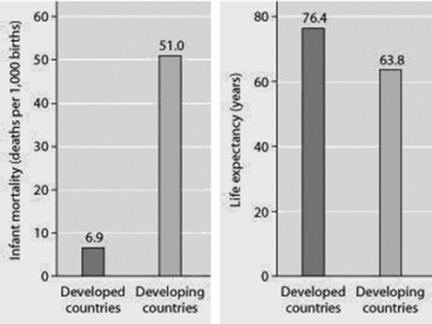
Infant mortality and life expectancy at birth in developed and developing countries (data as of 2005) .
What is a logical conclusion that can be drawn from the graphs? Developed countries have ________.
A) lower infant mortality rates and lower life expectancy than developing countries
B) higher infant mortality rates and lower life expectancy than developing countries
C) lower infant mortality rates and higher life expectancy than developing countries
D) higher infant mortality rates and higher life expectancy than developing countries
Correct Answer:
Verified
Q41: Use the graphs to answer the following
Q42: Which of the following traits is characteristic
Q43: Often the growth cycle of one population
Q44: Which of the following graphs illustrates the
Q45: Use the graph to answer the following
Q47: Use the figures to answer the following
Q48: A recent study of ecological footprints concluded
Q49: Why does the U.S. population continue to
Q50: Which of the following statements regarding the
Q51: Which pair of terms most accurately describes
Unlock this Answer For Free Now!
View this answer and more for free by performing one of the following actions

Scan the QR code to install the App and get 2 free unlocks

Unlock quizzes for free by uploading documents