Use the following to answer question
This figure depicts gas prices for the month of August from 1976 to 2004.(Data were extracted from the Bureau of Labor Statistics Web site.)
Figure: Gas Prices 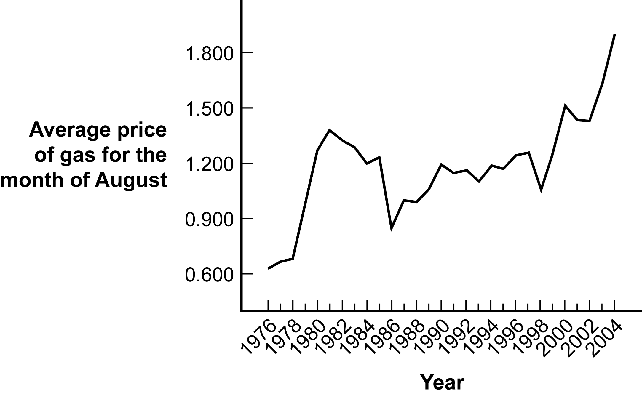
-(Figure: Gas Prices) Identify the type of graph depicted in the figure.
A) histogram
B) time series plot
C) Pareto chart
D) line graph
Correct Answer:
Verified
Q25: A graph that depicts the relation between
Q26: A type of line graph used to
Q27: On a histogram the x-axis depicts the
Q28: What is a Pareto chart?
A) a bar
Q29: A researcher investigated the relationship between IQ
Q31: A researcher was interested in measuring reaction
Q32: The last step in creating a scatterplot
Q33: A time plot is also known as
Q34: When the data on a scatterplot form
Q35: What is a potential benefit of creating
Unlock this Answer For Free Now!
View this answer and more for free by performing one of the following actions

Scan the QR code to install the App and get 2 free unlocks

Unlock quizzes for free by uploading documents