The following graph shows pepper prices throughout a 12-month period. 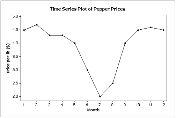 Suppose you made a new graph of the same data, where the maximum value on the Y-axis was changed from 5.0 to 10.0.(Assume everything else stays the same.) Your new graph would appear to have ____ variability in pepper prices compared to the original graph shown above.
A) more
B) less
C) the same
D) unknown
Correct Answer:
Verified
Q104: The techniques of shrinking the horizontal axis
Q106: If the form of the graph replaces
Q121: A pie chart uses relative frequencies to
Q122: Possible methods of creating distorted impressions with
Q123: The scale used on a bar chart
Q126: Which of the following characteristics apply to
Q128: The effect of making the slope of
Q132: A bar chart can be made to
Q134: Which of the following statements is true?
A)Graphical
Q135: Which of the following is a characteristic
Unlock this Answer For Free Now!
View this answer and more for free by performing one of the following actions

Scan the QR code to install the App and get 2 free unlocks

Unlock quizzes for free by uploading documents