Multiple Choice
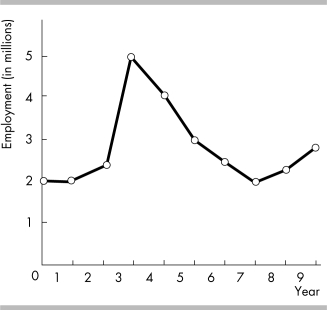
-According to the graph in the figure above, which year experienced the most rapid change in employment?
A) Year 2
B) Year 4
C) Year 5
D) Year 3
Correct Answer:
Verified
Related Questions
Q370: Q371: Q372: A trend is Q373: Which type of graph shows the values Q374: A time- series graph displaying real GDP Q376: A graph shows the average SAT scores Q377: A graph that shows the average income Q378: Trend refers to Q379: Inflation climbed steadily from 1952 to 1972. Q380: A _ _ shows relative values for![]()
![]()
A) the maximum value of
A) decreases but not increases
Unlock this Answer For Free Now!
View this answer and more for free by performing one of the following actions

Scan the QR code to install the App and get 2 free unlocks

Unlock quizzes for free by uploading documents