Deck 4: Describing Data: Displaying and Exploring Data
Full screen (f)
Question
Question
Question
Question
Question
Question
Question
Question
Question
Question
Question
Question
Question
Question
Question
Question
Question
Question
Question
Question
Question
Question
Question
Question
The following graph is a 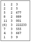
A) Dot plot
B) Stem-and-leaf display
C) Box plot
D) Contingency table
A) Dot plot
B) Stem-and-leaf display
C) Box plot
D) Contingency table
Question
Question
Question
In the following graph, 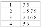
A) There are 16 observations.
B) There are four observations in the second class.
C) There are ten observations less than thirty.
D) There are ten observations greater than thirty.
A) There are 16 observations.
B) There are four observations in the second class.
C) There are ten observations less than thirty.
D) There are ten observations greater than thirty.
Question
Question
Question
Question
Question
Question
The following graph is a 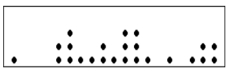
A) Dot plot
B) Stem-and-leaf diagram
C) Box plot
D) Contingency table
A) Dot plot
B) Stem-and-leaf diagram
C) Box plot
D) Contingency table
Question
Question
Question
In the following graph, 
A) The median is 2.5.
B) The minimum value is 135.
C) The maximum value is 456.
D) The range is 33.
A) The median is 2.5.
B) The minimum value is 135.
C) The maximum value is 456.
D) The range is 33.
Question
Question
Question
Question
Question
Question
The following graph illustrates 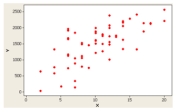
A) A positive or direct relationship.
B) A negative or inverse relationship.
C) No relationship.
D) A distribution for a single variable.
A) A positive or direct relationship.
B) A negative or inverse relationship.
C) No relationship.
D) A distribution for a single variable.
Question
Question
Question
Question
Question
Question
The following graph is a 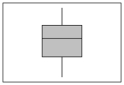
A) Dot plot
B) Stem-and-leaf display
C) Box plot
D) Contingency table
A) Dot plot
B) Stem-and-leaf display
C) Box plot
D) Contingency table
Question
Question
Question
Question
Question
The following graph is 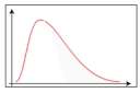
A) Positively skewed.
B) Negatively skewed.
C) Symmetric.
D) Uniformly distributed.
A) Positively skewed.
B) Negatively skewed.
C) Symmetric.
D) Uniformly distributed.
Question
Question
Question
Question
Question
The following graph is a 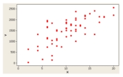
A) Dot plot
B) Stem-and-leaf display
C) Box plot
D) Scatter Plot
A) Dot plot
B) Stem-and-leaf display
C) Box plot
D) Scatter Plot
Question
Question
Question
Question
Question
Question
Question
Question
Question
Question
Given the sample information in the following table regarding public opinion on gun control, who is more likely to favor gun control? 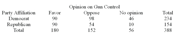
Question
Given the sample information in the following table regarding public opinion on gun control, what percent of Democrats have no opinion? 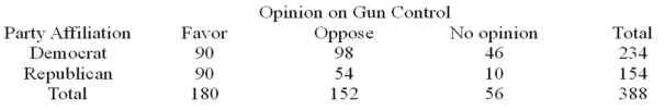
Question
Question
Question
Question
The following is an example of ____________________________ 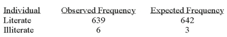
Question
Question
Question
Question
Question
Question
Question

Unlock Deck
Sign up to unlock the cards in this deck!
Unlock Deck
Unlock Deck
1/108
Play
Full screen (f)
Deck 4: Describing Data: Displaying and Exploring Data
1
The 50th percentile of a distribution is the same as the distribution mean.
False
2
A dot plot is useful for showing possible outliers.
True
3
A scatter diagram of sales versus production is labeled with sales on the Y-axis and production on the X-axis.
True
4
Pearson's coefficient of skewness is a measure of a distribution's symmetry.
Unlock Deck
Unlock for access to all 108 flashcards in this deck.
Unlock Deck
k this deck
5
If a distribution is negatively skewed, the distribution is not symmetrical and the long tail is to the left.
Unlock Deck
Unlock for access to all 108 flashcards in this deck.
Unlock Deck
k this deck
6
A dot plot is useful for showing the range of the data.
Unlock Deck
Unlock for access to all 108 flashcards in this deck.
Unlock Deck
k this deck
7
A box plot shows the relative symmetry of a distribution.
Unlock Deck
Unlock for access to all 108 flashcards in this deck.
Unlock Deck
k this deck
8
Quartiles divide a distribution into ten equal parts.
Unlock Deck
Unlock for access to all 108 flashcards in this deck.
Unlock Deck
k this deck
9
A student scored in the 85th percentile on a standardized test. This means that the student scored lower than 85% of all students who took the test.
Unlock Deck
Unlock for access to all 108 flashcards in this deck.
Unlock Deck
k this deck
10
A stem-and-leaf diagram shows the actual data values.
Unlock Deck
Unlock for access to all 108 flashcards in this deck.
Unlock Deck
k this deck
11
The "box" in a box plot shows the interquartile range.
Unlock Deck
Unlock for access to all 108 flashcards in this deck.
Unlock Deck
k this deck
12
A dot plot is useful for quickly graphing frequencies in a small data set.
Unlock Deck
Unlock for access to all 108 flashcards in this deck.
Unlock Deck
k this deck
13
A box plot graphically shows the 10th and 90th percentiles.
Unlock Deck
Unlock for access to all 108 flashcards in this deck.
Unlock Deck
k this deck
14
A dot plot shows the relative symmetry of a distribution.
Unlock Deck
Unlock for access to all 108 flashcards in this deck.
Unlock Deck
k this deck
15
Percentiles divide a distribution into one hundred equal parts.
Unlock Deck
Unlock for access to all 108 flashcards in this deck.
Unlock Deck
k this deck
16
In a stem-and-leaf display, the leaf represents a class of a frequency distribution.
Unlock Deck
Unlock for access to all 108 flashcards in this deck.
Unlock Deck
k this deck
17
In a stem-and-leaf display, the leaf represents the members of a class in a frequency distribution.
Unlock Deck
Unlock for access to all 108 flashcards in this deck.
Unlock Deck
k this deck
18
A dot plot is an easy way to represent the relationship between two variables.
Unlock Deck
Unlock for access to all 108 flashcards in this deck.
Unlock Deck
k this deck
19
The coefficient of skewness is the standard deviation divided by the mean.
Unlock Deck
Unlock for access to all 108 flashcards in this deck.
Unlock Deck
k this deck
20
Quartiles divide a distribution into four equal parts.
Unlock Deck
Unlock for access to all 108 flashcards in this deck.
Unlock Deck
k this deck
21
A dot plot is best applied when
A) The mean, median and mode are equal.
B) The general shape of a distribution is symmetric.
C) The relationship between two variables is summarized.
D) A single variable is summarized.
A) The mean, median and mode are equal.
B) The general shape of a distribution is symmetric.
C) The relationship between two variables is summarized.
D) A single variable is summarized.
Unlock Deck
Unlock for access to all 108 flashcards in this deck.
Unlock Deck
k this deck
22
A dot plot can be used to show
A) The mean, median and mode.
B) The general shape of a distribution for a nominal qualitative variable.
C) The distribution for a quantitative variable.
D) The interquartile range.
A) The mean, median and mode.
B) The general shape of a distribution for a nominal qualitative variable.
C) The distribution for a quantitative variable.
D) The interquartile range.
Unlock Deck
Unlock for access to all 108 flashcards in this deck.
Unlock Deck
k this deck
23
A stem-and-leaf display includes the following row: 3 | 0 1 3 5 7 9. Assume that the data is rounded to the nearest whole number.
A) The frequency of the class is seven.
B) The minimum value in the class is 0.
C) The maximum value in the class is 39.
D) The class interval is 5.
A) The frequency of the class is seven.
B) The minimum value in the class is 0.
C) The maximum value in the class is 39.
D) The class interval is 5.
Unlock Deck
Unlock for access to all 108 flashcards in this deck.
Unlock Deck
k this deck
24
The following graph is a
A) Dot plot
B) Stem-and-leaf display
C) Box plot
D) Contingency table
A) Dot plot
B) Stem-and-leaf display
C) Box plot
D) Contingency table
Unlock Deck
Unlock for access to all 108 flashcards in this deck.
Unlock Deck
k this deck
25
Percentiles divide a distribution into
A) 2 equal parts.
B) 4 equal parts.
C) 10 equal parts.
D) 100 equal parts.
A) 2 equal parts.
B) 4 equal parts.
C) 10 equal parts.
D) 100 equal parts.
Unlock Deck
Unlock for access to all 108 flashcards in this deck.
Unlock Deck
k this deck
26
The test scores for a class of 147 students are computed. What is the location of the test score associated with the third quartile?
A) 111
B) 37
C) 74
D) 75%
A) 111
B) 37
C) 74
D) 75%
Unlock Deck
Unlock for access to all 108 flashcards in this deck.
Unlock Deck
k this deck
27
In the following graph,
A) There are 16 observations.
B) There are four observations in the second class.
C) There are ten observations less than thirty.
D) There are ten observations greater than thirty.
A) There are 16 observations.
B) There are four observations in the second class.
C) There are ten observations less than thirty.
D) There are ten observations greater than thirty.
Unlock Deck
Unlock for access to all 108 flashcards in this deck.
Unlock Deck
k this deck
28
A relationship between two nominal variables is summarized by a contingency table.
Unlock Deck
Unlock for access to all 108 flashcards in this deck.
Unlock Deck
k this deck
29
Quartiles divide a distribution into
A) 2 equal parts.
B) 4 equal parts.
C) 10 equal parts.
D) 100 equal parts.
A) 2 equal parts.
B) 4 equal parts.
C) 10 equal parts.
D) 100 equal parts.
Unlock Deck
Unlock for access to all 108 flashcards in this deck.
Unlock Deck
k this deck
30
A relationship between gender and preference for Coke or Pepsi can be best represented by a scatter diagram.
Unlock Deck
Unlock for access to all 108 flashcards in this deck.
Unlock Deck
k this deck
31
In the following set of data, what are the first, second, and third quartiles? 1 3 5 6 7 9 100
A) 1, 6, and 100.
B) 3, 5, and 9.
C) 3, 6, and 9.
D) 1, 5, and 100.
A) 1, 6, and 100.
B) 3, 5, and 9.
C) 3, 6, and 9.
D) 1, 5, and 100.
Unlock Deck
Unlock for access to all 108 flashcards in this deck.
Unlock Deck
k this deck
32
A dot plot is best applied for a data set with
A) 1,000 observations.
B) 50 observations.
C) More than one variable.
D) A one mode.
A) 1,000 observations.
B) 50 observations.
C) More than one variable.
D) A one mode.
Unlock Deck
Unlock for access to all 108 flashcards in this deck.
Unlock Deck
k this deck
33
The following graph is a
A) Dot plot
B) Stem-and-leaf diagram
C) Box plot
D) Contingency table
A) Dot plot
B) Stem-and-leaf diagram
C) Box plot
D) Contingency table
Unlock Deck
Unlock for access to all 108 flashcards in this deck.
Unlock Deck
k this deck
34
To locate the percentile for a given observation in a data set, the data must be
A) Sorted and listed from the minimum to the maximum values.
B) Displayed in a histogram.
C) Summarized in a cumulative frequency distribution.
D) Distributed symmetrically around the mean.
A) Sorted and listed from the minimum to the maximum values.
B) Displayed in a histogram.
C) Summarized in a cumulative frequency distribution.
D) Distributed symmetrically around the mean.
Unlock Deck
Unlock for access to all 108 flashcards in this deck.
Unlock Deck
k this deck
35
If a student places in the 99th percentile on an exam, she performed better than 99% of all students who completed the exam. Her performance is similar to a statement based on a
A) Frequency table.
B) Cumulative frequency distribution.
C) Histogram.
D) Pie chart.
A) Frequency table.
B) Cumulative frequency distribution.
C) Histogram.
D) Pie chart.
Unlock Deck
Unlock for access to all 108 flashcards in this deck.
Unlock Deck
k this deck
36
In the following graph,
A) The median is 2.5.
B) The minimum value is 135.
C) The maximum value is 456.
D) The range is 33.
A) The median is 2.5.
B) The minimum value is 135.
C) The maximum value is 456.
D) The range is 33.
Unlock Deck
Unlock for access to all 108 flashcards in this deck.
Unlock Deck
k this deck
37
A dot plot shows the
A) The general shape of a distribution.
B) The mean, median, and mode.
C) The relationship between two variables.
D) The interquartile range.
A) The general shape of a distribution.
B) The mean, median, and mode.
C) The relationship between two variables.
D) The interquartile range.
Unlock Deck
Unlock for access to all 108 flashcards in this deck.
Unlock Deck
k this deck
38
In a distribution, the second quartile corresponds with the
A) Mean.
B) Median.
C) Mode.
D) Variance.
A) Mean.
B) Median.
C) Mode.
D) Variance.
Unlock Deck
Unlock for access to all 108 flashcards in this deck.
Unlock Deck
k this deck
39
A scatter diagram of sales versus production may be constructed by plotting the minimum, first quartile, median, third quartile, and the maximum values of each variable.
Unlock Deck
Unlock for access to all 108 flashcards in this deck.
Unlock Deck
k this deck
40
A stem-and-leaf display includes the following row: 5 | 10 11 31 52 79 98. Assume that the data is rounded to the nearest whole number.
A) The frequency of the class is seven.
B) The minimum value in the class is 5.
C) The maximum value in the class is 98.
D) The class interval is 100.
A) The frequency of the class is seven.
B) The minimum value in the class is 5.
C) The maximum value in the class is 98.
D) The class interval is 100.
Unlock Deck
Unlock for access to all 108 flashcards in this deck.
Unlock Deck
k this deck
41
What statistics are needed to draw a box plot?
A) The minimum, maximum, median, first and third quartiles.
B) The median, mean and standard deviation.
C) The median and interquartile range.
D) The mean and standard deviation.
A) The minimum, maximum, median, first and third quartiles.
B) The median, mean and standard deviation.
C) The median and interquartile range.
D) The mean and standard deviation.
Unlock Deck
Unlock for access to all 108 flashcards in this deck.
Unlock Deck
k this deck
42
The following graph illustrates
A) A positive or direct relationship.
B) A negative or inverse relationship.
C) No relationship.
D) A distribution for a single variable.
A) A positive or direct relationship.
B) A negative or inverse relationship.
C) No relationship.
D) A distribution for a single variable.
Unlock Deck
Unlock for access to all 108 flashcards in this deck.
Unlock Deck
k this deck
43
In a contingency table, we describe the relationship between
A) two variables measured at the ordinal or nominal level.
B) two variables, one measured as an ordinal variable and the other as a ratio variable.
C) two variables measured at the interval or ratio level.
D) a variable measure on the interval or ratio level and time.
A) two variables measured at the ordinal or nominal level.
B) two variables, one measured as an ordinal variable and the other as a ratio variable.
C) two variables measured at the interval or ratio level.
D) a variable measure on the interval or ratio level and time.
Unlock Deck
Unlock for access to all 108 flashcards in this deck.
Unlock Deck
k this deck
44
A box plot shows
A) The mean and variance.
B) The relative symmetry of a distribution for a set of data.
C) The 10th and 90th percentiles of a distribution.
D) The deciles of a distribution.
A) The mean and variance.
B) The relative symmetry of a distribution for a set of data.
C) The 10th and 90th percentiles of a distribution.
D) The deciles of a distribution.
Unlock Deck
Unlock for access to all 108 flashcards in this deck.
Unlock Deck
k this deck
45
What is the value of the Pearson coefficient of skewness for a distribution with a mean of 17, median of 12 and standard deviation of 6?
A) +2.5
B) -2.5
C) +0.83
D) -0.83
A) +2.5
B) -2.5
C) +0.83
D) -0.83
Unlock Deck
Unlock for access to all 108 flashcards in this deck.
Unlock Deck
k this deck
46
Outliers are clearly presented in a
A) Dot plot.
B) Stem-and-leaf display.
C) Box plot.
D) Contingency table.
A) Dot plot.
B) Stem-and-leaf display.
C) Box plot.
D) Contingency table.
Unlock Deck
Unlock for access to all 108 flashcards in this deck.
Unlock Deck
k this deck
47
A sample of experienced typists revealed that their mean typing speed is 87 words per minute and the median is 73. The standard deviation is 16.9 words per minute. What is the Pearson's coefficient of skewness?
A) -2.5
B) -4.2
C) +4.2
D) +2.5
A) -2.5
B) -4.2
C) +4.2
D) +2.5
Unlock Deck
Unlock for access to all 108 flashcards in this deck.
Unlock Deck
k this deck
48
The following graph is a
A) Dot plot
B) Stem-and-leaf display
C) Box plot
D) Contingency table
A) Dot plot
B) Stem-and-leaf display
C) Box plot
D) Contingency table
Unlock Deck
Unlock for access to all 108 flashcards in this deck.
Unlock Deck
k this deck
49
If the coefficient of skewness is equal to zero, the shape of the distribution is
A) Negatively skewed.
B) Symmetric.
C) Positively skewed.
D) Unknown.
A) Negatively skewed.
B) Symmetric.
C) Positively skewed.
D) Unknown.
Unlock Deck
Unlock for access to all 108 flashcards in this deck.
Unlock Deck
k this deck
50
What does the interquartile range describe?
A) The lower 50% of the observations
B) The middle 50% of the observations
C) The upper 50% of the observations
D) The lower 25% and the upper 25% of the observations
A) The lower 50% of the observations
B) The middle 50% of the observations
C) The upper 50% of the observations
D) The lower 25% and the upper 25% of the observations
Unlock Deck
Unlock for access to all 108 flashcards in this deck.
Unlock Deck
k this deck
51
A large oil company is studying the number of gallons of gasoline purchased per customer at self-service pumps. The mean number of gallons is 10.0 with a standard deviation of 3.0 gallons. The median is 10.75 gallons. What is the Pearson's coefficient of skewness?
A) -1.00
B) -0.75
C) +0.75
D) +1.00
A) -1.00
B) -0.75
C) +0.75
D) +1.00
Unlock Deck
Unlock for access to all 108 flashcards in this deck.
Unlock Deck
k this deck
52
In a scatter diagram, we describe the relationship between
A) two variables measured at the ordinal level.
B) two variables, one measured as an ordinal variable and the other as a ratio variable.
C) two variables measured at the interval or ratio level.
D) a variable measure on the interval or ratio level and time.
A) two variables measured at the ordinal level.
B) two variables, one measured as an ordinal variable and the other as a ratio variable.
C) two variables measured at the interval or ratio level.
D) a variable measure on the interval or ratio level and time.
Unlock Deck
Unlock for access to all 108 flashcards in this deck.
Unlock Deck
k this deck
53
The following graph is
A) Positively skewed.
B) Negatively skewed.
C) Symmetric.
D) Uniformly distributed.
A) Positively skewed.
B) Negatively skewed.
C) Symmetric.
D) Uniformly distributed.
Unlock Deck
Unlock for access to all 108 flashcards in this deck.
Unlock Deck
k this deck
54
Using the following statistics to describe a distribution of data, what is the interquartile range? Minimum = 10
Q1 = 25
Median = 50
Q3 = 75
Maximum = 95
A) 85.
B) 50.
C) 15.
D) 20.
Q1 = 25
Median = 50
Q3 = 75
Maximum = 95
A) 85.
B) 50.
C) 15.
D) 20.
Unlock Deck
Unlock for access to all 108 flashcards in this deck.
Unlock Deck
k this deck
55
What is the possible range of values for Pearson's coefficient of skewness?
A) -1 and +1
B) -3 and +3
C) 0% and 100%
D) Unlimited values
A) -1 and +1
B) -3 and +3
C) 0% and 100%
D) Unlimited values
Unlock Deck
Unlock for access to all 108 flashcards in this deck.
Unlock Deck
k this deck
56
The interquartile range is graphically presented in a
A) Dot plot.
B) Stem-and-leaf display.
C) Box plot.
D) Contingency table.
A) Dot plot.
B) Stem-and-leaf display.
C) Box plot.
D) Contingency table.
Unlock Deck
Unlock for access to all 108 flashcards in this deck.
Unlock Deck
k this deck
57
A contingency table would be used to summarize data such as
A) Company employees by gender and organizational title.
B) Company employees by gender and age.
C) Company employees by compensation and age.
D) Company employees by compensation and years with the company.
A) Company employees by gender and organizational title.
B) Company employees by gender and age.
C) Company employees by compensation and age.
D) Company employees by compensation and years with the company.
Unlock Deck
Unlock for access to all 108 flashcards in this deck.
Unlock Deck
k this deck
58
The following graph is a
A) Dot plot
B) Stem-and-leaf display
C) Box plot
D) Scatter Plot
A) Dot plot
B) Stem-and-leaf display
C) Box plot
D) Scatter Plot
Unlock Deck
Unlock for access to all 108 flashcards in this deck.
Unlock Deck
k this deck
59
The coefficient of skewness is
A) Always positive or greater than or equal to zero.
B) Always negative or less than or equal to zero.
C) Positive, negative, or zero.
D) Unknown.
A) Always positive or greater than or equal to zero.
B) Always negative or less than or equal to zero.
C) Positive, negative, or zero.
D) Unknown.
Unlock Deck
Unlock for access to all 108 flashcards in this deck.
Unlock Deck
k this deck
60
What chart or graph uses dots to show frequencies? ________________
Unlock Deck
Unlock for access to all 108 flashcards in this deck.
Unlock Deck
k this deck
61
The interquartile range is the distance between ___________.
Unlock Deck
Unlock for access to all 108 flashcards in this deck.
Unlock Deck
k this deck
62
What is the best way to display the relationship between two variables measured on an interval or ratio level? _________
Unlock Deck
Unlock for access to all 108 flashcards in this deck.
Unlock Deck
k this deck
63
What graph shows the interquartile range? ___________
Unlock Deck
Unlock for access to all 108 flashcards in this deck.
Unlock Deck
k this deck
64
In a symmetric distribution, is the 99th percentile located in the right or left tail? _______________
Unlock Deck
Unlock for access to all 108 flashcards in this deck.
Unlock Deck
k this deck
65
What statistic can be used to measure the relative symmetry of a distribution? ___________________________________
Unlock Deck
Unlock for access to all 108 flashcards in this deck.
Unlock Deck
k this deck
66
What chart or graph uses several rows of data to show a frequency distribution? _______________
Unlock Deck
Unlock for access to all 108 flashcards in this deck.
Unlock Deck
k this deck
67
Percentiles divide a frequency distribution into _________ equal parts.
Unlock Deck
Unlock for access to all 108 flashcards in this deck.
Unlock Deck
k this deck
68
Given the sample information in the following table regarding public opinion on gun control, who is more likely to favor gun control?
Unlock Deck
Unlock for access to all 108 flashcards in this deck.
Unlock Deck
k this deck
69
Given the sample information in the following table regarding public opinion on gun control, what percent of Democrats have no opinion?
Unlock Deck
Unlock for access to all 108 flashcards in this deck.
Unlock Deck
k this deck
70
The coefficient of skewness is a measure of ____________ symmetry.
Unlock Deck
Unlock for access to all 108 flashcards in this deck.
Unlock Deck
k this deck
71
What type of graph clearly shows outliers? ___________
Unlock Deck
Unlock for access to all 108 flashcards in this deck.
Unlock Deck
k this deck
72
What types of variables are summarized in a contingency table? ____________
Unlock Deck
Unlock for access to all 108 flashcards in this deck.
Unlock Deck
k this deck
73
The following is an example of ____________________________
Unlock Deck
Unlock for access to all 108 flashcards in this deck.
Unlock Deck
k this deck
74
In a negatively skewed distribution, the coefficient of skewness is _______________.
Unlock Deck
Unlock for access to all 108 flashcards in this deck.
Unlock Deck
k this deck
75
The Pearson's coefficient of skewness (Sk) measures the amount of skewness and may range from -3.0 to +3.0. It is computed by subtracting the median from the mean, multiplying the result by 3 and dividing by _______________.
Unlock Deck
Unlock for access to all 108 flashcards in this deck.
Unlock Deck
k this deck
76
In a positively skewed distribution, the 50th percentile is the same as the _______________.
Unlock Deck
Unlock for access to all 108 flashcards in this deck.
Unlock Deck
k this deck
77
If the mean of a distribution is smaller than the median and mode, what is the sign of Pearson's coefficient of skewness? _______________
Unlock Deck
Unlock for access to all 108 flashcards in this deck.
Unlock Deck
k this deck
78
A scatter diagram shows the ____________ between two interval or ratio variables.
Unlock Deck
Unlock for access to all 108 flashcards in this deck.
Unlock Deck
k this deck
79
What unit of measurement is used to express the coefficient of skewness? _________
Unlock Deck
Unlock for access to all 108 flashcards in this deck.
Unlock Deck
k this deck
80
Quartiles divide a frequency distribution into _______ equal parts.
Unlock Deck
Unlock for access to all 108 flashcards in this deck.
Unlock Deck
k this deck
Unlock Deck
Unlock for access to all 108 flashcards in this deck.