Deck 3: Visual Displays of Data Exam
Full screen (f)
Question
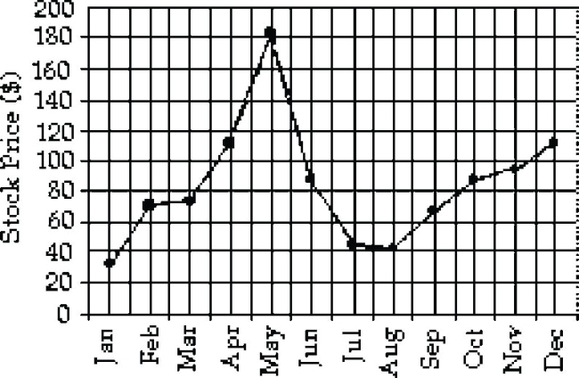
The table shows the price of a volatile stock from the months January 1999 through December 1999 as determined by the closing price on the last trading day of the month. The price is rounded to the nearest dollar.
Which time series line chart represents the data?
A)
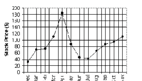
B)
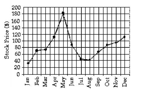
C)
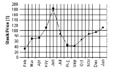
D) None of the above
Which time series line chart represents the data?
A)
B)
C)
D) None of the above
Question
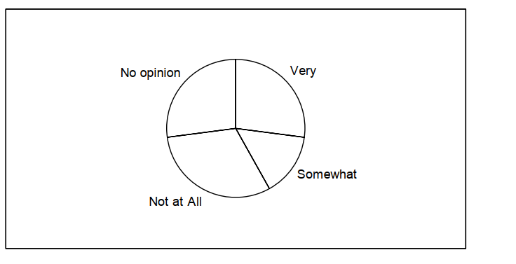
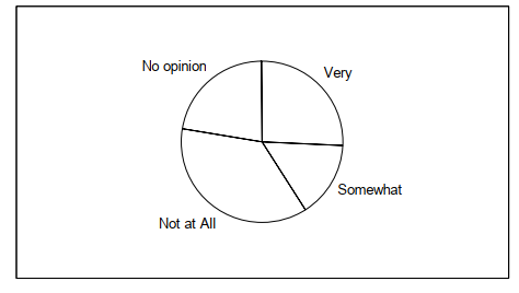
The data below represent the results of a poll in which the following question was asked:, "To what degree are you satisfied with the outcome of the 2012 gubernatorial election?" Which pie chart below represents the given data set?
A)
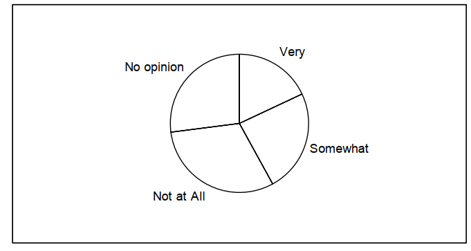
B)
A)
B)
Question
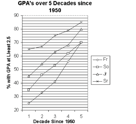
using the graphical display below.

-Identify the class that has the greatest increase in 2.5 or better GPA's over the five decades.
A) Sr
B) Jr
C) So
D) Fr
-Identify the class that has the greatest increase in 2.5 or better GPA's over the five decades.
A) Sr
B) Jr
C) So
D) Fr
Question
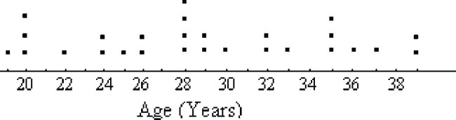
The following dot plot represents the ages of the people in a sample selected from a group of campaign volunteers.

How many people were in the sample?
A) 15
B) 21
C) 27
D) 28
How many people were in the sample?
A) 15
B) 21
C) 27
D) 28
Question
Question
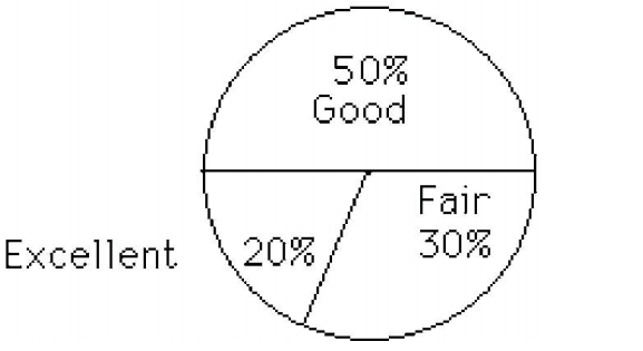
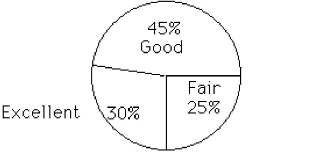
After reviewing a movie, 400 people rated the movie as excellent, good, or fair. The following data give the rating distribution. Which pie chart below represents the given data set?
A)
B)
A)
B)
Question
The table lists the winners of the Wimbledon women's singles title for the years 1976-1995.
Construct a bar chart for the given relative frequencies.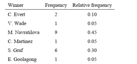
Construct a bar chart for the given relative frequencies.
Question
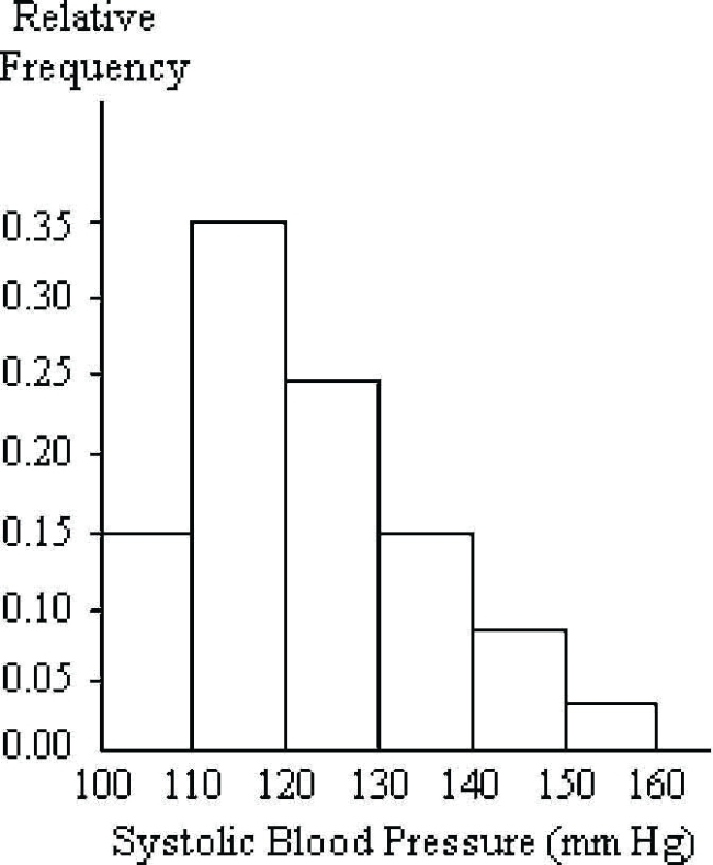
A nurse measured the blood pressure of each person who visited her clinic. Following is a relative-frequency histogram for the systolic blood pressure readings for those people aged between 25 and 40. Use the histogram to answer the question. The blood pressure readings Were rounded to the next higher whole number.
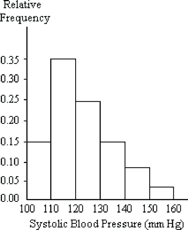
Given that 800 people were aged between 25 and 40, approximately how many had a systolic Blood pressure reading greater than 120 and less than or equal to 140?
A) 0.40
B) 32
C) 320
D) 400
Given that 800 people were aged between 25 and 40, approximately how many had a systolic Blood pressure reading greater than 120 and less than or equal to 140?
A) 0.40
B) 32
C) 320
D) 400
Question
Question
Question
Question
The data below are the numbers of hours of homework done as reported by 24 high school juniors for the last week in September, 2006.
6, 5, 6, 4, 6, 6, 9, 7, 6, 3, 8, 5, 5, 8, 6, 5, 8, 6, 5, 7, 5, 8, 7, 4
Using bins of 2 hours width, which relative frequency histogram represents the data?
A)
B)
C)
D) None of the above
6, 5, 6, 4, 6, 6, 9, 7, 6, 3, 8, 5, 5, 8, 6, 5, 8, 6, 5, 7, 5, 8, 7, 4
Using bins of 2 hours width, which relative frequency histogram represents the data?
A)
B)
C)
D) None of the above
Question
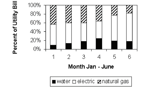
using the graphical disply below.
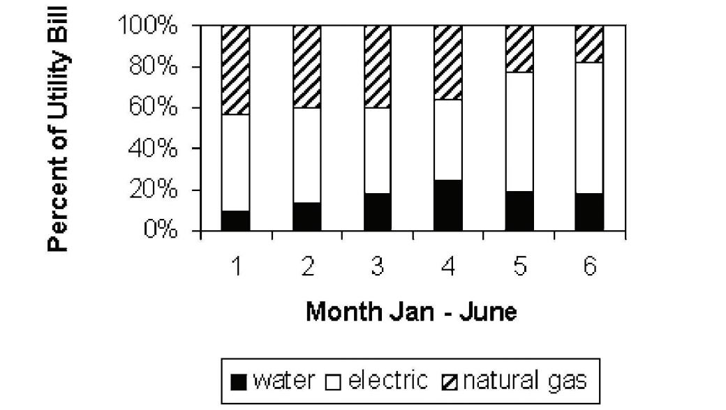
-Identify the utility that decreases as a percentage of the total utility bill from January to June.
A) Electric
B) Natural Gas
C) Water
D) None decrease from January to June.
-Identify the utility that decreases as a percentage of the total utility bill from January to June.
A) Electric
B) Natural Gas
C) Water
D) None decrease from January to June.
Question
Which line chart below represents the data?
A)
B)
C)
D) None of the above
A)
B)
C)
D) None of the above
Question
Question
Question
The following dot plot represents the ages of the customers who visited a sporting goods store on a particular Monday.
How many people in the sample were aged between 20 and 28, inclusive?
How many people in the sample were aged between 20 and 28, inclusive?
Question
Question
Construct a bar chart for the relative frequencies given. 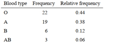
Question
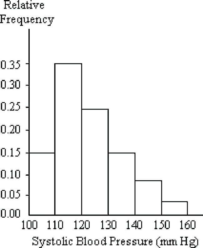
A nurse measured the blood pressure of each person who visited her clinic. Following is a relative-frequency histogram for the systolic blood pressure readings for those people aged between 25 and 40. Use the histogram to answer the question. The blood pressure readings were rounded up to the next whole number.
 Approximately what percentage of the people aged 25-40 had a systolic blood pressure reading greater than or equal to 130?
A) 15%
B) 28%
C) 75%
D) 90%
Approximately what percentage of the people aged 25-40 had a systolic blood pressure reading greater than or equal to 130?A) 15%
B) 28%
C) 75%
D) 90%
Question
Question
Question
Using the graphical display below.
-Identify the class that had the lowest percentage increase in 2.5 or better GPA's between the fourth and fifth decades.
A) Sr
B) Jr
C) So
D) Fr
-Identify the class that had the lowest percentage increase in 2.5 or better GPA's between the fourth and fifth decades.
A) Sr
B) Jr
C) So
D) Fr
Question
Which line chart below represents the data in the table?
A)
B)
C)

D) None of the above
A)
B)
C)
D) None of the above
Question
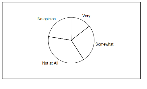
The data below represent the results of a poll in which the following question was asked: "To what degree are you satisfied with your current health insurance?" Which pie chart below
Represents the given data set?
A)
B)
Represents the given data set?
A)
B)
Question
The time series line chart below shows the prices of a volatile stock from January 1999 to December 1999. Between which two consecutive months did the price of the stock drop by The greatest percentage?
A) June - July
B) August - September
C) May - June
D) None of the above
A) June - July
B) August - September
C) May - June
D) None of the above
Question
The table shows the end-of-the-month checking account balance of a statistics teacher for the months January 1999 through December 1999 as determined by the closing balance on the last banking day of the month. The balance is rounded to the nearest dollar.
Which time series line chart represents the data?
A)
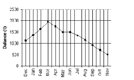
B)
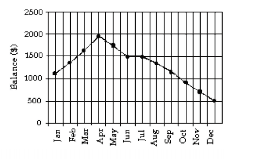
C)
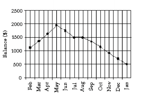
D) None of the above
Which time series line chart represents the data?
A)
B)
C)
D) None of the above
Question
Question
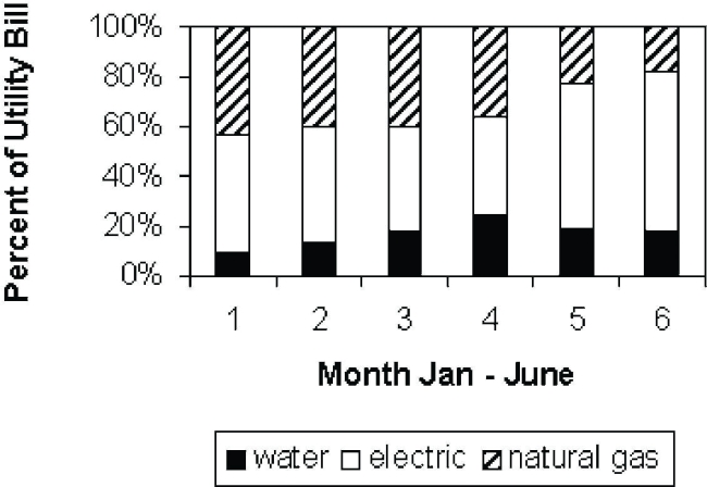
Using the graphical display below.
-Identify the utility that has its smallest percentage of the total bill in March.
A) Gas
B) Electric
C) Water
D) None of the utilities has its smallest percentage of the total bill in March.
-Identify the utility that has its smallest percentage of the total bill in March.
A) Gas
B) Electric
C) Water
D) None of the utilities has its smallest percentage of the total bill in March.
Question
Question
Question
Question
Question
The bar chart shows the relative frequencies of winners of the Wimbledon women's singles tennis title for 1976 - 1995.
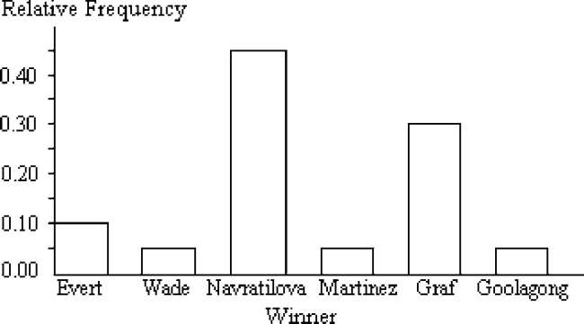
How many titles did Graf and Navratilova win?
A)0.75
B)14
C)15
D)40
How many titles did Graf and Navratilova win?
A)0.75
B)14
C)15
D)40
Question
Using the graphical display below.

-Identify the class that has had the greatest percentage increase with respect to its initial percentage over the five decades.
A) Fr
B) So
C) Jr
D) Sr
-Identify the class that has had the greatest percentage increase with respect to its initial percentage over the five decades.
A) Fr
B) So
C) Jr
D) Sr
Question
Question
A nurse measured the blood pressure of each person who visited her clinic. Following is a relative-frequency histogram for the systolic blood pressure readings for those people aged between 25 and 40. Use the histogram to answer the question. The blood pressure readings were rounded down to the next whole number.
Given that 600 people were aged between 25 and 40, approximately how many had a systolic blood pressure reading recorded as between 120 and 149 inclusive?
A) 48%
B) 250
C) 288
D) 300
Given that 600 people were aged between 25 and 40, approximately how many had a systolic blood pressure reading recorded as between 120 and 149 inclusive?
A) 48%
B) 250
C) 288
D) 300
Question
Using the graphical display below.
-Identify the utility that accounts for over half the total bill in two months.
A) Water
B) Electric
C) Gas
D) No single utility accounts for more than half the total bill in two months.
-Identify the utility that accounts for over half the total bill in two months.
A) Water
B) Electric
C) Gas
D) No single utility accounts for more than half the total bill in two months.
Question
Question
Construct a frequency table for the numbers of persons with various blood types. 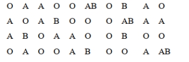
Question
Question
The stacked bar chart below shows the percentages of death due to cancer in four geographic regions of the U.S. that occurred in three ethnic groups in 2003. 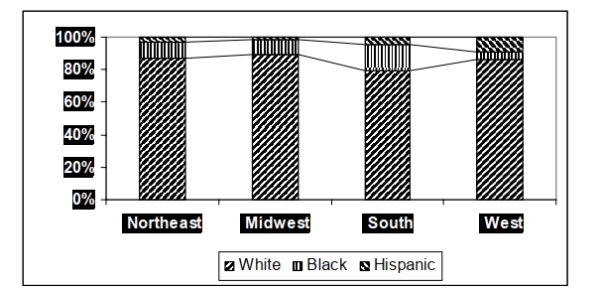 In which geographic area did Hispanics account for their highest percentage of cancer deaths
in 2003?
In which geographic area did Hispanics account for their highest percentage of cancer deathsin 2003?
Question
Question
Question
Alan tossed a die 50 times and obtained the results shown in the dot plot below. 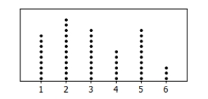 How many times did he roll an even number?
How many times did he roll an even number? Question
Question
The histogram below shows the ages of the actors who won the academy award for best actor from 1970 to 2006.
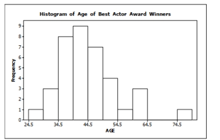
How many of the award winners were 50 years old or older at the time they won their Oscar?
How many of the award winners were 50 years old or older at the time they won their Oscar?
Question
The following multiple line graph shows the numbers of death due to cancer in four geographic regions of the U.S. that occurred in three ethnic groups in 2003. 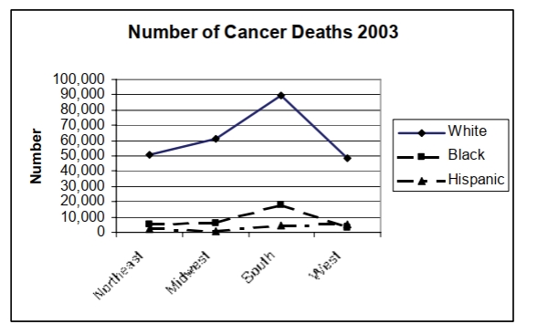
In which geographic area was the number of cancer deaths among whites the highest in 2003?
In which geographic area was the number of cancer deaths among whites the highest in 2003?
Question
- construct a line plot, starting at 1000.

Unlock Deck
Sign up to unlock the cards in this deck!
Unlock Deck
Unlock Deck
1/49
Play
Full screen (f)
Deck 3: Visual Displays of Data Exam
1
The table shows the price of a volatile stock from the months January 1999 through December 1999 as determined by the closing price on the last trading day of the month. The price is rounded to the nearest dollar.
Which time series line chart represents the data?
A)
B)
C)
D) None of the above
Which time series line chart represents the data?
A)
B)
C)
D) None of the above
2
The data below represent the results of a poll in which the following question was asked:, "To what degree are you satisfied with the outcome of the 2012 gubernatorial election?" Which pie chart below represents the given data set?
A)
B)
A)
B)
A
3
using the graphical display below.
-Identify the class that has the greatest increase in 2.5 or better GPA's over the five decades.
A) Sr
B) Jr
C) So
D) Fr
-Identify the class that has the greatest increase in 2.5 or better GPA's over the five decades.
A) Sr
B) Jr
C) So
D) Fr
Fr
4
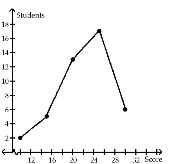
The following dot plot represents the ages of the people in a sample selected from a group of campaign volunteers.
How many people were in the sample?
A) 15
B) 21
C) 27
D) 28
How many people were in the sample?
A) 15
B) 21
C) 27
D) 28
Unlock Deck
Unlock for access to all 49 flashcards in this deck.
Unlock Deck
k this deck
5
The frequency table shows the lengths in inches of 40 fireplace logs.
Construct a cumulative frequency table for the data.
Construct a cumulative frequency table for the data.
Unlock Deck
Unlock for access to all 49 flashcards in this deck.
Unlock Deck
k this deck
6
After reviewing a movie, 400 people rated the movie as excellent, good, or fair. The following data give the rating distribution. Which pie chart below represents the given data set?
A)
B)
A)
B)
Unlock Deck
Unlock for access to all 49 flashcards in this deck.
Unlock Deck
k this deck
7
The table lists the winners of the Wimbledon women's singles title for the years 1976-1995.
Construct a bar chart for the given relative frequencies.
Construct a bar chart for the given relative frequencies.
Unlock Deck
Unlock for access to all 49 flashcards in this deck.
Unlock Deck
k this deck
8
A nurse measured the blood pressure of each person who visited her clinic. Following is a relative-frequency histogram for the systolic blood pressure readings for those people aged between 25 and 40. Use the histogram to answer the question. The blood pressure readings Were rounded to the next higher whole number.
Given that 800 people were aged between 25 and 40, approximately how many had a systolic Blood pressure reading greater than 120 and less than or equal to 140?
A) 0.40
B) 32
C) 320
D) 400
Given that 800 people were aged between 25 and 40, approximately how many had a systolic Blood pressure reading greater than 120 and less than or equal to 140?
A) 0.40
B) 32
C) 320
D) 400
Unlock Deck
Unlock for access to all 49 flashcards in this deck.
Unlock Deck
k this deck
9
Find the original data from the stem-and-leaf plot.
A) 95, 91, 99, 101, 111, 115
B) 91, 95, 91, 109, 119, 115
C) 95, 99, 101, 101, 115, 115
D) 95, 99, 101, 109, 115, 115
A) 95, 91, 99, 101, 111, 115
B) 91, 95, 91, 109, 119, 115
C) 95, 99, 101, 101, 115, 115
D) 95, 99, 101, 109, 115, 115
Unlock Deck
Unlock for access to all 49 flashcards in this deck.
Unlock Deck
k this deck
10
On Monday mornings, a bookie tabulates the point spreads for the basketball games played on saturday and Sunday. He found that 5 games had a spread of 1 or 2 points, 4 had a spread of 3 to 6 points, 4 had a spread of 7 to 10, and 3 were more than 10. Construct the relative frequency table the bookie obtained for the weekend basketball games.
Unlock Deck
Unlock for access to all 49 flashcards in this deck.
Unlock Deck
k this deck
11
Wagenlucht Ice Cream Company is always trying to create new flavors of ice cream. They are market testing three kinds to find out which one has the best chance by of becoming popular.
They give small samples of each to 50 people at a grocery store. 15 ice cream tasters preferred the Strawberry Cream, 30 preferred Choco-Nuts, and 5 loved the Orange Mint. Construct a pareto chart to represent these preferences. Choose the vertical scale so that the relative frequencies are represented.
They give small samples of each to 50 people at a grocery store. 15 ice cream tasters preferred the Strawberry Cream, 30 preferred Choco-Nuts, and 5 loved the Orange Mint. Construct a pareto chart to represent these preferences. Choose the vertical scale so that the relative frequencies are represented.
Unlock Deck
Unlock for access to all 49 flashcards in this deck.
Unlock Deck
k this deck
12
The data below are the numbers of hours of homework done as reported by 24 high school juniors for the last week in September, 2006.
6, 5, 6, 4, 6, 6, 9, 7, 6, 3, 8, 5, 5, 8, 6, 5, 8, 6, 5, 7, 5, 8, 7, 4
Using bins of 2 hours width, which relative frequency histogram represents the data?
A)
B)
C)
D) None of the above
6, 5, 6, 4, 6, 6, 9, 7, 6, 3, 8, 5, 5, 8, 6, 5, 8, 6, 5, 7, 5, 8, 7, 4
Using bins of 2 hours width, which relative frequency histogram represents the data?
A)
B)
C)
D) None of the above
Unlock Deck
Unlock for access to all 49 flashcards in this deck.
Unlock Deck
k this deck
13
using the graphical disply below.
-Identify the utility that decreases as a percentage of the total utility bill from January to June.
A) Electric
B) Natural Gas
C) Water
D) None decrease from January to June.
-Identify the utility that decreases as a percentage of the total utility bill from January to June.
A) Electric
B) Natural Gas
C) Water
D) None decrease from January to June.
Unlock Deck
Unlock for access to all 49 flashcards in this deck.
Unlock Deck
k this deck
14
Which line chart below represents the data?
A)
B)
C)
D) None of the above
A)
B)
C)
D) None of the above
Unlock Deck
Unlock for access to all 49 flashcards in this deck.
Unlock Deck
k this deck
15
A medical research team studied the ages of patients who had strokes caused by stress. The results of 34 patients are tabulated below. Construct the frequency histogram.
Unlock Deck
Unlock for access to all 49 flashcards in this deck.
Unlock Deck
k this deck
16
A machine is supposed to fill juice bottles with 16 fluid ounces of juice. The manufacturer picks a sample of bottles that have been filled by the machine and determines the volume of juice in each bottle. The results are shown in the following stem-and-leaf diagram. The leaf unit is 0.1. How many bottles were sampled?
A) 9
B) 10
C) 15
D) 44
A) 9
B) 10
C) 15
D) 44
Unlock Deck
Unlock for access to all 49 flashcards in this deck.
Unlock Deck
k this deck
17
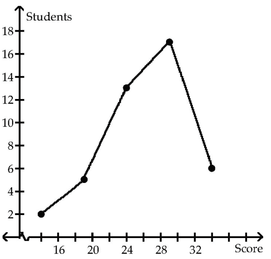
The following dot plot represents the ages of the customers who visited a sporting goods store on a particular Monday.
How many people in the sample were aged between 20 and 28, inclusive?
How many people in the sample were aged between 20 and 28, inclusive?
Unlock Deck
Unlock for access to all 49 flashcards in this deck.
Unlock Deck
k this deck
18
The Kappa Iota Sigma Fraternity polled its members on the weekend party theme. The vote was as follows: six for toga, four for hayride, eight for casino, and two for masquerade. Display the vote count in a Pareto chart.
Unlock Deck
Unlock for access to all 49 flashcards in this deck.
Unlock Deck
k this deck
19
Construct a bar chart for the relative frequencies given.
Unlock Deck
Unlock for access to all 49 flashcards in this deck.
Unlock Deck
k this deck
20
A nurse measured the blood pressure of each person who visited her clinic. Following is a relative-frequency histogram for the systolic blood pressure readings for those people aged between 25 and 40. Use the histogram to answer the question. The blood pressure readings were rounded up to the next whole number.
Approximately what percentage of the people aged 25-40 had a systolic blood pressure reading greater than or equal to 130?
A) 15%
B) 28%
C) 75%
D) 90%
Approximately what percentage of the people aged 25-40 had a systolic blood pressure reading greater than or equal to 130?A) 15%
B) 28%
C) 75%
D) 90%
Unlock Deck
Unlock for access to all 49 flashcards in this deck.
Unlock Deck
k this deck
21
The stem-and-leaf diagram below shows the highest wind velocity ever recorded in 30 different U.S. cities. The velocities are given in miles per hour. The leaf unit is 1.0.
How many of the maximum wind velocities are 88 miles per hour or lower?
A) 2
B) 5
C) 11
D) 18
How many of the maximum wind velocities are 88 miles per hour or lower?
A) 2
B) 5
C) 11
D) 18
Unlock Deck
Unlock for access to all 49 flashcards in this deck.
Unlock Deck
k this deck
22
A machine is supposed to fill juice bottles with 16 fluid ounces of juice. The manufacturer picks a sample of bottles that have been filled by the machine and determines the volume of juice in each bottle. The results are shown in the stem-and-leaf diagram below. The leaf unit is 0.1.
How many bottles had exactly 16 fluid ounces (to the nearest 0.1 ounce)?
A) 0
B) 6
C) 11
D) 25
How many bottles had exactly 16 fluid ounces (to the nearest 0.1 ounce)?
A) 0
B) 6
C) 11
D) 25
Unlock Deck
Unlock for access to all 49 flashcards in this deck.
Unlock Deck
k this deck
23
Using the graphical display below.
-Identify the class that had the lowest percentage increase in 2.5 or better GPA's between the fourth and fifth decades.
A) Sr
B) Jr
C) So
D) Fr
-Identify the class that had the lowest percentage increase in 2.5 or better GPA's between the fourth and fifth decades.
A) Sr
B) Jr
C) So
D) Fr
Unlock Deck
Unlock for access to all 49 flashcards in this deck.
Unlock Deck
k this deck
24
Which line chart below represents the data in the table?
A)
B)
C)
D) None of the above
A)
B)
C)
D) None of the above
Unlock Deck
Unlock for access to all 49 flashcards in this deck.
Unlock Deck
k this deck
25
The data below represent the results of a poll in which the following question was asked: "To what degree are you satisfied with your current health insurance?" Which pie chart below
Represents the given data set?
A)
B)
Represents the given data set?
A)
B)
Unlock Deck
Unlock for access to all 49 flashcards in this deck.
Unlock Deck
k this deck
26
The time series line chart below shows the prices of a volatile stock from January 1999 to December 1999. Between which two consecutive months did the price of the stock drop by The greatest percentage?
A) June - July
B) August - September
C) May - June
D) None of the above
A) June - July
B) August - September
C) May - June
D) None of the above
Unlock Deck
Unlock for access to all 49 flashcards in this deck.
Unlock Deck
k this deck
27
The table shows the end-of-the-month checking account balance of a statistics teacher for the months January 1999 through December 1999 as determined by the closing balance on the last banking day of the month. The balance is rounded to the nearest dollar.
Which time series line chart represents the data?
A)
B)
C)
D) None of the above
Which time series line chart represents the data?
A)
B)
C)
D) None of the above
Unlock Deck
Unlock for access to all 49 flashcards in this deck.
Unlock Deck
k this deck
28
Over the past 4 years of football games the Thunder gained the number of yards rushing as shown in the following table. Construct a relative frequency table for these data.
Unlock Deck
Unlock for access to all 49 flashcards in this deck.
Unlock Deck
k this deck
29
Using the graphical display below.
-Identify the utility that has its smallest percentage of the total bill in March.
A) Gas
B) Electric
C) Water
D) None of the utilities has its smallest percentage of the total bill in March.
-Identify the utility that has its smallest percentage of the total bill in March.
A) Gas
B) Electric
C) Water
D) None of the utilities has its smallest percentage of the total bill in March.
Unlock Deck
Unlock for access to all 49 flashcards in this deck.
Unlock Deck
k this deck
30
A car dealer is deciding what kinds of vehicles he should order from the factory. He looks at his sales report for the preceding period. Choose the vertical scale so that the relative frequencies are represented.
Construct a Pareto chart to help him decide.
Construct a Pareto chart to help him decide.
Unlock Deck
Unlock for access to all 49 flashcards in this deck.
Unlock Deck
k this deck
31
States with high deer populations have a large number of car-deer collisions. A survey of 30 drivers aged 40-49 in Wisconsin asked each driver how many such collisions they had had since obtaining a driver's license. The data were
Obtain a frequency table for these data using one value for each class.
Obtain a frequency table for these data using one value for each class.
Unlock Deck
Unlock for access to all 49 flashcards in this deck.
Unlock Deck
k this deck
32
The frequency table shows the weights in ounces of 30 stones. Construct the relative frequency table from the given frequency table.
Unlock Deck
Unlock for access to all 49 flashcards in this deck.
Unlock Deck
k this deck
33
The data below is the number of hours of homework done as reported by 24 high school juniors for the last week in September, 2006.
6, 5, 6, 4, 6, 6, 9, 7, 6, 3, 8, 5, 5, 8, 6, 5, 8, 6, 5, 7, 5, 8, 7, 4
Using bins of 2 hours width beginning at 3, construct the cumulative frequency histogram.
6, 5, 6, 4, 6, 6, 9, 7, 6, 3, 8, 5, 5, 8, 6, 5, 8, 6, 5, 7, 5, 8, 7, 4
Using bins of 2 hours width beginning at 3, construct the cumulative frequency histogram.
Unlock Deck
Unlock for access to all 49 flashcards in this deck.
Unlock Deck
k this deck
34
The bar chart shows the relative frequencies of winners of the Wimbledon women's singles tennis title for 1976 - 1995.
How many titles did Graf and Navratilova win?
A)0.75
B)14
C)15
D)40
How many titles did Graf and Navratilova win?
A)0.75
B)14
C)15
D)40
Unlock Deck
Unlock for access to all 49 flashcards in this deck.
Unlock Deck
k this deck
35
Using the graphical display below.
-Identify the class that has had the greatest percentage increase with respect to its initial percentage over the five decades.
A) Fr
B) So
C) Jr
D) Sr
-Identify the class that has had the greatest percentage increase with respect to its initial percentage over the five decades.
A) Fr
B) So
C) Jr
D) Sr
Unlock Deck
Unlock for access to all 49 flashcards in this deck.
Unlock Deck
k this deck
36
Find the original data from the stem-and-leaf plot.
A) 7.11, 7.18, 7.28, 7.28, 7.31, 7.38, 7.38
B) 0.81, 1.51, 1.52, 1.52, 0.83, 1.53, 1.53
C) 0.81, 0.81, 1.52, 1.52, 1.52, 0.83, 1.53, 1.54
D) 711, 712, 728, 728, 731, 738, 738
A) 7.11, 7.18, 7.28, 7.28, 7.31, 7.38, 7.38
B) 0.81, 1.51, 1.52, 1.52, 0.83, 1.53, 1.53
C) 0.81, 0.81, 1.52, 1.52, 1.52, 0.83, 1.53, 1.54
D) 711, 712, 728, 728, 731, 738, 738
Unlock Deck
Unlock for access to all 49 flashcards in this deck.
Unlock Deck
k this deck
37
A nurse measured the blood pressure of each person who visited her clinic. Following is a relative-frequency histogram for the systolic blood pressure readings for those people aged between 25 and 40. Use the histogram to answer the question. The blood pressure readings were rounded down to the next whole number.
Given that 600 people were aged between 25 and 40, approximately how many had a systolic blood pressure reading recorded as between 120 and 149 inclusive?
A) 48%
B) 250
C) 288
D) 300
Given that 600 people were aged between 25 and 40, approximately how many had a systolic blood pressure reading recorded as between 120 and 149 inclusive?
A) 48%
B) 250
C) 288
D) 300
Unlock Deck
Unlock for access to all 49 flashcards in this deck.
Unlock Deck
k this deck
38
Using the graphical display below.
-Identify the utility that accounts for over half the total bill in two months.
A) Water
B) Electric
C) Gas
D) No single utility accounts for more than half the total bill in two months.
-Identify the utility that accounts for over half the total bill in two months.
A) Water
B) Electric
C) Gas
D) No single utility accounts for more than half the total bill in two months.
Unlock Deck
Unlock for access to all 49 flashcards in this deck.
Unlock Deck
k this deck
39
Find the original data from the stem-and-leaf plot.
A) 11, 18, 23, 23, 27, 33, 34, 38, 39, 43, 44
B) 2, 9, 2, 2, 4, 8, 4, 4, 6, 11, 12, 7, 8, 12
C) 13, 13, 14, 21, 21, 23, 27, 31, 31, 43, 44
D) 11, 18, 21, 21, 23, 27, 31, 33, 33, 38, 39, 43, 44
A) 11, 18, 23, 23, 27, 33, 34, 38, 39, 43, 44
B) 2, 9, 2, 2, 4, 8, 4, 4, 6, 11, 12, 7, 8, 12
C) 13, 13, 14, 21, 21, 23, 27, 31, 31, 43, 44
D) 11, 18, 21, 21, 23, 27, 31, 33, 33, 38, 39, 43, 44
Unlock Deck
Unlock for access to all 49 flashcards in this deck.
Unlock Deck
k this deck
40
Construct a frequency table for the numbers of persons with various blood types.
Unlock Deck
Unlock for access to all 49 flashcards in this deck.
Unlock Deck
k this deck
41
2|9
3| 12
3| 67788
4| 0233
4| 5567
5| 124
5|
6| 0
-How many values are there less than 40?
3| 12
3| 67788
4| 0233
4| 5567
5| 124
5|
6| 0
-How many values are there less than 40?
Unlock Deck
Unlock for access to all 49 flashcards in this deck.
Unlock Deck
k this deck
42
The stacked bar chart below shows the percentages of death due to cancer in four geographic regions of the U.S. that occurred in three ethnic groups in 2003. In which geographic area did Hispanics account for their highest percentage of cancer deaths
in 2003?
In which geographic area did Hispanics account for their highest percentage of cancer deathsin 2003?
Unlock Deck
Unlock for access to all 49 flashcards in this deck.
Unlock Deck
k this deck
43
The 47 businesses on four blocks of Water Street were classified according to the amount of sales taxes they collected in one month.
Construct a frequency histogram for these data.
Construct a frequency histogram for these data.
Unlock Deck
Unlock for access to all 49 flashcards in this deck.
Unlock Deck
k this deck
44
The stem and leaf plot below shows the weights in pounds of halibut caught on an Alaskan fishing boat for one day.
2|9
3| 12
3| 67788
4| 0233
4| 5567
5| 124
5|
6| 0
List all of the original weights.
2|9
3| 12
3| 67788
4| 0233
4| 5567
5| 124
5|
6| 0
List all of the original weights.
Unlock Deck
Unlock for access to all 49 flashcards in this deck.
Unlock Deck
k this deck
45
Alan tossed a die 50 times and obtained the results shown in the dot plot below. How many times did he roll an even number?
How many times did he roll an even number? Unlock Deck
Unlock for access to all 49 flashcards in this deck.
Unlock Deck
k this deck
46
Construct a Pareto chart for the NCAA wrestling data in Problem 4.
Unlock Deck
Unlock for access to all 49 flashcards in this deck.
Unlock Deck
k this deck
47
The histogram below shows the ages of the actors who won the academy award for best actor from 1970 to 2006.
How many of the award winners were 50 years old or older at the time they won their Oscar?
How many of the award winners were 50 years old or older at the time they won their Oscar?
Unlock Deck
Unlock for access to all 49 flashcards in this deck.
Unlock Deck
k this deck
48
The following multiple line graph shows the numbers of death due to cancer in four geographic regions of the U.S. that occurred in three ethnic groups in 2003.
In which geographic area was the number of cancer deaths among whites the highest in 2003?
In which geographic area was the number of cancer deaths among whites the highest in 2003?
Unlock Deck
Unlock for access to all 49 flashcards in this deck.
Unlock Deck
k this deck
49
- construct a line plot, starting at 1000.
Unlock Deck
Unlock for access to all 49 flashcards in this deck.
Unlock Deck
k this deck
Unlock Deck
Unlock for access to all 49 flashcards in this deck.