Deck 10: Data Analysisstatistics: an Introduction
Full screen (f)
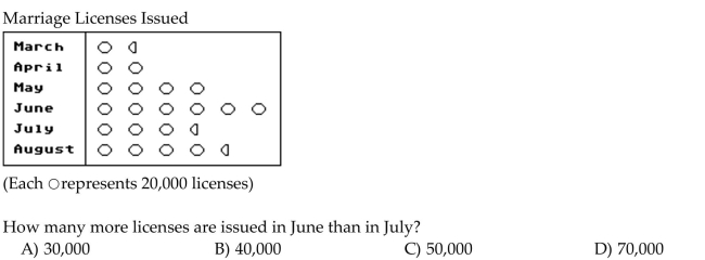
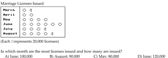
Question
Use the statistical display to answer the question.
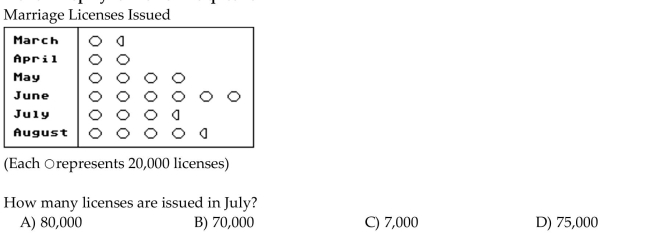
Question
Use the figure to answer the question.
The heights (in inches)of a group of high school students are listed below in a back-to-back stem-and-leaf plot.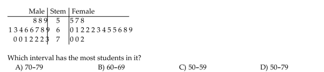
The heights (in inches)of a group of high school students are listed below in a back-to-back stem-and-leaf plot.
Question
Use the statistical display to answer the question.
Question
Construct the requested statistical display.
The weights of 22 members of the varsity football team are listed below. Draw an ordered stem-and-leaf plot for the data.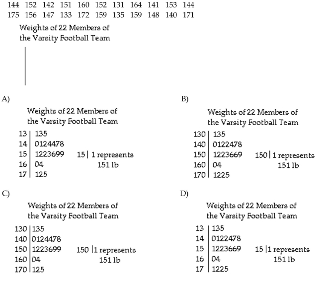
The weights of 22 members of the varsity football team are listed below. Draw an ordered stem-and-leaf plot for the data.
Question
Use the statistical display to answer the question.
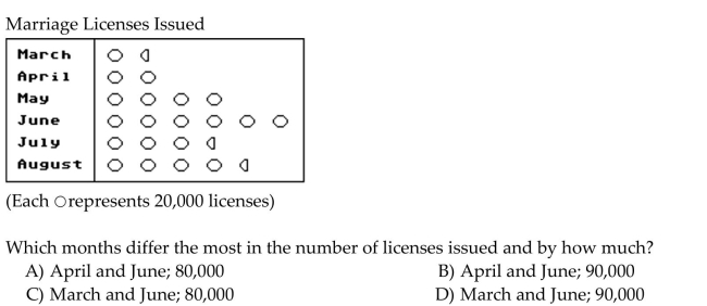
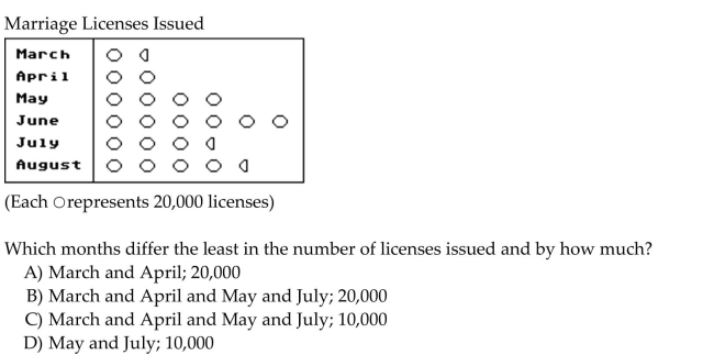
The midterm test scores for the seventh-period typing class are shown below on a dot plot.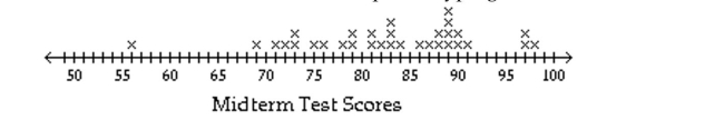 What are the outliers?
A)86, 87, 88, 89, 90, 91
B)56
C)69
D)97, 98
The midterm test scores for the seventh-period typing class are shown below on a dot plot.
What are the outliers?A)86, 87, 88, 89, 90, 91
B)56
C)69
D)97, 98
Question
Use the figure to answer the question.
The heights (in inches)of a group of high school students are listed below in a back-to-back stem-and-leaf plot.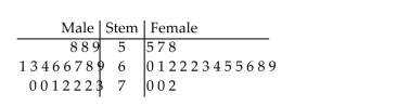 Which gender has the tallest student?
A)Female
B)Male
C)Both male and female have a student with the same tallest height.
The heights (in inches)of a group of high school students are listed below in a back-to-back stem-and-leaf plot.
Which gender has the tallest student?A)Female
B)Male
C)Both male and female have a student with the same tallest height.
Question
Use the figure to answer the question.
The heights (in inches)of a group of high school students are listed below in a back-to-back stem-and-leaf plot.
The heights (in inches)of a group of high school students are listed below in a back-to-back stem-and-leaf plot.
Question
Use the figure to answer the question.
The weights (in pounds)of a group of high school students are listed below in a stem-and-leaf plot.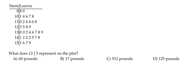
The weights (in pounds)of a group of high school students are listed below in a stem-and-leaf plot.
Question
Use the statistical display to answer the question.
The midterm test scores for the seventh-period typing class are shown below on a dot plot. What is the most frequent score?
A)83
B)89
C)56
D)98
The midterm test scores for the seventh-period typing class are shown below on a dot plot.
What is the most frequent score?A)83
B)89
C)56
D)98
Question
Use the statistical display to answer the question.
Question
Use the statistical display to answer the question.
Question
Construct the requested statistical display.
The mileage ratings for city driving of various subcompact cars are listed below. Construct a line plot using the data.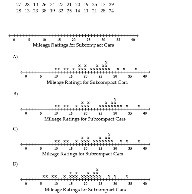
The mileage ratings for city driving of various subcompact cars are listed below. Construct a line plot using the data.
Question
Use the statistical display to answer the question.
The midterm test scores for the seventh-period typing class are shown below on a dot plot.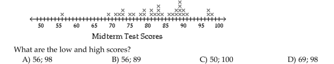
The midterm test scores for the seventh-period typing class are shown below on a dot plot.
Question
Construct the requested statistical display.
The attendance counts for this season's basketball games are listed below. Draw a stem-and-leaf plot for the data.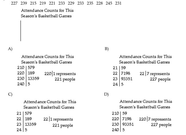
The attendance counts for this season's basketball games are listed below. Draw a stem-and-leaf plot for the data.
Question
Use the figure to answer the question.
The weights (in pounds)of a group of high school students are listed below in a stem-and-leaf plot.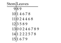 Which interval has the most students in it?
A)130-139
B)110-119
C)140-149
D)90-99
The weights (in pounds)of a group of high school students are listed below in a stem-and-leaf plot.
Which interval has the most students in it?A)130-139
B)110-119
C)140-149
D)90-99
Question
Use the statistical display to answer the question.
The midterm test scores for the seventh-period typing class are shown below on a dot plot.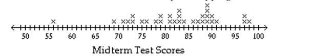 What cluster has the highest scores?
A)71-73
B)56
C)97-98
D)86-91
The midterm test scores for the seventh-period typing class are shown below on a dot plot.
What cluster has the highest scores?A)71-73
B)56
C)97-98
D)86-91
Question
Use the figure to answer the question.
The weights (in pounds)of a group of high school students are listed below in a stem-and-leaf plot. What is the most frequent weight?
A)159
B)99
C)142
D)114
The weights (in pounds)of a group of high school students are listed below in a stem-and-leaf plot.
What is the most frequent weight?A)159
B)99
C)142
D)114
Question
Use the figure to answer the question.
The weights (in pounds)of a group of high school students are listed below in a stem-and-leaf plot. What is the difference between the lowest and highest weights?
A)98
B)61
C)53
D)60
The weights (in pounds)of a group of high school students are listed below in a stem-and-leaf plot.
What is the difference between the lowest and highest weights?A)98
B)61
C)53
D)60
Question
Use the statistical display to answer the question.
Question
Use the statistical display to answer the question.
The midterm test scores for the seventh-period typing class are shown below on a dot plot. What is the largest gap in scores, not including gaps between outliers?
A)83-86
B)91-97
C)98-100
D)69-91
The midterm test scores for the seventh-period typing class are shown below on a dot plot.
What is the largest gap in scores, not including gaps between outliers?A)83-86
B)91-97
C)98-100
D)69-91
Question
Use the circle graph to
A survey of the 9729 vehicles on the campus of State University yielded the following circle graph.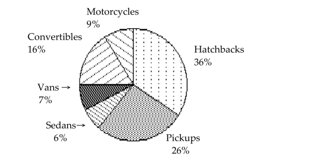 Find the number of hatchbacks. Round your result to the nearest whole number.
A)36
B)3989
C)3502
D)6227
A survey of the 9729 vehicles on the campus of State University yielded the following circle graph.
Find the number of hatchbacks. Round your result to the nearest whole number.A)36
B)3989
C)3502
D)6227
Question
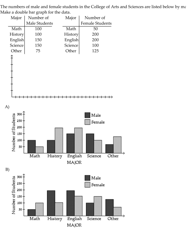
Use the figure to answer the question.
The numbers of students in the College of Arts and Sciences, categorized by major, are listed
below. Make a bar graph for the data.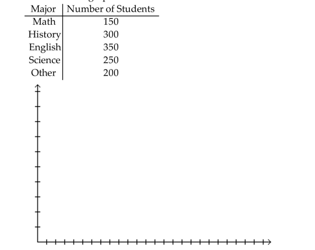
The numbers of students in the College of Arts and Sciences, categorized by major, are listed
below. Make a bar graph for the data.
Question
Use the figure to answer the question.
This double-bar graph shows the number of male (M)and female (F)athletes at a university over a four-year period.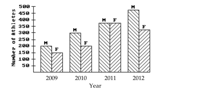 Which year had the greatest number of male athletes?
A)2011
B)2012
C)2009
D)2010
This double-bar graph shows the number of male (M)and female (F)athletes at a university over a four-year period.
Which year had the greatest number of male athletes?A)2011
B)2012
C)2009
D)2010
Question
Use the figure to answer the question.
The bar graph below shows the number of students by major in the College of Arts and Sciences.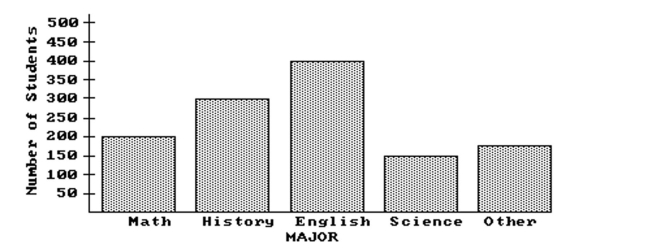 What is the ratio of history majors to the total number of students in the college?
A)49 to 8
B)12 to 49
C)12 to 48 or 1 to 4
D)12 to 16 or 3 to 4
The bar graph below shows the number of students by major in the College of Arts and Sciences.
What is the ratio of history majors to the total number of students in the college?A)49 to 8
B)12 to 49
C)12 to 48 or 1 to 4
D)12 to 16 or 3 to 4
Question
Use the figure to answer the question.
The bar graph below shows the number of students by major in the College of Arts and Sciences.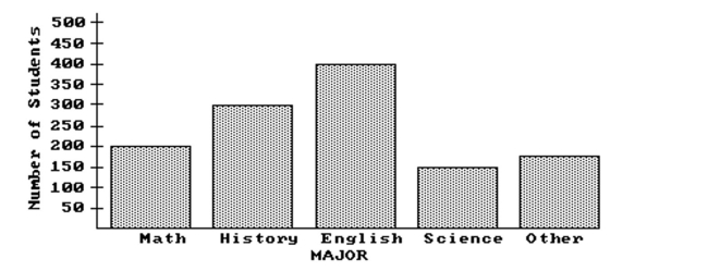 What percent of students in the college are history majors (to the nearest tenth of a percent)?
A)32.7%
B)24.5%
C)66.7%
D)75.5%
The bar graph below shows the number of students by major in the College of Arts and Sciences.
What percent of students in the college are history majors (to the nearest tenth of a percent)?A)32.7%
B)24.5%
C)66.7%
D)75.5%
Question
Use the circle graph to
The circle graph shows the percent of the total population of 93,700 of Springfield living in the given types of housing.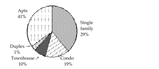 Find the number of people who live in single family houses. Round your result to the nearest whole
Number.
A)66,527 people
B)31,858 people
C)27,173 people
D)29 people
The circle graph shows the percent of the total population of 93,700 of Springfield living in the given types of housing.
Find the number of people who live in single family houses. Round your result to the nearest wholeNumber.
A)66,527 people
B)31,858 people
C)27,173 people
D)29 people
Question
Use the figure to answer the question.
The wages of the employees of a company are presented in this histogram. Assume that $6 is in the interval $6-$8, not $4-$6, similarly for $8, $10, and $12.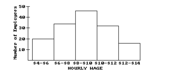 How many employees earn at least $6 and less than $8 an hour?
A)20
B)46
C)34
D)14
The wages of the employees of a company are presented in this histogram. Assume that $6 is in the interval $6-$8, not $4-$6, similarly for $8, $10, and $12.
How many employees earn at least $6 and less than $8 an hour?A)20
B)46
C)34
D)14
Question
Use the figure to answer the question.
This double-bar graph shows the number of male (M)and female (F)athletes at a university over a four-year period.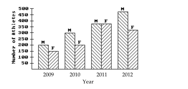 What is the only year in which the number of female athletes declined from its previous value?
A)2012
B)2009
C)2010
D)2011
This double-bar graph shows the number of male (M)and female (F)athletes at a university over a four-year period.
What is the only year in which the number of female athletes declined from its previous value?A)2012
B)2009
C)2010
D)2011
Question
Use the figure to answer the question.
The heights (in inches)of a group of high school students are listed below in a back-to-back stem-and-leaf plot. Which gender has the greatest average height?
A)Female
B)Male
C)Both male and female have about the same average height.
The heights (in inches)of a group of high school students are listed below in a back-to-back stem-and-leaf plot.
Which gender has the greatest average height?A)Female
B)Male
C)Both male and female have about the same average height.
Question
Use the circle graph to
In a school survey, students showed these preferences for instructional materials.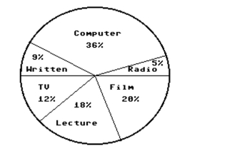 About how many students would you expect to prefer computers in a school of 500 students?
A)About 36 students
B)About 100 students
C)About 90 students
D)About 180 students
In a school survey, students showed these preferences for instructional materials.
About how many students would you expect to prefer computers in a school of 500 students?A)About 36 students
B)About 100 students
C)About 90 students
D)About 180 students
Question
Use the circle graph to
In a school survey, students showed these preferences for instructional materials. About how many students would you expect to prefer written materials in a school of 450 students?
A)About 81 students
B)About 9 students
C)About 162 students
D)About 41 students
In a school survey, students showed these preferences for instructional materials.
About how many students would you expect to prefer written materials in a school of 450 students?A)About 81 students
B)About 9 students
C)About 162 students
D)About 41 students
Question
Use the figure to answer the question.
The wages of the employees of a company are presented in this histogram. Assume that $6 is in the interval $6-$8, not $4-$6, similarly for $8, $10, and $12.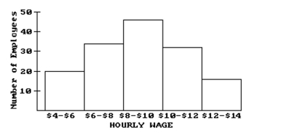 How many employees earn at least $12 and less than $14 an hour?
A)20
B)16
C)46
D)10
The wages of the employees of a company are presented in this histogram. Assume that $6 is in the interval $6-$8, not $4-$6, similarly for $8, $10, and $12.
How many employees earn at least $12 and less than $14 an hour?A)20
B)16
C)46
D)10
Question
Use the circle graph to
In a school survey, students showed these preferences for instructional materials. About how many students would you expect to prefer radio in a school of 250 students?
A)About 45 students
B)About 13 students
C)About 5 students
D)About 90 students
In a school survey, students showed these preferences for instructional materials.
About how many students would you expect to prefer radio in a school of 250 students?A)About 45 students
B)About 13 students
C)About 5 students
D)About 90 students
Question
Use the figure to answer the question.
This double-bar graph shows the number of male (M)and female (F)athletes at a university over a four-year period.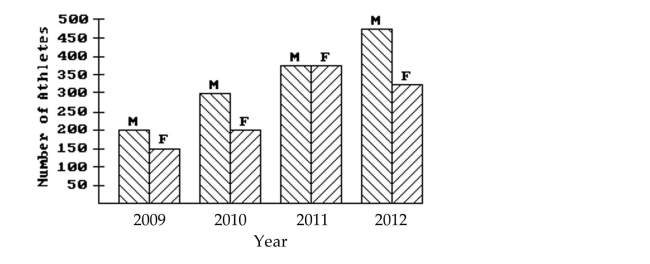 Which year had the smallest number of male athletes?
A)2009
B)2012
C)2010
D)2011
This double-bar graph shows the number of male (M)and female (F)athletes at a university over a four-year period.
Which year had the smallest number of male athletes?A)2009
B)2012
C)2010
D)2011
Question
Construct the requested statistical display.
Question
Use the figure to answer the question.
This double-bar graph shows the number of male (M)and female (F)athletes at a university over a four-year period.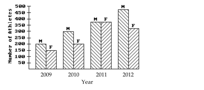 Which year had the same number of male and female athletes?
A)2010
B)2012
C)2011
D)2009
This double-bar graph shows the number of male (M)and female (F)athletes at a university over a four-year period.
Which year had the same number of male and female athletes?A)2010
B)2012
C)2011
D)2009
Question
Use the circle graph to
In a school survey, students showed these preferences for instructional materials.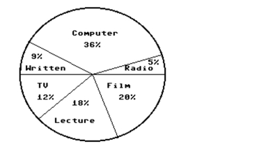 About how many students would you expect to prefer lectures in a school of 750 students?
A)About 135 students
B)About 150 students
C)About 270 students
D)About 18 students
In a school survey, students showed these preferences for instructional materials.
About how many students would you expect to prefer lectures in a school of 750 students?A)About 135 students
B)About 150 students
C)About 270 students
D)About 18 students
Question
Use the figure to answer the question.
The bar graph below shows the number of students by major in the College of Arts and Sciences.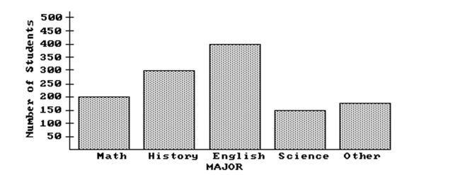 How many students are in the College of Arts and Sciences?
A)1325
B)1050
C)1225
D)1275
The bar graph below shows the number of students by major in the College of Arts and Sciences.
How many students are in the College of Arts and Sciences?A)1325
B)1050
C)1225
D)1275
Question
Use the figure to answer the question.
The wages of the employees of a company are presented in this histogram. Assume that $6 is in the interval $6-$8, not $4-$6, similarly for $8, $10, and $12.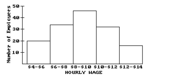 How many employees earn at least $4 and less than $6 an hour?
A)20
B)10
C)34
D)22
The wages of the employees of a company are presented in this histogram. Assume that $6 is in the interval $6-$8, not $4-$6, similarly for $8, $10, and $12.
How many employees earn at least $4 and less than $6 an hour?A)20
B)10
C)34
D)22
Question
Use the figure to answer the question.
Students in Mr. Mason's classes collected items from different countries. The data show how
many of each item one class collected. Construct a bar graph for the frequency data.
Stamps, 9
Postcards, 11
Coins, 7
Books, 13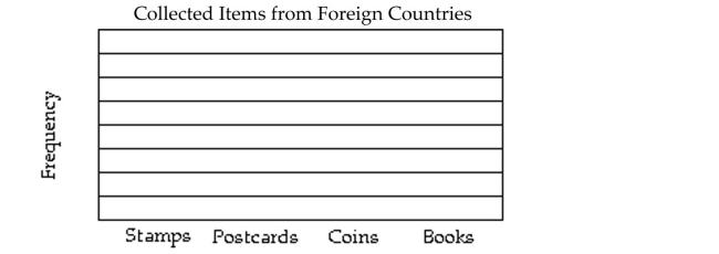
Students in Mr. Mason's classes collected items from different countries. The data show how
many of each item one class collected. Construct a bar graph for the frequency data.
Stamps, 9
Postcards, 11
Coins, 7
Books, 13
Question
Use the figure to answer the question.
The average amount of weekend television viewing of high school students is shown below and used to create a frequency table. Which interval has the greatest amount of students?
A)7-8.5
B)9-10
C)5-6.5
D)3-4.5
The average amount of weekend television viewing of high school students is shown below and used to create a frequency table.
Which interval has the greatest amount of students?A)7-8.5
B)9-10
C)5-6.5
D)3-4.5
Question
Identify whether the given scatterplot shows a positive association, negative association, or no association.
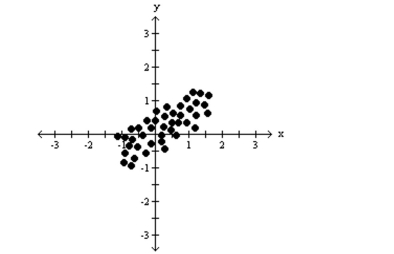
A)positive association
B)no association
C)negative association
A)positive association
B)no association
C)negative association
Question
Use the figure to answer the question.
The sales figures for the Big "D" Company are shown below in a line graph.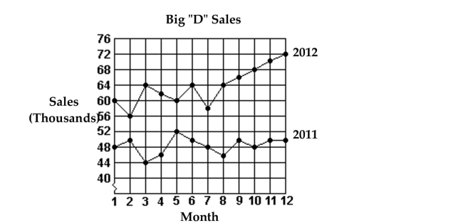 Which month in 2011 had the lowest sales?
A)Month 8
B)Month 2
C)Month 3
D)Month 6
The sales figures for the Big "D" Company are shown below in a line graph.
Which month in 2011 had the lowest sales?A)Month 8
B)Month 2
C)Month 3
D)Month 6
Question
Use the figure to answer the question.
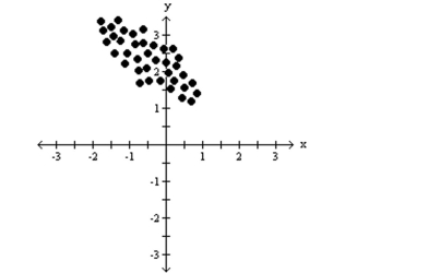
The following scatterplot shows the heights (in inches)of a group of children and their ages. What can be the expected height range for a 2-year-old child?
A)25-38 inches
B)35-45 inches
C)40-50 inches
D)20-30 inches
The following scatterplot shows the heights (in inches)of a group of children and their ages.
What can be the expected height range for a 2-year-old child?A)25-38 inches
B)35-45 inches
C)40-50 inches
D)20-30 inches
Question
Identify whether the given scatterplot shows a positive association, negative association, or no association.
Question
Use the figure to answer the question.
The one-day temperatures for 12 world cities along with their latitudes are shown in the table
below. Make a scatterplot for the data.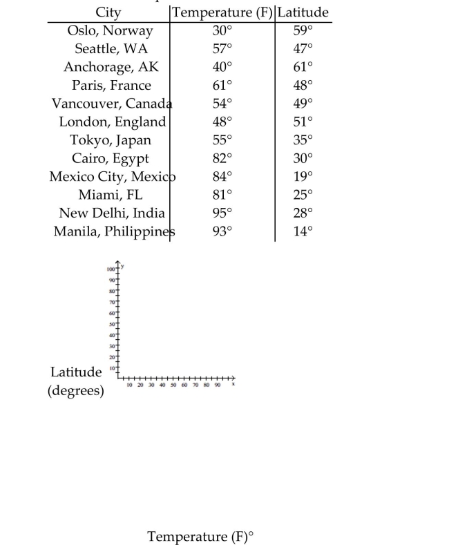
The one-day temperatures for 12 world cities along with their latitudes are shown in the table
below. Make a scatterplot for the data.
Question
Use the circle graph to
In a school survey, students showed these preferences for instructional materials.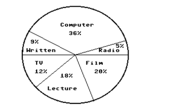 About how many students would you expect to prefer TV in a school of 500 students?
A)About 60 students
B)About 100 students
C)About 12 students
D)About 90 students
In a school survey, students showed these preferences for instructional materials.
About how many students would you expect to prefer TV in a school of 500 students?A)About 60 students
B)About 100 students
C)About 12 students
D)About 90 students
Question
Identify whether the given scatterplot shows a positive association, negative association, or no association.
A)positive association
B)negative association
C)no association
A)positive association
B)negative association
C)no association
Question
Identify whether the given scatterplot shows a positive association, negative association, or no association.
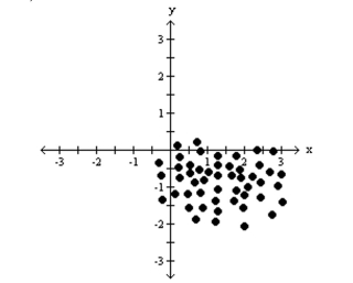
A)positive association
B)negative association
C)no association
A)positive association
B)negative association
C)no association
Question
Use the figure to answer the question.
The data below give the figures for the United States production of canned fruit from 2002 to
2009. Make a line graph for the data.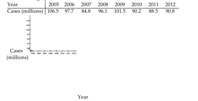
The data below give the figures for the United States production of canned fruit from 2002 to
2009. Make a line graph for the data.
Question
Use the figure to answer the question.
The following scatterplot shows the heights (in inches)of a group of children and their ages.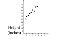 Age (years) From this data, conjecture how old you think a child is who is about 39 inches tall?
A)1 year
B)3 months
C)3 years
D)7 years
The following scatterplot shows the heights (in inches)of a group of children and their ages.
Age (years) From this data, conjecture how old you think a child is who is about 39 inches tall?A)1 year
B)3 months
C)3 years
D)7 years
Question
Use the figure to answer the question.
The sales figures for the Big "D" Company are shown below in a line graph.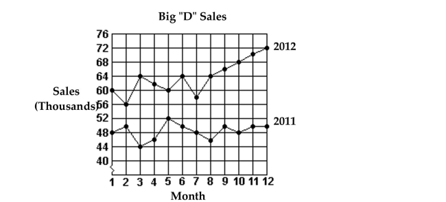 What were the total sales for the first 6 months of 2011?
A)$366,000
B)$240,000
C)$46,000
D)$290,000
The sales figures for the Big "D" Company are shown below in a line graph.
What were the total sales for the first 6 months of 2011?A)$366,000
B)$240,000
C)$46,000
D)$290,000
Question
Use the circle graph to
In a school survey, students showed these preferences for instructional materials. About how many students would you expect to prefer films in a school of 350 students?
A)About 20 students
B)About 63 students
C)About 42 students
D)About 70 students
In a school survey, students showed these preferences for instructional materials.
About how many students would you expect to prefer films in a school of 350 students?A)About 20 students
B)About 63 students
C)About 42 students
D)About 70 students
Question
Use the figure to answer the question.
The sales figures for the Big "D" Company are shown below in a line graph.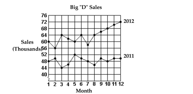 What were the total sales for the first 6 months of 2012?
A)$286,000
B)$64,000
C)$366,000
D)$302,000
The sales figures for the Big "D" Company are shown below in a line graph.
What were the total sales for the first 6 months of 2012?A)$286,000
B)$64,000
C)$366,000
D)$302,000
Question
Construct the requested statistical display.
Kevin asked some of his friends how many hours they worked during the previous week at their after-school jobs. Make a frequency table for the data.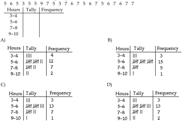
Kevin asked some of his friends how many hours they worked during the previous week at their after-school jobs. Make a frequency table for the data.
Question
Use the figure to answer the question.
The average amount of weekend television viewing of high school students is shown below in a frequency table. To the nearest half hour, what is the most common amount of weekend television viewing?
A)5-6.5
B)7-8.5
C)Can not be determined from the frequency table
D)3-4.5
The average amount of weekend television viewing of high school students is shown below in a frequency table.
To the nearest half hour, what is the most common amount of weekend television viewing?A)5-6.5
B)7-8.5
C)Can not be determined from the frequency table
D)3-4.5
Question
Use the figure to answer the question.
The sales figures for the Big "D" Company are shown below in a line graph.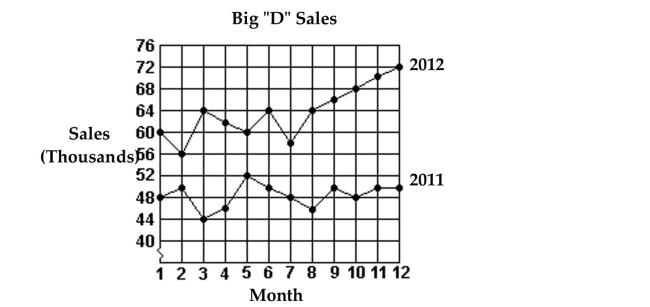 Which month in 2012 had the highest sales?
A)Month 3
B)Month 5
C)Month 6
D)Month 12
The sales figures for the Big "D" Company are shown below in a line graph.
Which month in 2012 had the highest sales?A)Month 3
B)Month 5
C)Month 6
D)Month 12

Unlock Deck
Sign up to unlock the cards in this deck!
Unlock Deck
Unlock Deck
1/57
Play
Full screen (f)
Deck 10: Data Analysisstatistics: an Introduction
1
Use the statistical display to answer the question.
D
2
Use the figure to answer the question.
The heights (in inches)of a group of high school students are listed below in a back-to-back stem-and-leaf plot.
The heights (in inches)of a group of high school students are listed below in a back-to-back stem-and-leaf plot.
B
3
Use the statistical display to answer the question.
C
4
Construct the requested statistical display.
The weights of 22 members of the varsity football team are listed below. Draw an ordered stem-and-leaf plot for the data.
The weights of 22 members of the varsity football team are listed below. Draw an ordered stem-and-leaf plot for the data.
Unlock Deck
Unlock for access to all 57 flashcards in this deck.
Unlock Deck
k this deck
5
Use the statistical display to answer the question.
The midterm test scores for the seventh-period typing class are shown below on a dot plot. What are the outliers?
A)86, 87, 88, 89, 90, 91
B)56
C)69
D)97, 98
The midterm test scores for the seventh-period typing class are shown below on a dot plot.
What are the outliers?A)86, 87, 88, 89, 90, 91
B)56
C)69
D)97, 98
Unlock Deck
Unlock for access to all 57 flashcards in this deck.
Unlock Deck
k this deck
6
Use the figure to answer the question.
The heights (in inches)of a group of high school students are listed below in a back-to-back stem-and-leaf plot. Which gender has the tallest student?
A)Female
B)Male
C)Both male and female have a student with the same tallest height.
The heights (in inches)of a group of high school students are listed below in a back-to-back stem-and-leaf plot.
Which gender has the tallest student?A)Female
B)Male
C)Both male and female have a student with the same tallest height.
Unlock Deck
Unlock for access to all 57 flashcards in this deck.
Unlock Deck
k this deck
7
Use the figure to answer the question.
The heights (in inches)of a group of high school students are listed below in a back-to-back stem-and-leaf plot.
The heights (in inches)of a group of high school students are listed below in a back-to-back stem-and-leaf plot.
Unlock Deck
Unlock for access to all 57 flashcards in this deck.
Unlock Deck
k this deck
8
Use the figure to answer the question.
The weights (in pounds)of a group of high school students are listed below in a stem-and-leaf plot.
The weights (in pounds)of a group of high school students are listed below in a stem-and-leaf plot.
Unlock Deck
Unlock for access to all 57 flashcards in this deck.
Unlock Deck
k this deck
9
Use the statistical display to answer the question.
The midterm test scores for the seventh-period typing class are shown below on a dot plot. What is the most frequent score?
A)83
B)89
C)56
D)98
The midterm test scores for the seventh-period typing class are shown below on a dot plot.
What is the most frequent score?A)83
B)89
C)56
D)98
Unlock Deck
Unlock for access to all 57 flashcards in this deck.
Unlock Deck
k this deck
10
Use the statistical display to answer the question.
Unlock Deck
Unlock for access to all 57 flashcards in this deck.
Unlock Deck
k this deck
11
Use the statistical display to answer the question.
Unlock Deck
Unlock for access to all 57 flashcards in this deck.
Unlock Deck
k this deck
12
Construct the requested statistical display.
The mileage ratings for city driving of various subcompact cars are listed below. Construct a line plot using the data.
The mileage ratings for city driving of various subcompact cars are listed below. Construct a line plot using the data.
Unlock Deck
Unlock for access to all 57 flashcards in this deck.
Unlock Deck
k this deck
13
Use the statistical display to answer the question.
The midterm test scores for the seventh-period typing class are shown below on a dot plot.
The midterm test scores for the seventh-period typing class are shown below on a dot plot.
Unlock Deck
Unlock for access to all 57 flashcards in this deck.
Unlock Deck
k this deck
14
Construct the requested statistical display.
The attendance counts for this season's basketball games are listed below. Draw a stem-and-leaf plot for the data.
The attendance counts for this season's basketball games are listed below. Draw a stem-and-leaf plot for the data.
Unlock Deck
Unlock for access to all 57 flashcards in this deck.
Unlock Deck
k this deck
15
Use the figure to answer the question.
The weights (in pounds)of a group of high school students are listed below in a stem-and-leaf plot. Which interval has the most students in it?
A)130-139
B)110-119
C)140-149
D)90-99
The weights (in pounds)of a group of high school students are listed below in a stem-and-leaf plot.
Which interval has the most students in it?A)130-139
B)110-119
C)140-149
D)90-99
Unlock Deck
Unlock for access to all 57 flashcards in this deck.
Unlock Deck
k this deck
16
Use the statistical display to answer the question.
The midterm test scores for the seventh-period typing class are shown below on a dot plot. What cluster has the highest scores?
A)71-73
B)56
C)97-98
D)86-91
The midterm test scores for the seventh-period typing class are shown below on a dot plot.
What cluster has the highest scores?A)71-73
B)56
C)97-98
D)86-91
Unlock Deck
Unlock for access to all 57 flashcards in this deck.
Unlock Deck
k this deck
17
Use the figure to answer the question.
The weights (in pounds)of a group of high school students are listed below in a stem-and-leaf plot. What is the most frequent weight?
A)159
B)99
C)142
D)114
The weights (in pounds)of a group of high school students are listed below in a stem-and-leaf plot.
What is the most frequent weight?A)159
B)99
C)142
D)114
Unlock Deck
Unlock for access to all 57 flashcards in this deck.
Unlock Deck
k this deck
18
Use the figure to answer the question.
The weights (in pounds)of a group of high school students are listed below in a stem-and-leaf plot. What is the difference between the lowest and highest weights?
A)98
B)61
C)53
D)60
The weights (in pounds)of a group of high school students are listed below in a stem-and-leaf plot.
What is the difference between the lowest and highest weights?A)98
B)61
C)53
D)60
Unlock Deck
Unlock for access to all 57 flashcards in this deck.
Unlock Deck
k this deck
19
Use the statistical display to answer the question.
Unlock Deck
Unlock for access to all 57 flashcards in this deck.
Unlock Deck
k this deck
20
Use the statistical display to answer the question.
The midterm test scores for the seventh-period typing class are shown below on a dot plot. What is the largest gap in scores, not including gaps between outliers?
A)83-86
B)91-97
C)98-100
D)69-91
The midterm test scores for the seventh-period typing class are shown below on a dot plot.
What is the largest gap in scores, not including gaps between outliers?A)83-86
B)91-97
C)98-100
D)69-91
Unlock Deck
Unlock for access to all 57 flashcards in this deck.
Unlock Deck
k this deck
21
Use the circle graph to
A survey of the 9729 vehicles on the campus of State University yielded the following circle graph. Find the number of hatchbacks. Round your result to the nearest whole number.
A)36
B)3989
C)3502
D)6227
A survey of the 9729 vehicles on the campus of State University yielded the following circle graph.
Find the number of hatchbacks. Round your result to the nearest whole number.A)36
B)3989
C)3502
D)6227
Unlock Deck
Unlock for access to all 57 flashcards in this deck.
Unlock Deck
k this deck
22
Use the figure to answer the question.
The numbers of students in the College of Arts and Sciences, categorized by major, are listed
below. Make a bar graph for the data.
The numbers of students in the College of Arts and Sciences, categorized by major, are listed
below. Make a bar graph for the data.
Unlock Deck
Unlock for access to all 57 flashcards in this deck.
Unlock Deck
k this deck
23
Use the figure to answer the question.
This double-bar graph shows the number of male (M)and female (F)athletes at a university over a four-year period. Which year had the greatest number of male athletes?
A)2011
B)2012
C)2009
D)2010
This double-bar graph shows the number of male (M)and female (F)athletes at a university over a four-year period.
Which year had the greatest number of male athletes?A)2011
B)2012
C)2009
D)2010
Unlock Deck
Unlock for access to all 57 flashcards in this deck.
Unlock Deck
k this deck
24
Use the figure to answer the question.
The bar graph below shows the number of students by major in the College of Arts and Sciences. What is the ratio of history majors to the total number of students in the college?
A)49 to 8
B)12 to 49
C)12 to 48 or 1 to 4
D)12 to 16 or 3 to 4
The bar graph below shows the number of students by major in the College of Arts and Sciences.
What is the ratio of history majors to the total number of students in the college?A)49 to 8
B)12 to 49
C)12 to 48 or 1 to 4
D)12 to 16 or 3 to 4
Unlock Deck
Unlock for access to all 57 flashcards in this deck.
Unlock Deck
k this deck
25
Use the figure to answer the question.
The bar graph below shows the number of students by major in the College of Arts and Sciences. What percent of students in the college are history majors (to the nearest tenth of a percent)?
A)32.7%
B)24.5%
C)66.7%
D)75.5%
The bar graph below shows the number of students by major in the College of Arts and Sciences.
What percent of students in the college are history majors (to the nearest tenth of a percent)?A)32.7%
B)24.5%
C)66.7%
D)75.5%
Unlock Deck
Unlock for access to all 57 flashcards in this deck.
Unlock Deck
k this deck
26
Use the circle graph to
The circle graph shows the percent of the total population of 93,700 of Springfield living in the given types of housing. Find the number of people who live in single family houses. Round your result to the nearest whole
Number.
A)66,527 people
B)31,858 people
C)27,173 people
D)29 people
The circle graph shows the percent of the total population of 93,700 of Springfield living in the given types of housing.
Find the number of people who live in single family houses. Round your result to the nearest wholeNumber.
A)66,527 people
B)31,858 people
C)27,173 people
D)29 people
Unlock Deck
Unlock for access to all 57 flashcards in this deck.
Unlock Deck
k this deck
27
Use the figure to answer the question.
The wages of the employees of a company are presented in this histogram. Assume that $6 is in the interval $6-$8, not $4-$6, similarly for $8, $10, and $12. How many employees earn at least $6 and less than $8 an hour?
A)20
B)46
C)34
D)14
The wages of the employees of a company are presented in this histogram. Assume that $6 is in the interval $6-$8, not $4-$6, similarly for $8, $10, and $12.
How many employees earn at least $6 and less than $8 an hour?A)20
B)46
C)34
D)14
Unlock Deck
Unlock for access to all 57 flashcards in this deck.
Unlock Deck
k this deck
28
Use the figure to answer the question.
This double-bar graph shows the number of male (M)and female (F)athletes at a university over a four-year period. What is the only year in which the number of female athletes declined from its previous value?
A)2012
B)2009
C)2010
D)2011
This double-bar graph shows the number of male (M)and female (F)athletes at a university over a four-year period.
What is the only year in which the number of female athletes declined from its previous value?A)2012
B)2009
C)2010
D)2011
Unlock Deck
Unlock for access to all 57 flashcards in this deck.
Unlock Deck
k this deck
29
Use the figure to answer the question.
The heights (in inches)of a group of high school students are listed below in a back-to-back stem-and-leaf plot. Which gender has the greatest average height?
A)Female
B)Male
C)Both male and female have about the same average height.
The heights (in inches)of a group of high school students are listed below in a back-to-back stem-and-leaf plot.
Which gender has the greatest average height?A)Female
B)Male
C)Both male and female have about the same average height.
Unlock Deck
Unlock for access to all 57 flashcards in this deck.
Unlock Deck
k this deck
30
Use the circle graph to
In a school survey, students showed these preferences for instructional materials. About how many students would you expect to prefer computers in a school of 500 students?
A)About 36 students
B)About 100 students
C)About 90 students
D)About 180 students
In a school survey, students showed these preferences for instructional materials.
About how many students would you expect to prefer computers in a school of 500 students?A)About 36 students
B)About 100 students
C)About 90 students
D)About 180 students
Unlock Deck
Unlock for access to all 57 flashcards in this deck.
Unlock Deck
k this deck
31
Use the circle graph to
In a school survey, students showed these preferences for instructional materials. About how many students would you expect to prefer written materials in a school of 450 students?
A)About 81 students
B)About 9 students
C)About 162 students
D)About 41 students
In a school survey, students showed these preferences for instructional materials.
About how many students would you expect to prefer written materials in a school of 450 students?A)About 81 students
B)About 9 students
C)About 162 students
D)About 41 students
Unlock Deck
Unlock for access to all 57 flashcards in this deck.
Unlock Deck
k this deck
32
Use the figure to answer the question.
The wages of the employees of a company are presented in this histogram. Assume that $6 is in the interval $6-$8, not $4-$6, similarly for $8, $10, and $12. How many employees earn at least $12 and less than $14 an hour?
A)20
B)16
C)46
D)10
The wages of the employees of a company are presented in this histogram. Assume that $6 is in the interval $6-$8, not $4-$6, similarly for $8, $10, and $12.
How many employees earn at least $12 and less than $14 an hour?A)20
B)16
C)46
D)10
Unlock Deck
Unlock for access to all 57 flashcards in this deck.
Unlock Deck
k this deck
33
Use the circle graph to
In a school survey, students showed these preferences for instructional materials. About how many students would you expect to prefer radio in a school of 250 students?
A)About 45 students
B)About 13 students
C)About 5 students
D)About 90 students
In a school survey, students showed these preferences for instructional materials.
About how many students would you expect to prefer radio in a school of 250 students?A)About 45 students
B)About 13 students
C)About 5 students
D)About 90 students
Unlock Deck
Unlock for access to all 57 flashcards in this deck.
Unlock Deck
k this deck
34
Use the figure to answer the question.
This double-bar graph shows the number of male (M)and female (F)athletes at a university over a four-year period. Which year had the smallest number of male athletes?
A)2009
B)2012
C)2010
D)2011
This double-bar graph shows the number of male (M)and female (F)athletes at a university over a four-year period.
Which year had the smallest number of male athletes?A)2009
B)2012
C)2010
D)2011
Unlock Deck
Unlock for access to all 57 flashcards in this deck.
Unlock Deck
k this deck
35
Construct the requested statistical display.
Unlock Deck
Unlock for access to all 57 flashcards in this deck.
Unlock Deck
k this deck
36
Use the figure to answer the question.
This double-bar graph shows the number of male (M)and female (F)athletes at a university over a four-year period. Which year had the same number of male and female athletes?
A)2010
B)2012
C)2011
D)2009
This double-bar graph shows the number of male (M)and female (F)athletes at a university over a four-year period.
Which year had the same number of male and female athletes?A)2010
B)2012
C)2011
D)2009
Unlock Deck
Unlock for access to all 57 flashcards in this deck.
Unlock Deck
k this deck
37
Use the circle graph to
In a school survey, students showed these preferences for instructional materials. About how many students would you expect to prefer lectures in a school of 750 students?
A)About 135 students
B)About 150 students
C)About 270 students
D)About 18 students
In a school survey, students showed these preferences for instructional materials.
About how many students would you expect to prefer lectures in a school of 750 students?A)About 135 students
B)About 150 students
C)About 270 students
D)About 18 students
Unlock Deck
Unlock for access to all 57 flashcards in this deck.
Unlock Deck
k this deck
38
Use the figure to answer the question.
The bar graph below shows the number of students by major in the College of Arts and Sciences. How many students are in the College of Arts and Sciences?
A)1325
B)1050
C)1225
D)1275
The bar graph below shows the number of students by major in the College of Arts and Sciences.
How many students are in the College of Arts and Sciences?A)1325
B)1050
C)1225
D)1275
Unlock Deck
Unlock for access to all 57 flashcards in this deck.
Unlock Deck
k this deck
39
Use the figure to answer the question.
The wages of the employees of a company are presented in this histogram. Assume that $6 is in the interval $6-$8, not $4-$6, similarly for $8, $10, and $12. How many employees earn at least $4 and less than $6 an hour?
A)20
B)10
C)34
D)22
The wages of the employees of a company are presented in this histogram. Assume that $6 is in the interval $6-$8, not $4-$6, similarly for $8, $10, and $12.
How many employees earn at least $4 and less than $6 an hour?A)20
B)10
C)34
D)22
Unlock Deck
Unlock for access to all 57 flashcards in this deck.
Unlock Deck
k this deck
40
Use the figure to answer the question.
Students in Mr. Mason's classes collected items from different countries. The data show how
many of each item one class collected. Construct a bar graph for the frequency data.
Stamps, 9
Postcards, 11
Coins, 7
Books, 13
Students in Mr. Mason's classes collected items from different countries. The data show how
many of each item one class collected. Construct a bar graph for the frequency data.
Stamps, 9
Postcards, 11
Coins, 7
Books, 13
Unlock Deck
Unlock for access to all 57 flashcards in this deck.
Unlock Deck
k this deck
41
Use the figure to answer the question.
The average amount of weekend television viewing of high school students is shown below and used to create a frequency table. Which interval has the greatest amount of students?
A)7-8.5
B)9-10
C)5-6.5
D)3-4.5
The average amount of weekend television viewing of high school students is shown below and used to create a frequency table.
Which interval has the greatest amount of students?A)7-8.5
B)9-10
C)5-6.5
D)3-4.5
Unlock Deck
Unlock for access to all 57 flashcards in this deck.
Unlock Deck
k this deck
42
Identify whether the given scatterplot shows a positive association, negative association, or no association.
A)positive association
B)no association
C)negative association
A)positive association
B)no association
C)negative association
Unlock Deck
Unlock for access to all 57 flashcards in this deck.
Unlock Deck
k this deck
43
Use the figure to answer the question.
The sales figures for the Big "D" Company are shown below in a line graph. Which month in 2011 had the lowest sales?
A)Month 8
B)Month 2
C)Month 3
D)Month 6
The sales figures for the Big "D" Company are shown below in a line graph.
Which month in 2011 had the lowest sales?A)Month 8
B)Month 2
C)Month 3
D)Month 6
Unlock Deck
Unlock for access to all 57 flashcards in this deck.
Unlock Deck
k this deck
44
Use the figure to answer the question.
The following scatterplot shows the heights (in inches)of a group of children and their ages. What can be the expected height range for a 2-year-old child?
A)25-38 inches
B)35-45 inches
C)40-50 inches
D)20-30 inches
The following scatterplot shows the heights (in inches)of a group of children and their ages.
What can be the expected height range for a 2-year-old child?A)25-38 inches
B)35-45 inches
C)40-50 inches
D)20-30 inches
Unlock Deck
Unlock for access to all 57 flashcards in this deck.
Unlock Deck
k this deck
45
Identify whether the given scatterplot shows a positive association, negative association, or no association.
Unlock Deck
Unlock for access to all 57 flashcards in this deck.
Unlock Deck
k this deck
46
Use the figure to answer the question.
The one-day temperatures for 12 world cities along with their latitudes are shown in the table
below. Make a scatterplot for the data.
The one-day temperatures for 12 world cities along with their latitudes are shown in the table
below. Make a scatterplot for the data.
Unlock Deck
Unlock for access to all 57 flashcards in this deck.
Unlock Deck
k this deck
47
Use the circle graph to
In a school survey, students showed these preferences for instructional materials. About how many students would you expect to prefer TV in a school of 500 students?
A)About 60 students
B)About 100 students
C)About 12 students
D)About 90 students
In a school survey, students showed these preferences for instructional materials.
About how many students would you expect to prefer TV in a school of 500 students?A)About 60 students
B)About 100 students
C)About 12 students
D)About 90 students
Unlock Deck
Unlock for access to all 57 flashcards in this deck.
Unlock Deck
k this deck
48
Identify whether the given scatterplot shows a positive association, negative association, or no association.
A)positive association
B)negative association
C)no association
A)positive association
B)negative association
C)no association
Unlock Deck
Unlock for access to all 57 flashcards in this deck.
Unlock Deck
k this deck
49
Identify whether the given scatterplot shows a positive association, negative association, or no association.
A)positive association
B)negative association
C)no association
A)positive association
B)negative association
C)no association
Unlock Deck
Unlock for access to all 57 flashcards in this deck.
Unlock Deck
k this deck
50
Use the figure to answer the question.
The data below give the figures for the United States production of canned fruit from 2002 to
2009. Make a line graph for the data.
The data below give the figures for the United States production of canned fruit from 2002 to
2009. Make a line graph for the data.
Unlock Deck
Unlock for access to all 57 flashcards in this deck.
Unlock Deck
k this deck
51
Use the figure to answer the question.
The following scatterplot shows the heights (in inches)of a group of children and their ages. Age (years) From this data, conjecture how old you think a child is who is about 39 inches tall?
A)1 year
B)3 months
C)3 years
D)7 years
The following scatterplot shows the heights (in inches)of a group of children and their ages.
Age (years) From this data, conjecture how old you think a child is who is about 39 inches tall?A)1 year
B)3 months
C)3 years
D)7 years
Unlock Deck
Unlock for access to all 57 flashcards in this deck.
Unlock Deck
k this deck
52
Use the figure to answer the question.
The sales figures for the Big "D" Company are shown below in a line graph. What were the total sales for the first 6 months of 2011?
A)$366,000
B)$240,000
C)$46,000
D)$290,000
The sales figures for the Big "D" Company are shown below in a line graph.
What were the total sales for the first 6 months of 2011?A)$366,000
B)$240,000
C)$46,000
D)$290,000
Unlock Deck
Unlock for access to all 57 flashcards in this deck.
Unlock Deck
k this deck
53
Use the circle graph to
In a school survey, students showed these preferences for instructional materials. About how many students would you expect to prefer films in a school of 350 students?
A)About 20 students
B)About 63 students
C)About 42 students
D)About 70 students
In a school survey, students showed these preferences for instructional materials.
About how many students would you expect to prefer films in a school of 350 students?A)About 20 students
B)About 63 students
C)About 42 students
D)About 70 students
Unlock Deck
Unlock for access to all 57 flashcards in this deck.
Unlock Deck
k this deck
54
Use the figure to answer the question.
The sales figures for the Big "D" Company are shown below in a line graph. What were the total sales for the first 6 months of 2012?
A)$286,000
B)$64,000
C)$366,000
D)$302,000
The sales figures for the Big "D" Company are shown below in a line graph.
What were the total sales for the first 6 months of 2012?A)$286,000
B)$64,000
C)$366,000
D)$302,000
Unlock Deck
Unlock for access to all 57 flashcards in this deck.
Unlock Deck
k this deck
55
Construct the requested statistical display.
Kevin asked some of his friends how many hours they worked during the previous week at their after-school jobs. Make a frequency table for the data.
Kevin asked some of his friends how many hours they worked during the previous week at their after-school jobs. Make a frequency table for the data.
Unlock Deck
Unlock for access to all 57 flashcards in this deck.
Unlock Deck
k this deck
56
Use the figure to answer the question.
The average amount of weekend television viewing of high school students is shown below in a frequency table. To the nearest half hour, what is the most common amount of weekend television viewing?
A)5-6.5
B)7-8.5
C)Can not be determined from the frequency table
D)3-4.5
The average amount of weekend television viewing of high school students is shown below in a frequency table.
To the nearest half hour, what is the most common amount of weekend television viewing?A)5-6.5
B)7-8.5
C)Can not be determined from the frequency table
D)3-4.5
Unlock Deck
Unlock for access to all 57 flashcards in this deck.
Unlock Deck
k this deck
57
Use the figure to answer the question.
The sales figures for the Big "D" Company are shown below in a line graph. Which month in 2012 had the highest sales?
A)Month 3
B)Month 5
C)Month 6
D)Month 12
The sales figures for the Big "D" Company are shown below in a line graph.
Which month in 2012 had the highest sales?A)Month 3
B)Month 5
C)Month 6
D)Month 12
Unlock Deck
Unlock for access to all 57 flashcards in this deck.
Unlock Deck
k this deck
Unlock Deck
Unlock for access to all 57 flashcards in this deck.