 Chat with AI
Deck 6: Creating a Form on a Web
Full screen (f)
Question
Question
Question
Question
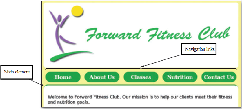
 Which of the following properties and values should be used if the navigation links should appear within the main area of a website?
A)float: left;
B)clear: right;
C)margin-left: 1%;
D)padding: right;
Question
Question
Question
Question
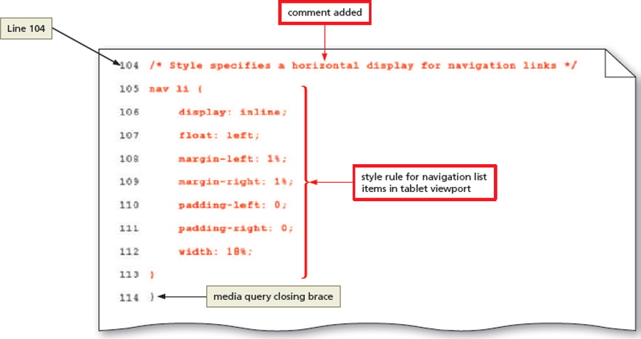
 Which of the following properties, from the figure, improves the appearance of navigation links by placing each list item immediately after the previous list item?
A)display: inline;
B)margin-left: 1%;
C)float: left;
D)padding-left: 0;
Question
Question
Question
Question
Question
Question
Question
Question
 Floating the list items to the _____ within the specified width has the effect of centering the group of navigation buttons on the page.
A)top
B)left
C)bottom
D)right
Question
Question
Question
Question
Question
Question
Question
Question
Question
Question
Question
Question
Question
Question
Question
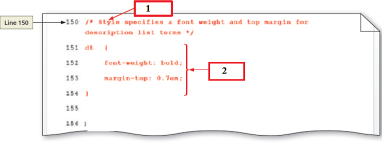
 In the above program, box 2 indicates the style rule for _____.
A)dynamic testing
B)date container
C)unordered list
D)definition list terms
Question
Question
Question
Question
Question
Question
Question
Question
Question
Question
Question
Question
Question
Question
Question
Question
Question
Question
Question
Question
Question
Question
Question
Question
Question
Question
Question
Question
Question
Question
Question
Question
Question
Question
Question
Question
Question
Question
Question
Question
Question
Question
Question
Question
Question
Question
Question
Question
Question

Unlock Deck
Sign up to unlock the cards in this deck!
Unlock Deck
Unlock Deck
1/91
Play
Full screen (f)
Deck 6: Creating a Form on a Web
1
The _____ attribute is used to determine which stylesheet should be applied.
A)class
B)coords
C)media
D)shape
A)class
B)coords
C)media
D)shape
C
2
In the media query @media only screen , the keyword only indicates _____.
A)that older browsers should ignore the media query's style rules
B)that it applies to all types of media when both minimum and maximum features are true
C)the orientation of the device
D)the contents to be removed from the display
A)that older browsers should ignore the media query's style rules
B)that it applies to all types of media when both minimum and maximum features are true
C)the orientation of the device
D)the contents to be removed from the display
A
3
Which of the following describes the width of a screen in pixels?
A)max-device-width
B)min-width
C)max-width
D)orientation
A)max-device-width
B)min-width
C)max-width
D)orientation
A
4
Which of the following properties and values should be used if the navigation links should appear within the main area of a website?A)float: left;
B)clear: right;
C)margin-left: 1%;
D)padding: right;
Unlock Deck
Unlock for access to all 91 flashcards in this deck.
Unlock Deck
k this deck
5
The default style for the navigation list items displays them as _____ with a green background, a design that need not be changed.
A)windows
B)buttons
C)frames
D)textboxes
A)windows
B)buttons
C)frames
D)textboxes
Unlock Deck
Unlock for access to all 91 flashcards in this deck.
Unlock Deck
k this deck
6
Which of the following is the minimum viewport width for large desktop monitors?
A)320px
B)481px
C)768px
D)1280px
A)320px
B)481px
C)768px
D)1280px
Unlock Deck
Unlock for access to all 91 flashcards in this deck.
Unlock Deck
k this deck
7
Which of the following describes the height of a screen in pixels?
A)max-device-height
B)min - height
C)max-height
D)orientation
A)max-device-height
B)min - height
C)max-height
D)orientation
Unlock Deck
Unlock for access to all 91 flashcards in this deck.
Unlock Deck
k this deck
8
Which of the following properties, from the figure, improves the appearance of navigation links by placing each list item immediately after the previous list item?A)display: inline;
B)margin-left: 1%;
C)float: left;
D)padding-left: 0;
Unlock Deck
Unlock for access to all 91 flashcards in this deck.
Unlock Deck
k this deck
9
In the above figure, _____ is added to a tablet viewport so that navigation links appear above the main element rather than within it.
A)clear: right;
B)clear: to p;
C)clear: left;
D)clear: bottom;
A)clear: right;
B)clear: to p;
C)clear: left;
D)clear: bottom;
Unlock Deck
Unlock for access to all 91 flashcards in this deck.
Unlock Deck
k this deck
10
Which of the following describes the width of a viewport in pixels?
A) max-device-width
B)width
C)max-width
D)orientation
A) max-device-width
B)width
C)max-width
D)orientation
Unlock Deck
Unlock for access to all 91 flashcards in this deck.
Unlock Deck
k this deck
11
The logical expressions to media queries in an external Cascading Style Sheet (CSS) file are as follows: @media screen and (min-width: 481px) {
.mobile { display: none; }
}
In this case, _____ is the feature of the screen that is tested.
A)@media screen
B).mobile
C)min-width
D)display
.mobile { display: none; }
}
In this case, _____ is the feature of the screen that is tested.
A)@media screen
B).mobile
C)min-width
D)display
Unlock Deck
Unlock for access to all 91 flashcards in this deck.
Unlock Deck
k this deck
12
Media queries can be embedded in the _____ tag that connects an external style sheet to a Hypertext Markup Language (HTML) file, or they can be inserted in the external style sheet itself.
A)link
B)coords
C)datalist
D)embed
A)link
B)coords
C)datalist
D)embed
Unlock Deck
Unlock for access to all 91 flashcards in this deck.
Unlock Deck
k this deck
13
Identify the minimum viewport width for small smartphones.
A)320px
B)480px
C)768px
D)481px
A)320px
B)480px
C)768px
D)481px
Unlock Deck
Unlock for access to all 91 flashcards in this deck.
Unlock Deck
k this deck
14
Which of the following is true of page design for a tablet viewport?
A)The larger screen provides an opportunity for websites to display more content and use a single-column layout.
B)The appearance of the website should look different from viewport to viewport.
C)The layout and placement of content on a website should be the same in all viewports.
D)A tablet viewport is larger than a mobile viewport but smaller than a desktop viewport.
Unlock Deck
Unlock for access to all 91 flashcards in this deck.
Unlock Deck
k this deck
15
Which of the following describes the height of a viewport in pixels?
A)max-device-height
B)height
C)max-height
D)orientation
A)max-device-height
B)height
C)max-height
D)orientation
Unlock Deck
Unlock for access to all 91 flashcards in this deck.
Unlock Deck
k this deck
16
Floating the list items to the _____ within the specified width has the effect of centering the group of navigation buttons on the page.A)top
B)left
C)bottom
D)right
Unlock Deck
Unlock for access to all 91 flashcards in this deck.
Unlock Deck
k this deck
17
Which of the following layouts is used by the mobile-first approach to prevent horizontal scrolling and minimize vertical scrolling?
A)Single-column layout
B)Two-column layout
C)Single-row layout
D) Two-row layout
A)Single-column layout
B)Two-column layout
C)Single-row layout
D) Two-row layout
Unlock Deck
Unlock for access to all 91 flashcards in this deck.
Unlock Deck
k this deck
18
Identify the maximum viewport width for tablets and larger smartphones.
A)320px
B)481px
C)768px
D)1279px
A)320px
B)481px
C)768px
D)1279px
Unlock Deck
Unlock for access to all 91 flashcards in this deck.
Unlock Deck
k this deck
19
Which of the following is true of tablet viewports?
A)Tablet devices vary by operating system, manufacturer, and screen size.
B)It is easy to design a "one size fits all" layout for a tablet device.
C)One layout to target tablet viewports cannot be created.
D)When responsive web design and media queries are used, multiple tablets must be designed to accommodate the growing tablet market.
Unlock Deck
Unlock for access to all 91 flashcards in this deck.
Unlock Deck
k this deck
20
Media queries can be implemented by coding them directly into a single Cascading Style Sheet (CSS) file using the _____ rule.
A)@import
B)@query
C)@media
D)@display
A)@import
B)@query
C)@media
D)@display
Unlock Deck
Unlock for access to all 91 flashcards in this deck.
Unlock Deck
k this deck
21
The selector _____ identifies the color to apply to a navigation link that has not yet been visited or clicked.
A)nav a:link
B)nav a:active
C)nav a:hover
D)nav a:visited
A)nav a:link
B)nav a:active
C)nav a:hover
D)nav a:visited
Unlock Deck
Unlock for access to all 91 flashcards in this deck.
Unlock Deck
k this deck
22
Which of the following pseudo-classes is used to style a link the moment it is clicked?
A):link
B):active
C):hover
D):visited
A):link
B):active
C):hover
D):visited
Unlock Deck
Unlock for access to all 91 flashcards in this deck.
Unlock Deck
k this deck
23
Which of the following is part of a pseudo-class and is placed between a selector and the pseudo-class?
A);
B)-
C):
D)/
A);
B)-
C):
D)/
Unlock Deck
Unlock for access to all 91 flashcards in this deck.
Unlock Deck
k this deck
24
Which of the following pseudo-classes is used to style a link that is clicked at the moment?
A):link
B):active
C):hover
D):visited
A):link
B):active
C):hover
D):visited
Unlock Deck
Unlock for access to all 91 flashcards in this deck.
Unlock Deck
k this deck
25
Which of the following prefixes is used in linear gradient to provide support for Google Chrome?
A)-o-
B)-gradient-
C)-webkit-
D)-moz-
A)-o-
B)-gradient-
C)-webkit-
D)-moz-
Unlock Deck
Unlock for access to all 91 flashcards in this deck.
Unlock Deck
k this deck
26
Which of the following is the correct order for using pseudo-classes?
A)link, visited, hover, active
B)active, hover, visited, link
C)link, visited, active, hover
D)active, link, visited, hover
A)link, visited, hover, active
B)active, hover, visited, link
C)link, visited, active, hover
D)active, link, visited, hover
Unlock Deck
Unlock for access to all 91 flashcards in this deck.
Unlock Deck
k this deck
27
Identify a pseudo-class used to style an unvisited link.
A):link
B):active
C):hover
D):visited
A):link
B):active
C):hover
D):visited
Unlock Deck
Unlock for access to all 91 flashcards in this deck.
Unlock Deck
k this deck
28
The selector _____ identifies the color to apply to a navigation link while the pointer is moving over the link.
A)nav a:link
B)nav a:active
C)nav a:hover
D)nav a:visited
A)nav a:link
B)nav a:active
C)nav a:hover
D)nav a:visited
Unlock Deck
Unlock for access to all 91 flashcards in this deck.
Unlock Deck
k this deck
29
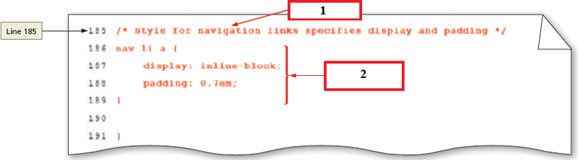
In the above program, box 2 indicates the style rule for _____ in a navigation list.
A)links
B)a container id
C)an unordered list
D)definition list terms
A)links
B)a container id
C)an unordered list
D)definition list terms
Unlock Deck
Unlock for access to all 91 flashcards in this deck.
Unlock Deck
k this deck
30
_____ gradients can transition from several different angles, and they transform from top to bottom, by default.
A)Linear
B)Axial
C)Radial
D)Binary
A)Linear
B)Axial
C)Radial
D)Binary
Unlock Deck
Unlock for access to all 91 flashcards in this deck.
Unlock Deck
k this deck
31
In the above program, box 2 indicates the style rule for _____.A)dynamic testing
B)date container
C)unordered list
D)definition list terms
Unlock Deck
Unlock for access to all 91 flashcards in this deck.
Unlock Deck
k this deck
32
_____ is an effective troubleshooting tool during the development process and adds a valuable level of professionalism to one's work.
A)Abstraction
B)Encapsulation
C)Normalization
D)Validation
A)Abstraction
B)Encapsulation
C)Normalization
D)Validation
Unlock Deck
Unlock for access to all 91 flashcards in this deck.
Unlock Deck
k this deck
33
Identify the purpose of the white-space property with a nowrap value.
A)This property and value keeps the navigation link text together on one line.
B)This property and value wraps the second word, such as Us in About Us, to the next line.
C)This property and value determines the viewport width for tablet and desktop viewports.
D)This property and value maximizes the browser window to display a page in a desktop viewport.
Unlock Deck
Unlock for access to all 91 flashcards in this deck.
Unlock Deck
k this deck
34
A _____ is attached to a selector with a colon to specify a state or relation to the selector to give the web developer more control over that selector.
A)pseudo-class
B)gradient
C)breakpoint
D)media query
A)pseudo-class
B)gradient
C)breakpoint
D)media query
Unlock Deck
Unlock for access to all 91 flashcards in this deck.
Unlock Deck
k this deck
35
The selector _____ identifies the color to apply to a navigation link when the link is being clicked or when it gains focus.
A)nav a:link
B)nav a:active
C)nav a:hover
D)nav a:visited
A)nav a:link
B)nav a:active
C)nav a:hover
D)nav a:visited
Unlock Deck
Unlock for access to all 91 flashcards in this deck.
Unlock Deck
k this deck
36
_____ gradients are specified by their center and a color begins in the center and transitions in a circular direction to other colors.
A)Horizontal
B)Linear
C)Radial
D)Diagonal
A)Horizontal
B)Linear
C)Radial
D)Diagonal
Unlock Deck
Unlock for access to all 91 flashcards in this deck.
Unlock Deck
k this deck
37
A _____ is the point at which different styles are applied to a webpage, usually depending on the viewport.
A)media point
B)checkpoint
C)breakpoint
D)tracepoint
A)media point
B)checkpoint
C)breakpoint
D)tracepoint
Unlock Deck
Unlock for access to all 91 flashcards in this deck.
Unlock Deck
k this deck
38
Identify a pseudo-class used to style a link when the mouse is moving over it.
A):link
B):active
C):hover
D):visited
A):link
B):active
C):hover
D):visited
Unlock Deck
Unlock for access to all 91 flashcards in this deck.
Unlock Deck
k this deck
39
The selector _____ identifies the color to apply to a navigation link that has been clicked.
A)nav a:link
B)nav a:active
C)nav a:hover
D)nav a:visited
A)nav a:link
B)nav a:active
C)nav a:hover
D)nav a:visited
Unlock Deck
Unlock for access to all 91 flashcards in this deck.
Unlock Deck
k this deck
40
One of the new properties introduced with Cascading Style Sheet (CSS) 3 is a _____, which is a gradual transition from one color to another.
A)breakpoint
B)gradient
C)media query
D)viewport
A)breakpoint
B)gradient
C)media query
D)viewport
Unlock Deck
Unlock for access to all 91 flashcards in this deck.
Unlock Deck
k this deck
41
A breakpoint is where different styles are applied to a webpage to cause it to change in a way that makes it easier to read and navigate for a particular situation.
Unlock Deck
Unlock for access to all 91 flashcards in this deck.
Unlock Deck
k this deck
42
The pseudo-class :hover is used to style an unvisited link.
Unlock Deck
Unlock for access to all 91 flashcards in this deck.
Unlock Deck
k this deck
43
The pseudo-class :link is used to style a link that has been clicked.
Unlock Deck
Unlock for access to all 91 flashcards in this deck.
Unlock Deck
k this deck
44
Threshold is the point at which one wants a webpage to change.
Unlock Deck
Unlock for access to all 91 flashcards in this deck.
Unlock Deck
k this deck
45
If a logical expression evaluates to "false," the media query applies the styles that follow.
Unlock Deck
Unlock for access to all 91 flashcards in this deck.
Unlock Deck
k this deck
46
Pseudo-classes are more often used in a desktop viewport because mobile and tablet devices are touch devices and do not have a hover option nor an option to click.
Unlock Deck
Unlock for access to all 91 flashcards in this deck.
Unlock Deck
k this deck
47
Radial gradients can transition from several different angles.
Unlock Deck
Unlock for access to all 91 flashcards in this deck.
Unlock Deck
k this deck
48
Media queries cannot determine the size of a viewport.
Unlock Deck
Unlock for access to all 91 flashcards in this deck.
Unlock Deck
k this deck
49
When designing for a tablet viewport, which of the following in a website should be maintained the same?A)Typography B)General look
C)Color scheme
D)Description lists
C)Color scheme
D)Description lists
Unlock Deck
Unlock for access to all 91 flashcards in this deck.
Unlock Deck
k this deck
50
Which of the following are pseudo-classes?A):active B):hover
C):link
D):construct
C):link
D):construct
Unlock Deck
Unlock for access to all 91 flashcards in this deck.
Unlock Deck
k this deck
51
When testng for minimum and maximum widths, the word "and" separates each part of the media attribute value.
Unlock Deck
Unlock for access to all 91 flashcards in this deck.
Unlock Deck
k this deck
52
Media queries can apply styles to move, hide, or display content on a webpage, change text or colors, or add any other styles to make the page easier to read in a particular situation.
Unlock Deck
Unlock for access to all 91 flashcards in this deck.
Unlock Deck
k this deck
53
The color of links in a website changes due to the use of pseudo-classes in the website's style sheet.
Unlock Deck
Unlock for access to all 91 flashcards in this deck.
Unlock Deck
k this deck
54
To understand the code and syntax of how a media query detects viewport size, a threshold is set.
Unlock Deck
Unlock for access to all 91 flashcards in this deck.
Unlock Deck
k this deck
55
In linear gradients , the color begins in the center and transitions in a radial direction to another color or colors.
Unlock Deck
Unlock for access to all 91 flashcards in this deck.
Unlock Deck
k this deck
56
Linear gradients can also transition up, left, right, or diagonally.
Unlock Deck
Unlock for access to all 91 flashcards in this deck.
Unlock Deck
k this deck
57
The default transition for radial gradients is from the top to the bottom.
Unlock Deck
Unlock for access to all 91 flashcards in this deck.
Unlock Deck
k this deck
58
In a mobile-first strategy, the mobile styles are listed first, because these are the default styles.
Unlock Deck
Unlock for access to all 91 flashcards in this deck.
Unlock Deck
k this deck
59
Identify the prefixes that are used with the linear gradient property to provide support for major browsers.A)-o- B)-chrome-
C)-webkit-
D)-moz-
C)-webkit-
D)-moz-
Unlock Deck
Unlock for access to all 91 flashcards in this deck.
Unlock Deck
k this deck
60
Styles created for smaller viewports apply to larger viewports by default.
Unlock Deck
Unlock for access to all 91 flashcards in this deck.
Unlock Deck
k this deck
61
Pseudo-classes must be used in the following order: active, link, visited, hover.
Unlock Deck
Unlock for access to all 91 flashcards in this deck.
Unlock Deck
k this deck
62
To add style rules that target tablet or desktop viewports in particular, a _________ for each viewport must be created.
Unlock Deck
Unlock for access to all 91 flashcards in this deck.
Unlock Deck
k this deck
63
If a particular tablet device has a viewport smaller than the minimum size specified in a media query, the layout will default to the mobile viewport layout.
Unlock Deck
Unlock for access to all 91 flashcards in this deck.
Unlock Deck
k this deck
64
Linear gradients are specified by their center.
Unlock Deck
Unlock for access to all 91 flashcards in this deck.
Unlock Deck
k this deck
65
The _________ attribute is used to determine which stylesheet should be applied.
Unlock Deck
Unlock for access to all 91 flashcards in this deck.
Unlock Deck
k this deck
66
A(n) _________ detects the media type and the capabilities of the device that the browser is running on.
Unlock Deck
Unlock for access to all 91 flashcards in this deck.
Unlock Deck
k this deck
67
A logical expression includes the name of a _________, a characteristic of the environment, and a breakpoint value to be tested.
Unlock Deck
Unlock for access to all 91 flashcards in this deck.
Unlock Deck
k this deck
68
When designing for a tablet viewport, layout and placement of content should remain the same from viewport to viewport.
Unlock Deck
Unlock for access to all 91 flashcards in this deck.
Unlock Deck
k this deck
69
To create a radial gradient, at least two colors must be specified.
Unlock Deck
Unlock for access to all 91 flashcards in this deck.
Unlock Deck
k this deck
70
To determine the ideal layout for a website's tablet viewport, one must first review the mobile site to determine where content should be added and whether any content should be hidden.
Unlock Deck
Unlock for access to all 91 flashcards in this deck.
Unlock Deck
k this deck
71
To understand the code and syntax of how a media query detects viewport size, a(n) _________ is set.
Unlock Deck
Unlock for access to all 91 flashcards in this deck.
Unlock Deck
k this deck
72
If a logical expression evaluates to "true," a _________ applies the styles that follow.
Unlock Deck
Unlock for access to all 91 flashcards in this deck.
Unlock Deck
k this deck
73
A tablet viewport is larger than a mobile viewport but smaller than a desktop viewport.
Unlock Deck
Unlock for access to all 91 flashcards in this deck.
Unlock Deck
k this deck
74
To modify the appearance of an element for a larger viewport, a media query for the larger viewport and then a new style must be created.
Unlock Deck
Unlock for access to all 91 flashcards in this deck.
Unlock Deck
k this deck
75
Since desktop screens are often wider than those for other devices, designing for a desktop viewport can only use single-column layout.
Unlock Deck
Unlock for access to all 91 flashcards in this deck.
Unlock Deck
k this deck
76
If a particular tablet device has a viewport smaller than the minimum size specified in the media query, the layout will default to the desktop viewport layout.
Unlock Deck
Unlock for access to all 91 flashcards in this deck.
Unlock Deck
k this deck
77
The only thing that should change while designing a tablet viewport is the appearance of the website.
Unlock Deck
Unlock for access to all 91 flashcards in this deck.
Unlock Deck
k this deck
78
A webpage's files should run through W3C's validator to check the document for errors.
Unlock Deck
Unlock for access to all 91 flashcards in this deck.
Unlock Deck
k this deck
79
_________ allow the application of different Cascading Style Sheet (CSS) styles in response to the environment, such as the media on which a webpage is being viewed (screen or print) or the size of the viewport.
Unlock Deck
Unlock for access to all 91 flashcards in this deck.
Unlock Deck
k this deck
80
Multiple colors can be used within a radial gradient.
Unlock Deck
Unlock for access to all 91 flashcards in this deck.
Unlock Deck
k this deck
Unlock Deck
Unlock for access to all 91 flashcards in this deck.


