Deck 16: Inserting and Formatting Charts
Full screen (f)
Question
Question
Question
Question
Question
Question
Question
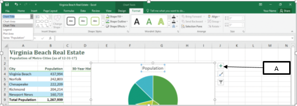
In the accompanying image of Microsoft Excel 2016, box "A" points to the _____.
A)data form
B)data bar
C)data series
D)data pane
A)data form
B)data bar
C)data series
D)data pane
Question
Question
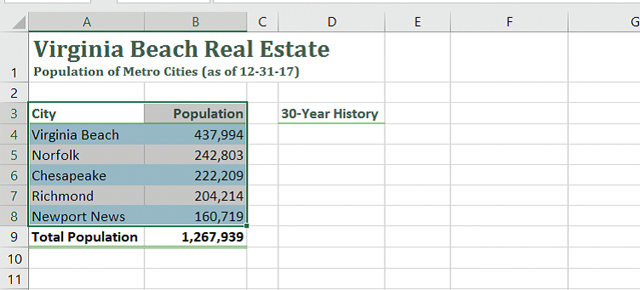
In the accompanying image of Microsoft Excel 2016, the selected range of cells represents a _____.

A)data frame
B)data bar
C)data source
D)data pane
A)data frame
B)data bar
C)data source
D)data pane
Question
Question
Question
Question
Question
Question
Question
Question
Question
Question
Question
Question
Question
Question
Question
In the accompanying image of Microsoft Excel 2016, box "A" points to the _____.
A)sizing handle
B)crop handle
C)fill handle
D)margin handle
A)sizing handle
B)crop handle
C)fill handle
D)margin handle
Question
Question
Question
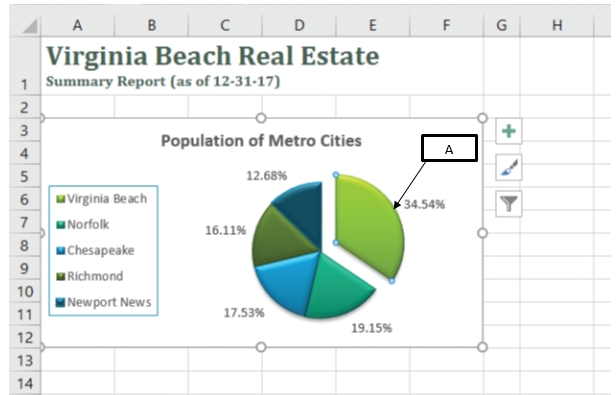
In the accompanying image of Microsoft Excel 2016, box "A" points to the _____.
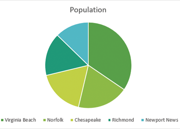
A)series
B)legend
C)title
D)range
A)series
B)legend
C)title
D)range
Question
Question
Question
Question
Question
Question
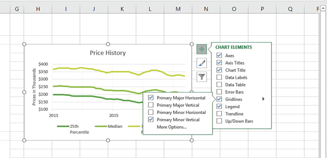
In the accompanying image of Microsoft Excel 2016, box "A" points to the _____.
A)Chart Layout button
B)Chart Format button
C)Chart Elements button
D)Chart Styles button
A)Chart Layout button
B)Chart Format button
C)Chart Elements button
D)Chart Styles button
Question
Question
Question
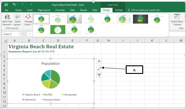
In the accompanying image of Microsoft Excel 2016, box "A" points to the _____.
A)Chart Styles button
B)Chart Elements button
C)Chart Filter button
D)Chart Design Button
A)Chart Styles button
B)Chart Elements button
C)Chart Filter button
D)Chart Design Button
Question
Question
Question
Question
Question
Question
Question
Question
Question
In the accompanying image of Microsoft Excel 2016, box "A" points to _____.
A)finish lines
B)leader lines
C)sparklines
D)gridlines
A)finish lines
B)leader lines
C)sparklines
D)gridlines
Question
Question
Question
Question
Question
Question
Question
Question
Question
Question
Question
Question
Question
In the accompanying image of Microsoft Excel 2016, box "A" points to a(n) _____.
A)exploded pie
B)embedded pie
C)75 degree pie
D)270 degree pie
A)exploded pie
B)embedded pie
C)75 degree pie
D)270 degree pie
Question
Question
Question
Question
Question
Question
Question
Question
Question
Question
Question
Question
Question
Question
Question
Question

Unlock Deck
Sign up to unlock the cards in this deck!
Unlock Deck
Unlock Deck
1/74
Play
Full screen (f)
Deck 16: Inserting and Formatting Charts
1
You can explode only one pie slice in a pie chart.
False
2
When data bars are used with negative values, the data bars originate from the bottom of a cell with negative bars extending to the right and positive bars extending to the left.
False
3
Which of the following describes a line chart?
A)It c ompares values from different categories.
B)It displays all the levels of a hierarchy.
C)It is used within a pie chart .
D)It combines two or more data types to make the data easy to visualize.
A)It c ompares values from different categories.
B)It displays all the levels of a hierarchy.
C)It is used within a pie chart .
D)It combines two or more data types to make the data easy to visualize.
A
4
Changing a value in a data source after creating a chart does not reflect on the existing chart.
Unlock Deck
Unlock for access to all 74 flashcards in this deck.
Unlock Deck
k this deck
5
You can change the appearance of the lines and data markers in a line chart using the Marker Options in the Format Data Series pane.
Unlock Deck
Unlock for access to all 74 flashcards in this deck.
Unlock Deck
k this deck
6
In Microsoft Excel 2016, charts are used to:
A)represent data in rows and columns.
B)illustrate numbers.
C)emphasize geographical features in maps.
D)change a page's orientation.
A)represent data in rows and columns.
B)illustrate numbers.
C)emphasize geographical features in maps.
D)change a page's orientation.
Unlock Deck
Unlock for access to all 74 flashcards in this deck.
Unlock Deck
k this deck
7
In the accompanying image of Microsoft Excel 2016, box "A" points to the _____.
A)data form
B)data bar
C)data series
D)data pane
A)data form
B)data bar
C)data series
D)data pane
Unlock Deck
Unlock for access to all 74 flashcards in this deck.
Unlock Deck
k this deck
8
The chart styles are located in the Chart Layouts group, which is available on the Chart Tools Format tab.
Unlock Deck
Unlock for access to all 74 flashcards in this deck.
Unlock Deck
k this deck
9
In the accompanying image of Microsoft Excel 2016, the selected range of cells represents a _____.
A)data frame
B)data bar
C)data source
D)data pane
A)data frame
B)data bar
C)data source
D)data pane
Unlock Deck
Unlock for access to all 74 flashcards in this deck.
Unlock Deck
k this deck
10
Column charts are used only when there is one data series.
Unlock Deck
Unlock for access to all 74 flashcards in this deck.
Unlock Deck
k this deck
11
Sparklines can be inserted anywhere within the workbook and can represent data from several rows or columns.
Unlock Deck
Unlock for access to all 74 flashcards in this deck.
Unlock Deck
k this deck
12
Which of the following is a true statement about charts in Excel?
A)You can enter legends only within the top portion of the chart area.
B)You can insert animations to a chart.
C)You can create custom chart types based on the built-in charts.
D)You can choose only from two types of charts-pie and bar chart.
A)You can enter legends only within the top portion of the chart area.
B)You can insert animations to a chart.
C)You can create custom chart types based on the built-in charts.
D)You can choose only from two types of charts-pie and bar chart.
Unlock Deck
Unlock for access to all 74 flashcards in this deck.
Unlock Deck
k this deck
13
In a pie chart, each pie slice always represents _____.
A)the entire data source
B)one data series value
C)one-fourth of a data series value
D)20% of the sum of the data series values
A)the entire data source
B)one data series value
C)one-fourth of a data series value
D)20% of the sum of the data series values
Unlock Deck
Unlock for access to all 74 flashcards in this deck.
Unlock Deck
k this deck
14
Which of the following describes a pie chart?
A) It compares relative values of different categories to the whole.
B)It indicates values by the height of columns.
C)It displays the high, low, opening, and closing prices of stocks.
D)It represents a data source within a single cell.
A) It compares relative values of different categories to the whole.
B)It indicates values by the height of columns.
C)It displays the high, low, opening, and closing prices of stocks.
D)It represents a data source within a single cell.
Unlock Deck
Unlock for access to all 74 flashcards in this deck.
Unlock Deck
k this deck
15
A combination chart can combine only two chart types in a single graph.
Unlock Deck
Unlock for access to all 74 flashcards in this deck.
Unlock Deck
k this deck
16
A bar chart is a column chart turned on its side so that the length of each bar is based on its value.
Unlock Deck
Unlock for access to all 74 flashcards in this deck.
Unlock Deck
k this deck
17
The horizontal axis is the axis along the side of the chart that shows the range of values from all of the data series plotted on the chart.
Unlock Deck
Unlock for access to all 74 flashcards in this deck.
Unlock Deck
k this deck
18
Pie charts are typically used when the data consists of values drawn from categories that follow a sequential order at evenly spaced intervals.
Unlock Deck
Unlock for access to all 74 flashcards in this deck.
Unlock Deck
k this deck
19
Sparklines cannot be used for column charts.
Unlock Deck
Unlock for access to all 74 flashcards in this deck.
Unlock Deck
k this deck
20
Gridlines appear by default on line charts and column charts.
Unlock Deck
Unlock for access to all 74 flashcards in this deck.
Unlock Deck
k this deck
21
Which of the following is an advantage of overlaying chart elements?
A)It makes more space for the plot area.
B)It fixes the chart elements to a particular position.
C)It automatically adds text to the chart elements.
D)It explodes the plot area or a pie.
A)It makes more space for the plot area.
B)It fixes the chart elements to a particular position.
C)It automatically adds text to the chart elements.
D)It explodes the plot area or a pie.
Unlock Deck
Unlock for access to all 74 flashcards in this deck.
Unlock Deck
k this deck
22
Lena, a professor, creates a bar graph displaying the performance of her students. She needs to choose a bar graph template with chart elements appropriately placed to suit her requirement. In this scenario, which of the following options should Lena use?
A)Chart Styles
B)Quick Layout
C)Sparklines
D)Chart Elements
A)Chart Styles
B)Quick Layout
C)Sparklines
D)Chart Elements
Unlock Deck
Unlock for access to all 74 flashcards in this deck.
Unlock Deck
k this deck
23
Identify a true statement about data source of pie charts.
A)It should include the chart color.
B)It should range from positive values to negative values.
C)It should not include the row or column totals.
D)It should not include category values.
A)It should include the chart color.
B)It should range from positive values to negative values.
C)It should not include the row or column totals.
D)It should not include category values.
Unlock Deck
Unlock for access to all 74 flashcards in this deck.
Unlock Deck
k this deck
24
In the accompanying image of Microsoft Excel 2016, box "A" points to the _____.
A)sizing handle
B)crop handle
C)fill handle
D)margin handle
A)sizing handle
B)crop handle
C)fill handle
D)margin handle
Unlock Deck
Unlock for access to all 74 flashcards in this deck.
Unlock Deck
k this deck
25
Which of the following is an accurate statement about overlaying chart elements?
A)An overlaid chart element cannot be formatted.
B)It allows you to drag a chart element to a new location.
C)It does not alter the space for a chart's plot area.
D)An overlaid pie never overlaps the contents of a chart.
A)An overlaid chart element cannot be formatted.
B)It allows you to drag a chart element to a new location.
C)It does not alter the space for a chart's plot area.
D)An overlaid pie never overlaps the contents of a chart.
Unlock Deck
Unlock for access to all 74 flashcards in this deck.
Unlock Deck
k this deck
26
Eugene, a financial analyst, collects data on the gross income of people working in different industries. She presents this data in a bar graph. However, she later feels that a line graph will be more appropriate for representing the data. In this scenario, Eugene should click the _____ in the Excel sheet to change the graph type.
A)Chart Tools Design tab
B)Chart Tools Format tab
C)Chart Tools Review tab
D)Chart Tools Data tab
A)Chart Tools Design tab
B)Chart Tools Format tab
C)Chart Tools Review tab
D)Chart Tools Data tab
Unlock Deck
Unlock for access to all 74 flashcards in this deck.
Unlock Deck
k this deck
27
In the accompanying image of Microsoft Excel 2016, box "A" points to the _____.
A)series
B)legend
C)title
D)range
A)series
B)legend
C)title
D)range
Unlock Deck
Unlock for access to all 74 flashcards in this deck.
Unlock Deck
k this deck
28
Celina, a Human Resource (HR) manager, creates a graph on an Excel sheet representing the attrition rate in the past five years in her company. She presents the graph such that the graph area occupies the entire worksheet without any worksheet cells. In this case, Celina presents a _____.
A)spreadsheet
B)sparkline
C)chart sheet
D)pivot table
A)spreadsheet
B)sparkline
C)chart sheet
D)pivot table
Unlock Deck
Unlock for access to all 74 flashcards in this deck.
Unlock Deck
k this deck
29
Which of the following is true of a plot area in the chart?
A)It contains a legend that identifies data markers associated with a data series.
B)It decreases its size to make room for the chart title when the chart area is small.
C)It is the area that contains the chart and all of the other chart elements.
D)It incorporates a descriptive label for the chart.
Unlock Deck
Unlock for access to all 74 flashcards in this deck.
Unlock Deck
k this deck
30
Which of the following is a function of chart layouts?
A)They provide blank chart sheets that enable a user to create a chart layout.
B)They provide options to change the color and effects of each chart element.
C)They specify which chart elements are displayed and how they are formatted.
D)They identify the data source that needs to be converted to a chart.
Unlock Deck
Unlock for access to all 74 flashcards in this deck.
Unlock Deck
k this deck
31
Zelda, a mechanical engineer, creates a line graph to illustrate the productivity and quality improvement in her company. She intends to add a glowing effect to the line in the graph. In this scenario, Zelda should:
A)left-click on the line to open a pane with format options specific to the line.
B)double-click on the line to open a pane with format options specific to the line.
C)click on the chart followed by the Chart Filters button to change the format of the line.
D)click on the chart followed by the Chart Elements button to change the format of the line.
Unlock Deck
Unlock for access to all 74 flashcards in this deck.
Unlock Deck
k this deck
32
When does the Chart Tools tab appear?
A)When you click the Insert tab
B)When you create a graph
C)When you select a data source
D)When you enter a data series
A)When you click the Insert tab
B)When you create a graph
C)When you select a data source
D)When you enter a data series
Unlock Deck
Unlock for access to all 74 flashcards in this deck.
Unlock Deck
k this deck
33
In the accompanying image of Microsoft Excel 2016, box "A" points to the _____.
A)Chart Layout button
B)Chart Format button
C)Chart Elements button
D)Chart Styles button
A)Chart Layout button
B)Chart Format button
C)Chart Elements button
D)Chart Styles button
Unlock Deck
Unlock for access to all 74 flashcards in this deck.
Unlock Deck
k this deck
34
Which of the following is a method to move a chart from one worksheet to another in a Microsoft Excel workbook?
A)Cutting and pasting a chart to a new location in the workbook
B)Using the Export Chart option in the File tab
C)Selecting the Quick Layout button on the Chart Tools Design tab
D)Dragging and dropping the chart into a new worksheet
A)Cutting and pasting a chart to a new location in the workbook
B)Using the Export Chart option in the File tab
C)Selecting the Quick Layout button on the Chart Tools Design tab
D)Dragging and dropping the chart into a new worksheet
Unlock Deck
Unlock for access to all 74 flashcards in this deck.
Unlock Deck
k this deck
35
Sarah, a microbiologist, collects data on the types of bacteria and the amount of each type of bacteria found in the soil. She creates a 3-D pie chart to represent this data. However, she realizes that the 3-D pie chart lacks clarity and intends to change it to a 2-D pie chart. In this scenario, which of the following options should Sarah use to modify the appearance of the chart?
A)Chart Styles gallery
B)Chart Layouts group
C)Chart Formats pane
D)Chart Filters button
A)Chart Styles gallery
B)Chart Layouts group
C)Chart Formats pane
D)Chart Filters button
Unlock Deck
Unlock for access to all 74 flashcards in this deck.
Unlock Deck
k this deck
36
In the accompanying image of Microsoft Excel 2016, box "A" points to the _____.
A)Chart Styles button
B)Chart Elements button
C)Chart Filter button
D)Chart Design Button
A)Chart Styles button
B)Chart Elements button
C)Chart Filter button
D)Chart Design Button
Unlock Deck
Unlock for access to all 74 flashcards in this deck.
Unlock Deck
k this deck
37
Karlo, an environmentalist, collects data on the endangered species and their declining numbers. He presents this data in the form of a bar graph on an Excel sheet. Since this graph needs to be presented to a large audience, Karlo decides to enhance the graph by changing the colors of the bars. In this scenario, Karlo should click the _____ in the Excel sheet.
A)Chart Tools Theme tab
B)Chart Tools Format tab
C)Chart Tools Review tab
D)Chart Tools Data tab
A)Chart Tools Theme tab
B)Chart Tools Format tab
C)Chart Tools Review tab
D)Chart Tools Data tab
Unlock Deck
Unlock for access to all 74 flashcards in this deck.
Unlock Deck
k this deck
38
Which of the following is a disadvantage of an embedded chart?
A)It cannot be repositioned from one worksheet to another.
B)It cannot be resized or formatted once embedded.
C)It might cover worksheet cells that hide data and formulas.
D)It might restrict renaming some chart elements.
A)It cannot be repositioned from one worksheet to another.
B)It cannot be resized or formatted once embedded.
C)It might cover worksheet cells that hide data and formulas.
D)It might restrict renaming some chart elements.
Unlock Deck
Unlock for access to all 74 flashcards in this deck.
Unlock Deck
k this deck
39
You can add or remove a chart title using the _____.
A)Chart Filters button
B)Quick Layout button
C)Chart Elements button
D)Chart Styles button
A)Chart Filters button
B)Quick Layout button
C)Chart Elements button
D)Chart Styles button
Unlock Deck
Unlock for access to all 74 flashcards in this deck.
Unlock Deck
k this deck
40
Bernard, the Chief Executive Officer (CEO) of Where We Go Travels, intends to create a graph representing the growth of his company. After creating the graph, Bernard decides to change the descriptive label of a chart. In this scenario, which of the following chart elements does Bernard want to change?
A)Chart dialog box
B)Chart filter
C)Chart legend
D)Chart title
A)Chart dialog box
B)Chart filter
C)Chart legend
D)Chart title
Unlock Deck
Unlock for access to all 74 flashcards in this deck.
Unlock Deck
k this deck
41
In Microsoft Excel Charts, a _________ is the range that contains the data to display in a chart.
A)data type
B)chart area
C)chart element
D)data source
A)data type
B)chart area
C)chart element
D)data source
Unlock Deck
Unlock for access to all 74 flashcards in this deck.
Unlock Deck
k this deck
42
Column and bar charts differ from pie charts in that bar charts:
A)apply to a wider range of data.
B)always represent population data.
C)select only one data series.
D)are constituted relative to the whole.
A)apply to a wider range of data.
B)always represent population data.
C)select only one data series.
D)are constituted relative to the whole.
Unlock Deck
Unlock for access to all 74 flashcards in this deck.
Unlock Deck
k this deck
43
Which of the following is a difference between column charts and pie charts?
A)Unlike pie charts, column charts can represent a narrower range of data.
B)Unlike pie charts, column charts can represent more than one data series.
C)Unlike pie charts, column charts are represented relative to the whole.
D)Unlike pie charts, column charts always represent population data.
A)Unlike pie charts, column charts can represent a narrower range of data.
B)Unlike pie charts, column charts can represent more than one data series.
C)Unlike pie charts, column charts are represented relative to the whole.
D)Unlike pie charts, column charts always represent population data.
Unlock Deck
Unlock for access to all 74 flashcards in this deck.
Unlock Deck
k this deck
44
Judith, a management student, creates a graph showing the number of start-ups commenced in her country in the year 2015. She uses a pie chart to represent her data. Judith, while reviewing her graph, feels that she should change the colors of the pies since she had used a dark colored background. In this scenario, Judith should click the _____ to change the color of the pies.
A)Chart Elements button
B)Chart Filter button
C) Chart Layout button
D)Chart Styles button
A)Chart Elements button
B)Chart Filter button
C) Chart Layout button
D)Chart Styles button
Unlock Deck
Unlock for access to all 74 flashcards in this deck.
Unlock Deck
k this deck
45
In the accompanying image of Microsoft Excel 2016, box "A" points to _____.
A)finish lines
B)leader lines
C)sparklines
D)gridlines
A)finish lines
B)leader lines
C)sparklines
D)gridlines
Unlock Deck
Unlock for access to all 74 flashcards in this deck.
Unlock Deck
k this deck
46
Case 16-2 Since extensive data in the form of numbers can be difficult to assimilate, such data are better represented as charts. There are several types of charts available in Microsoft Excel. Choosing the right chart type to represent a data source is important to effectively illustrate a data. A chart type should be chosen based on the number of data series, range of data series values, type of data series etc.
Benjamin, a nuclear physicist, needs to represent electron decay at five time intervals for ten different elements. Benjamin thus has five data series for ten category values. In this scenario, Benjamin can use a _____ to represent the data.
A)surface chart
B)line chart
C)radar chart
D)pie chart
Benjamin, a nuclear physicist, needs to represent electron decay at five time intervals for ten different elements. Benjamin thus has five data series for ten category values. In this scenario, Benjamin can use a _____ to represent the data.
A)surface chart
B)line chart
C)radar chart
D)pie chart
Unlock Deck
Unlock for access to all 74 flashcards in this deck.
Unlock Deck
k this deck
47
Case 16-2 Since extensive data in the form of numbers can be difficult to assimilate, such data are better represented as charts. There are several types of charts available in Microsoft Excel. Choosing the right chart type to represent a data source is important to effectively illustrate a data. A chart type should be chosen based on the number of data series, range of data series values, type of data series etc.
Natalia, a weather reporter, wants to plot a graph using the rainfall data in the past 20 years in a particular state. She intends to present the graph in a single cell to identify the maximum and minimum rainfall. In this scenario, Natalia should use a _____ to represent her data.
A)surface chart
B)sparkline chart
C)radar chart
D)pie chart
Unlock Deck
Unlock for access to all 74 flashcards in this deck.
Unlock Deck
k this deck
48
In Microsoft Excel charts, which of the following is a function of leader lines?
A)They help to display an entire chart within a single cell.
B)They extend the values of the major or minor units across the plot area of a chart.
C)They connect each data label to its corresponding data marker.
D)They provide gridlines to an Excel user to convert a 2-D chart to a 3-D chart.
A)They help to display an entire chart within a single cell.
B)They extend the values of the major or minor units across the plot area of a chart.
C)They connect each data label to its corresponding data marker.
D)They provide gridlines to an Excel user to convert a 2-D chart to a 3-D chart.
Unlock Deck
Unlock for access to all 74 flashcards in this deck.
Unlock Deck
k this deck
49
Han, a realtor, wants to create a chart representing the price variation of land in three different states across the period 2011-2015. For this, she has to present three data series in a single chart. In this scenario, which of the following types of charts would be most suitable for Han's purpose?
A)Pie chart
B)Bar chart
C)Radar chart
D)Venn chart
A)Pie chart
B)Bar chart
C)Radar chart
D)Venn chart
Unlock Deck
Unlock for access to all 74 flashcards in this deck.
Unlock Deck
k this deck
50
Case 16-1 George, an environmental scientist, collects information on the types and amount of gases emitted by a cheese processing factory.
George decides to present the data on an Excel sheet in the form of bars against X and Y axes. In this scenario, George presents the data in the form of a _____.
A) grid
B)pivot table
C)database
D)chart
George decides to present the data on an Excel sheet in the form of bars against X and Y axes. In this scenario, George presents the data in the form of a _____.
A) grid
B)pivot table
C)database
D)chart
Unlock Deck
Unlock for access to all 74 flashcards in this deck.
Unlock Deck
k this deck
51
Wayne, a senior software engineer, creates a chart using Microsoft Excel that represents the number of projects and types of projects undertaken by a team in the past five years. The chart presents the chart legend below the chart by default. Wayne wants to change the position of the chart legend to the left of the chart. In this scenario, Wayne should click the _____ to change the position of the legend.
A)Chart Styles button
B)Chart Elements button
C)Chart Filter button
D)Chart Design button
A)Chart Styles button
B)Chart Elements button
C)Chart Filter button
D)Chart Design button
Unlock Deck
Unlock for access to all 74 flashcards in this deck.
Unlock Deck
k this deck
52
In Microsoft Excel, which of the following is true of a chart legend?
A)It is not applicable for column chart and line chart.
B)It cannot be edited or formatted once overlaid.
C)It uses a default black color to identify each data category.
D)It identifies each data series in a chart.
A)It is not applicable for column chart and line chart.
B)It cannot be edited or formatted once overlaid.
C)It uses a default black color to identify each data category.
D)It identifies each data series in a chart.
Unlock Deck
Unlock for access to all 74 flashcards in this deck.
Unlock Deck
k this deck
53
Which of the following is a true statement about chart elements in Microsoft Excel?
A)Excel uses the data series values as the default legend.
B)An overlaid chart title cannot be edited or formatted.
C)Excel allows you to edit or replace the default chart title.
D)Chart elements cannot be placed on top of a chart.
A)Excel uses the data series values as the default legend.
B)An overlaid chart title cannot be edited or formatted.
C)Excel allows you to edit or replace the default chart title.
D)Chart elements cannot be placed on top of a chart.
Unlock Deck
Unlock for access to all 74 flashcards in this deck.
Unlock Deck
k this deck
54
Volya, a Human Resource manager, creates a pie chart in Excel representing the productivity of each team in her company in the last quarter. The team that achieved maximum productivity should standout from the rest of the teams. In this case, Volya should _____ to emphasize the team that has achieved maximum productivity.
A)embed the chart
B)explode the pie
C)use different colors for each pie
D)add legend for each pie
A)embed the chart
B)explode the pie
C)use different colors for each pie
D)add legend for each pie
Unlock Deck
Unlock for access to all 74 flashcards in this deck.
Unlock Deck
k this deck
55
Priya, a financial analyst, intends to graphically represent the household income of people in five cities over the past 10 years. The data that she presents in a chart is not relative to the whole household income. In this case, which of the following types of charts is most suited for Priya to illustrate the data series in a chart?
A)Pie chart
B)Radar chart
C)Column chart
D)Linear chart
A)Pie chart
B)Radar chart
C)Column chart
D)Linear chart
Unlock Deck
Unlock for access to all 74 flashcards in this deck.
Unlock Deck
k this deck
56
Michael, the Chief Executive Officer (CEO) of a company, needs to create a graph representing the company's quarterly revenue between the years 2005 and 2015. The data Michael has follows a sequential order which he intends to represent in evenly spaced intervals. In this scenario, which of the following types of graph will be most appropriate for Michael to use?
A)Pie chart
B)Line chart
C)Radar chart
D)Venn chart
A)Pie chart
B)Line chart
C)Radar chart
D)Venn chart
Unlock Deck
Unlock for access to all 74 flashcards in this deck.
Unlock Deck
k this deck
57
In Microsoft Excel Charts, a _________ is a set of values that represent data for one item in a chart.
A)category
B)cluster
C)quotient
D)legend
A)category
B)cluster
C)quotient
D)legend
Unlock Deck
Unlock for access to all 74 flashcards in this deck.
Unlock Deck
k this deck
58
In the accompanying image of Microsoft Excel 2016, box "A" points to a(n) _____.
A)exploded pie
B)embedded pie
C)75 degree pie
D)270 degree pie
A)exploded pie
B)embedded pie
C)75 degree pie
D)270 degree pie
Unlock Deck
Unlock for access to all 74 flashcards in this deck.
Unlock Deck
k this deck
59
Case 16-2 Since extensive data in the form of numbers can be difficult to assimilate, such data are better represented as charts. There are several types of charts available in Microsoft Excel. Choosing the right chart type to represent a data source is important to effectively illustrate data. A chart type should be chosen based on the number of data series, range of data series values, type of data series etc.
John, a senior scientist, is involved in a population study. He needs to create a graph based on the data he has collected for the population study. John's data source consists of a single data series whose values should be represented as relative to the whole. In this scenario, John should use a _____ to illustrate his data.
A)radar chart
B)surface chart
C)pie chart
D)Venn chart
Unlock Deck
Unlock for access to all 74 flashcards in this deck.
Unlock Deck
k this deck
60
Case 16-1 George, an environmental scientist, collects information on the types and amount of gases emitted by a cheese processing factory.
George enters the types of gases and the amount of gases emitted in two columns of an Excel sheet. Based on this data he creates a pie chart. In this case, the information typed out by George in the two columns of an Excel sheet is known as a _____.
A)data bar
B)data source
C)chart element
D)chart area
Unlock Deck
Unlock for access to all 74 flashcards in this deck.
Unlock Deck
k this deck
61
What is a sparkline? Explain how a sparkline can be inserted and its use.
Unlock Deck
Unlock for access to all 74 flashcards in this deck.
Unlock Deck
k this deck
62
A(n) _________ is a fusion of two or more chart types in a single graph, such as a column chart and a line chart.
A)treemap chart
B)area chart
C)combo chart
D)sunburst chart
A)treemap chart
B)area chart
C)combo chart
D)sunburst chart
Unlock Deck
Unlock for access to all 74 flashcards in this deck.
Unlock Deck
k this deck
63
A _________ is the type of chart on Microsoft Excel that does not include chart elements such as legends, titles, gridlines, or axes.
A)sparkline
B)gridline
C)timeline
D)streamline
A)sparkline
B)gridline
C)timeline
D)streamline
Unlock Deck
Unlock for access to all 74 flashcards in this deck.
Unlock Deck
k this deck
64
In a Microsoft Excel worksheet, a(n) _________ is a chart that is an object in a worksheet.
A)place value chart
B)embedded chart
C)album chart
D)size chart
A)place value chart
B)embedded chart
C)album chart
D)size chart
Unlock Deck
Unlock for access to all 74 flashcards in this deck.
Unlock Deck
k this deck
65
What is a data bar? Describe its features.
Unlock Deck
Unlock for access to all 74 flashcards in this deck.
Unlock Deck
k this deck
66
The _________ shows the patterns or relationship between two or more sets of values.
A)Box & Whisker Chart
B)Sunburst Chart
C)X Y (Scatter) Chart
D)Surface Chart
A)Box & Whisker Chart
B)Sunburst Chart
C)X Y (Scatter) Chart
D)Surface Chart
Unlock Deck
Unlock for access to all 74 flashcards in this deck.
Unlock Deck
k this deck
67
Explain how to edit a chart data and add a data series to an existing chart.
Unlock Deck
Unlock for access to all 74 flashcards in this deck.
Unlock Deck
k this deck
68
The _________ tab provides a gallery of column chart layouts and a gallery of column chart styles and access to the individual chart elements you can include on a column chart.
A)Chart Tools Design
B)Chart Tools Format
C)Chart Tools Data
D)Chart Tools View
A)Chart Tools Design
B)Chart Tools Format
C)Chart Tools Data
D)Chart Tools View
Unlock Deck
Unlock for access to all 74 flashcards in this deck.
Unlock Deck
k this deck
69
In Microsoft Excel Charts, _________ are individual parts of a chart such as the chart area, the chart title, the plot area, data markers, and a legend.
A)chart sectors
B)chart elements
C)chart metrics
D)chart plotters
A)chart sectors
B)chart elements
C)chart metrics
D)chart plotters
Unlock Deck
Unlock for access to all 74 flashcards in this deck.
Unlock Deck
k this deck
70
The _________ button is used to create data bars.
A)What-If Analysis
B)Conditional Formatting
C)Data Validation
D)Forecast Sheet
A)What-If Analysis
B)Conditional Formatting
C)Data Validation
D)Forecast Sheet
Unlock Deck
Unlock for access to all 74 flashcards in this deck.
Unlock Deck
k this deck
71
If you select a chart's sequence, the formula displayed in the formula bar uses the _________ function.
A)SERIES
B)QUARTILE
C)LOOKUP
D)AREAS
A)SERIES
B)QUARTILE
C)LOOKUP
D)AREAS
Unlock Deck
Unlock for access to all 74 flashcards in this deck.
Unlock Deck
k this deck
72
In Microsoft Excel, a(n) _________ is a page in a workbook that contains only a graph and no worksheet cells.
A)optical mark recognition sheet
B)perspex sheet
C)data sheet
D)chart sheet
A)optical mark recognition sheet
B)perspex sheet
C)data sheet
D)chart sheet
Unlock Deck
Unlock for access to all 74 flashcards in this deck.
Unlock Deck
k this deck
73
The _________ button next to the selected chart displays a list of the data series and category values used in the chart .
A)Chart Elements
B)Chart Styles
C)Chart Filters
D)Chart Layouts
A)Chart Elements
B)Chart Styles
C)Chart Filters
D)Chart Layouts
Unlock Deck
Unlock for access to all 74 flashcards in this deck.
Unlock Deck
k this deck
74
A _________ is a horizontal bar that is always placed in the cell containing the value it represents.
A)space bar
B)data bar
C)taskbar
D)toolbar
A)space bar
B)data bar
C)taskbar
D)toolbar
Unlock Deck
Unlock for access to all 74 flashcards in this deck.
Unlock Deck
k this deck
Unlock Deck
Unlock for access to all 74 flashcards in this deck.