The following graph is a 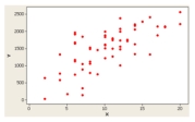
A) Dot plot
B) Stem-and-leaf display
C) Box plot
D) Scatter Plot
Correct Answer:
Verified
Q25: The interquartile range is graphically presented in
Q52: Using the following statistics to describe a
Q53: The following graph is Q54: A contingency table would be used to Q58: What is the possible range of values Q59: The coefficient of skewness is Q60: What chart or graph uses dots to Q62: What is the best way to display Q63: What graph shows the interquartile range? _ Q66: The interquartile range is the distance between![]()
A) Always positive
Unlock this Answer For Free Now!
View this answer and more for free by performing one of the following actions

Scan the QR code to install the App and get 2 free unlocks

Unlock quizzes for free by uploading documents