Figure 7.1 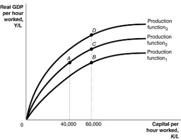 Alt text for Figure 7.1: In figure 7.1, a graph comparing capital per hour worked and real GDP per hour worked.
Long description for Figure 7.1: The x-axis is labelled, capital per hour worked, K/L, with values 40,000 and 60,000 marked.The y-axis is labelled, real GDP per hour worked, Y/L, with 0 at the vertex.3 concave curves, each originating from the vertex are shown.4 points A, B, C, and D are plotted such that point A has 40,000 as the x coordinate, and points B, C, and D have 60,000 as the x coordinate.The 3 curves pass through these points.The curve labelled, Production function 1, passes through point B.The curve labelled, Production function 2, passes through points A and C.The curve labelled, Production function 3, passes through point D.
-Refer to Figure 7.1.Technological change is illustrated in the per-worker production function in the figure above by a movement from
A) A to B.
B) B to C.
C) B to A.
D) D to C.
E) D to A.
Correct Answer:
Verified
Q40: In 2014,South America had a lower average
Q44: Most economic growth in the world occurred
Q45: Figure 7.1 Q47: An economic growth model explains Q50: Which of the following would you expect![]()
A)changes in real
Unlock this Answer For Free Now!
View this answer and more for free by performing one of the following actions

Scan the QR code to install the App and get 2 free unlocks

Unlock quizzes for free by uploading documents