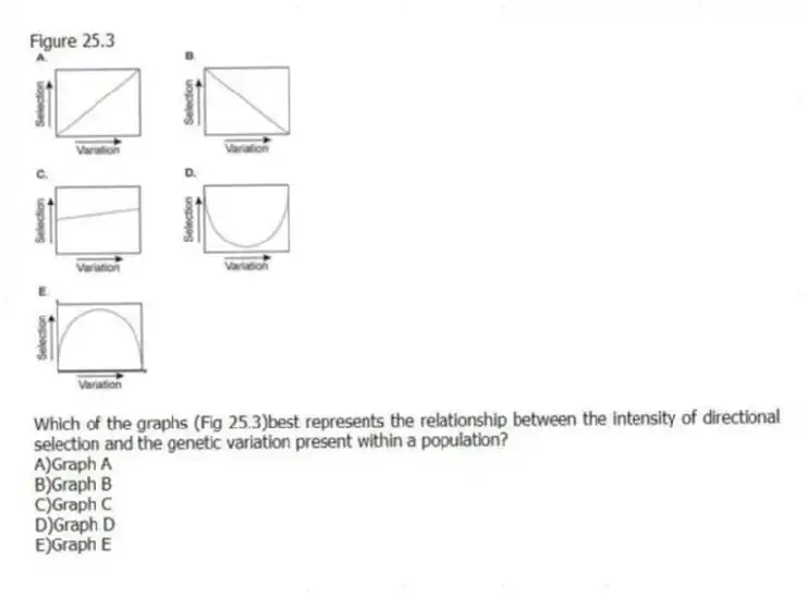
Figure 25.3

-Which of the graphs (Fig 25.3) best represents the relationship between the intensity of directional selection and the genetic variation present within a population?
A) Graph A
B) Graph B
C) Graph C
D) Graph D
E) Graph E
Correct Answer:
Verified
Q1: For a biologist studying a small fish
Q7: For biologists studying a large flatworm population
Q12: Currently the only predators of Galápagos marine
Q13: Figure 25.1.
Use the following information when answering
Q14: Cystic fibrosis is a genetic disorder in
Q17: A biologist doing a long-term study on
Q18: Three-spined stickleback fish (Gasterosteus aculeatus)show substantial heritable
Q19: Use the following information when answering the
Q20: Cystic fibrosis is a genetic disorder in
Q33: In a small population of alpine foxes,
Unlock this Answer For Free Now!
View this answer and more for free by performing one of the following actions

Scan the QR code to install the App and get 2 free unlocks

Unlock quizzes for free by uploading documents