Which graph most likely illustrates the average daily temperature as a function of time (in months) .
Assume the horizontal axis represents time.
A) 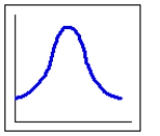
B) 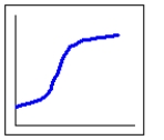
C) 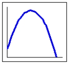
D) 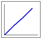
Correct Answer:
Verified
Q121: Estimate (to the nearest integer) the maximum
Q122: Over what interval is the function concave
Q123: Over what interval is the function concave
Q124: Over what interval is the function concave
Q125: Over what interval is the function concave
Q127: Each of these tanks is being filled
Q128: If the tank pictured here is filled
Q129: On what interval is this graph increasing.
Q130: On what interval is this graph decreasing.
Q131: On what interval is this graph increasing.
Unlock this Answer For Free Now!
View this answer and more for free by performing one of the following actions

Scan the QR code to install the App and get 2 free unlocks

Unlock quizzes for free by uploading documents