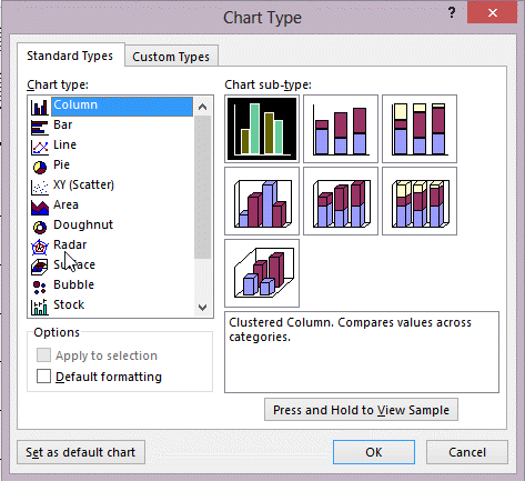
 In the figure above, which chart would you most likely use to show comparisons of values, such as annual sales for a different product for several sales representatives?
A) Column
B) Pie
C) Doughnut
D) Scatter
Correct Answer:
Verified
Q47: Access provides a(n) _ Wizard that steps
Q48: The chart type that shows comparisons of
Q48: Q49: _, also called graphs, are visual representations Q52: The x-axis is also called the _ Q53: This chart area determines the legend on Q57: The chart type that shows parts of Q58: This chart area determines the x-axis on Q59: Which of the following is NOT a Q60: The chart type that shows trends over![]()
Unlock this Answer For Free Now!
View this answer and more for free by performing one of the following actions

Scan the QR code to install the App and get 2 free unlocks

Unlock quizzes for free by uploading documents