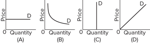
 Refer to the graphs above. A price increase from $20 to $40 causes quantity demanded to decrease from 100 units to 50 units. Which graph best illustrates the demand for this good?
A) graph A
B) graph B
C) graph C
D) graph D
Correct Answer:
Verified
Q155: The price of season tickets to a
Q156: Along a linear downward-sloping demand curve, the
Q157: Q158: Suppose the price elasticity coefficients of demand Q159: You are the only seller of eggs Q161: Gigantic State University raises tuition for the Q162: In which of the following cases will Q163: If a firm's demand for labor is Q164: Q165: Unlock this Answer For Free Now! View this answer and more for free by performing one of the following actions Scan the QR code to install the App and get 2 free unlocks Unlock quizzes for free by uploading documents![]()
![]()
![]()

