The chart below can be best described as 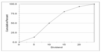
A) Frequency Polygon
B) Cumulative frequency polygon
C) Clustered bar chart
D) Stacked bar chart
E) Histogram
Correct Answer:
Verified
Q46: When a class interval is expressed as:
Q58: How many employees were absent six or
Q59: What is the class interval? _
A) 2
B)
Q60: What is the class interval?
A) 9
B) 10
C)
Q61: The chart below can be best described
Q62: Which is the best (most informative and
Q64: The grades on a statistics exam for
Q66: The Lake Ontario Credit Union selected a
Q67: (i. In constructing a frequency distribution, you
Q68: The grades on a statistics exam for
Unlock this Answer For Free Now!
View this answer and more for free by performing one of the following actions

Scan the QR code to install the App and get 2 free unlocks

Unlock quizzes for free by uploading documents