Use the graph to answer the question. 
-Given the bar graph shown below, the Pareto chart that would best represent the data should have the bars in the following order. 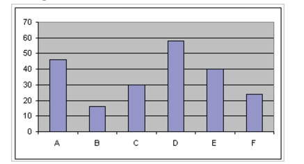
A) D A E C F B
B) B F C E A D
C) C A D E F B
D) B F E D AC
Correct Answer:
Verified
Q6: Use the graph to answer the
Q7: Use the graph to answer the question.
Q8: The pie chart shows the percentage of
Q9: The pie chart shows the percentage of
Q10: Use the graph to answer the
Q12: Retailers are always interested in determining
Q13: Relative frequency is the proportion (or
Q14: The 1995 payroll amounts for all
Q15: Use the graph to answer the
Q16: Use the graph to answer the question.
Unlock this Answer For Free Now!
View this answer and more for free by performing one of the following actions

Scan the QR code to install the App and get 2 free unlocks

Unlock quizzes for free by uploading documents