The bar graph below shows the average cost of renting a studio in one city in each of the years 2002 through 2006. 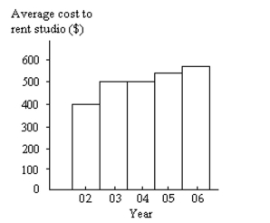 By what percentage does the average price increase from 2002 to 2003? Obtain a truncated version of the graph by sliding a piece of paper over the bottom of the graph so that the bars start at 300. In the truncated graph, by what percentage does the price appear to increase from 2002 to 2003? Why is the truncated graph misleading?
Correct Answer:
Verified
View Answer
Unlock this answer now
Get Access to more Verified Answers free of charge
Q2: Construct the requested histogram.
-The table below
Q3: Use cutpoint grouping to organize these
Q4: Use cutpoint grouping to organize these
Q5: A television manufacturer sold three times as
Q6: Given the following "data scenario," decide which
Q8: Use cutpoint grouping to organize these
Q9: Given the following "data scenario," decide which
Q10: Maria constructed the frequency distribution shown
Q11: When organizing data into tables, what is
Q12: Which type of graph, a stem-and-leaf
Unlock this Answer For Free Now!
View this answer and more for free by performing one of the following actions

Scan the QR code to install the App and get 2 free unlocks

Unlock quizzes for free by uploading documents