Plot and Interpret the Appropriate Scatter Diagram Which Scatter Diagram Describes the Data and the Relationship, If
Plot and interpret the appropriate scatter diagram.
-The table gives the times spent watching TV and the grades of several students. Which scatter diagram describes the data and the relationship, if any?
A) 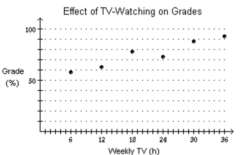
More hours spent watching TV may reduce grades.
B) 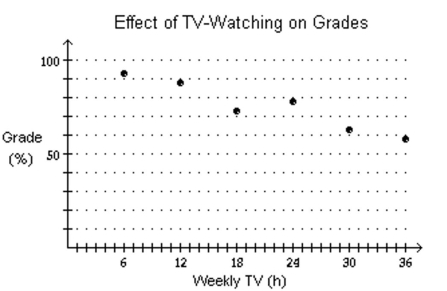
More hours spent watching TV may increase grades.
C) 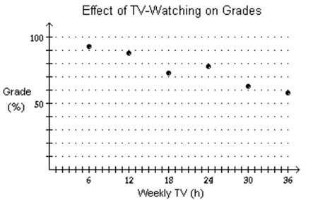
More hours spent watching TV may reduce grades.
D) none of these
Correct Answer:
Verified
Q42: Plot a scatter diagram.
-
Q43: Solve the problem.
-The cost for labor associated
Q44: Solve the problem.
-In a certain city, the
Q45: Plot a scatter diagram.
-
Q46: Solve the problem.
-Let
Q48: Solve the problem.
-Regrind, Inc. regrinds used typewriter
Q49: Solve the problem.
-Let
Q50: Solve the problem.
-If an object is
Q51: Solve the problem.
-Northwest Molded molds plastic handles
Q52: Solve the problem.
-If an object is dropped
Unlock this Answer For Free Now!
View this answer and more for free by performing one of the following actions

Scan the QR code to install the App and get 2 free unlocks

Unlock quizzes for free by uploading documents