Refer to the graphs shown.The market is caviar.Which graph best represents the impact of an increase in consumer incomes on the market for caviar? 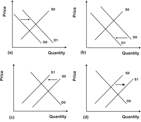
A) a
B) b
C) c
D) d
Correct Answer:
Verified
Q107: Refer to the graphs shown.The market is
Q108: Refer to the graphs shown.The market is
Q112: Refer to the graphs shown.The effect of
Q114: Refer to the graphs shown.The consequences of
Q126: A decrease in the number of consumers
Q134: Honey and jam are substitute products. If
Q135: When workers are paid higher wages, production
Q138: If market supply increases, equilibrium price will:
A)
Q143: When airlines were deregulated, airfares declined by
Q147: How would a decline in demand for
Unlock this Answer For Free Now!
View this answer and more for free by performing one of the following actions

Scan the QR code to install the App and get 2 free unlocks

Unlock quizzes for free by uploading documents