Use the table below to answer the following question.
Table 1A.4.3
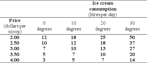
-Refer to Table 1A.4.3.The table shows some data on the quantity of ice cream consumed at different prices and in different weather conditions.To draw a graph of the relationship between the quantity of the ice cream consumed and the price of ice cream,we must
A) decrease the temperature as the price rises.
B) pick the temperature that prevailed when the price was $2.00.
C) increase the temperature as the price rises.
D) hold the temperature constant at any of the four levels shown.
E) hold the price constant at any of the five levels shown.
Correct Answer:
Verified
Q186: Use the figure below to answer the
Q187: Use the figure below to answer the
Q188: The equation of a line is y
Q189: Use the figure below to answer the
Q190: The equation of a line is y
Q192: Use the figure below to answer the
Q193: If the equation of a straight line
Q194: Use the figure below to answer the
Q195: Use the figure below to answer the
Q196: Use the figure below to answer the
Unlock this Answer For Free Now!
View this answer and more for free by performing one of the following actions

Scan the QR code to install the App and get 2 free unlocks

Unlock quizzes for free by uploading documents