Deck 5: Exploring Data With Graphs
ملء الشاشة (f)
سؤال
سؤال
سؤال
سؤال
Inspect the post-test box-whisker plot. Which of the following quartiles has the greatest range of data? 
A) 0-25%
B) 26-50%
C) 51-75%
D) 76-100%
A) 0-25%
B) 26-50%
C) 51-75%
D) 76-100%
سؤال
سؤال
Plot the FEV1 data presented in Q11 as a scatterplot. You should get the scatterplot shown below. Inspecting the scatterplot, what is the r-value for the line of best fit? 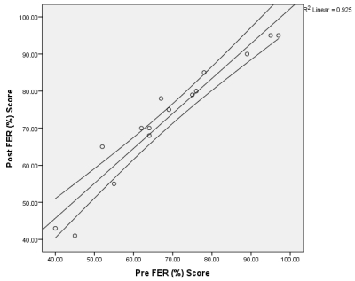
A) .96
B) .94
C) .93
D) .92
A) .96
B) .94
C) .93
D) .92
سؤال
Analyse the following box-whisker plot. What assumptions can be made about participant 3 in the post-test data set? 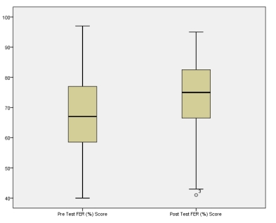
A) This person has the lowest score and can be considered an outlying data point
B) This person has the lowest score and can be considered an extreme outlying data point
C) This person has the lowest score but is not considered an outlying data point
D) This person has the lowest score but is a borderline outlying data point
سؤال
سؤال
سؤال
سؤال
سؤال
سؤال
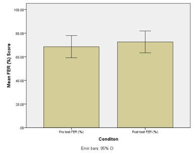
Researchers were interested in finding out how the respiratory parameters in a group of individuals who were diagnosed with asthma responded to a six-week aerobic training intervention. Forced expired ratio (FER, %) is the product of the forced expired ratio in 1 second (FEV1, litres) divided by the forced vital capacity (FVC, litres) and was the parameter the researchers were most interested in. The results are presented below. Enter the data into SPSS and plot a bar chart representing the mean of the pre- and post-test data. Add the 95% confidence intervals for the mean. You should get the bar chart shown below. What does the 95% confidence interval (CI) that you have plotted refer to? 
A) 95% confidence that the mean will fall between these intervals
B) 95% confidence that all data points fall between these intervals
C) 95% confidence that all data points fall outside these intervals
D) 95% confidence that the range falls between these intervals
A) 95% confidence that the mean will fall between these intervals
B) 95% confidence that all data points fall between these intervals
C) 95% confidence that all data points fall outside these intervals
D) 95% confidence that the range falls between these intervals
سؤال
سؤال
سؤال
سؤال
سؤال
سؤال
سؤال
سؤال
The graph presented below represents the post-test FER data, but what is its correct title? 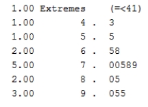
A) Stem-and-leaf plot
B) Histogram
C) Line plot
D) Error bar plot
A) Stem-and-leaf plot
B) Histogram
C) Line plot
D) Error bar plot

فتح الحزمة
قم بالتسجيل لفتح البطاقات في هذه المجموعة!
Unlock Deck
Unlock Deck
1/21
العب
ملء الشاشة (f)
Deck 5: Exploring Data With Graphs
1
If you were to graphically present the learning style data, which might be the most appropriate option?
A) Bar chart
B) Scatterplot
C) Histogram
D) Stem-and-leaf plot
A) Bar chart
B) Scatterplot
C) Histogram
D) Stem-and-leaf plot
A
2
Which axis is the dependent variable usually plotted on?
A) x-axis
B) y-axis
C) z-axis
D) a-axis
A) x-axis
B) y-axis
C) z-axis
D) a-axis
B
3
Normally distributed data are normally referred to as
A) Bell-shaped
B) Asymmetrical
C) Skewed
D) Peaked
A) Bell-shaped
B) Asymmetrical
C) Skewed
D) Peaked
A
4
Inspect the post-test box-whisker plot. Which of the following quartiles has the greatest range of data?
A) 0-25%
B) 26-50%
C) 51-75%
D) 76-100%
A) 0-25%
B) 26-50%
C) 51-75%
D) 76-100%
فتح الحزمة
افتح القفل للوصول البطاقات البالغ عددها 21 في هذه المجموعة.
فتح الحزمة
k this deck
5
Which measure of central tendency is presented in a box-whisker plot?
A) Median
B) Mean
C) Mode
D) Standard error of the mean
A) Median
B) Mean
C) Mode
D) Standard error of the mean
فتح الحزمة
افتح القفل للوصول البطاقات البالغ عددها 21 في هذه المجموعة.
فتح الحزمة
k this deck
6
Plot the FEV1 data presented in Q11 as a scatterplot. You should get the scatterplot shown below. Inspecting the scatterplot, what is the r-value for the line of best fit?
A) .96
B) .94
C) .93
D) .92
A) .96
B) .94
C) .93
D) .92
فتح الحزمة
افتح القفل للوصول البطاقات البالغ عددها 21 في هذه المجموعة.
فتح الحزمة
k this deck
7
Analyse the following box-whisker plot. What assumptions can be made about participant 3 in the post-test data set?
A) This person has the lowest score and can be considered an outlying data point
B) This person has the lowest score and can be considered an extreme outlying data point
C) This person has the lowest score but is not considered an outlying data point
D) This person has the lowest score but is a borderline outlying data point
فتح الحزمة
افتح القفل للوصول البطاقات البالغ عددها 21 في هذه المجموعة.
فتح الحزمة
k this deck
8
Twenty-five percentile points is commonly referred to as a
A) Quartile
B) Interquartile range
C) Quarter
D) Range
A) Quartile
B) Interquartile range
C) Quarter
D) Range
فتح الحزمة
افتح القفل للوصول البطاقات البالغ عددها 21 في هذه المجموعة.
فتح الحزمة
k this deck
9
Calculate the mean and standard deviation of the pre-test FER scores.
A) 68.5 ± 17.0%
B) 65.8 ± 18.1%
C) 70.4 ± 15.0%
D) 66.6 ± 17.8%
A) 68.5 ± 17.0%
B) 65.8 ± 18.1%
C) 70.4 ± 15.0%
D) 66.6 ± 17.8%
فتح الحزمة
افتح القفل للوصول البطاقات البالغ عددها 21 في هذه المجموعة.
فتح الحزمة
k this deck
10
Why is it necessary to present numerical data graphically?
A) To explore the data.
B) To enable you to 'make sense' of the data.
C) To gain a greater insight into the data.
D) All of the above.
A) To explore the data.
B) To enable you to 'make sense' of the data.
C) To gain a greater insight into the data.
D) All of the above.
فتح الحزمة
افتح القفل للوصول البطاقات البالغ عددها 21 في هذه المجموعة.
فتح الحزمة
k this deck
11
Calculate the mean and standard deviation of the post-test FER scores.
A) 72.6 ± 16.6%
B) 69.8 ± 19.7%
C) 70.9 ± 19.4%
D) 66.6 ± 17.3%
A) 72.6 ± 16.6%
B) 69.8 ± 19.7%
C) 70.9 ± 19.4%
D) 66.6 ± 17.3%
فتح الحزمة
افتح القفل للوصول البطاقات البالغ عددها 21 في هذه المجموعة.
فتح الحزمة
k this deck
12
Which axis is the independent variable usually plotted on?
A) x-axis
B) y-axis
C) z-axis
D) a-axis
A) x-axis
B) y-axis
C) z-axis
D) a-axis
فتح الحزمة
افتح القفل للوصول البطاقات البالغ عددها 21 في هذه المجموعة.
فتح الحزمة
k this deck
13
Researchers were interested in finding out how the respiratory parameters in a group of individuals who were diagnosed with asthma responded to a six-week aerobic training intervention. Forced expired ratio (FER, %) is the product of the forced expired ratio in 1 second (FEV1, litres) divided by the forced vital capacity (FVC, litres) and was the parameter the researchers were most interested in. The results are presented below. Enter the data into SPSS and plot a bar chart representing the mean of the pre- and post-test data. Add the 95% confidence intervals for the mean. You should get the bar chart shown below. What does the 95% confidence interval (CI) that you have plotted refer to?
A) 95% confidence that the mean will fall between these intervals
B) 95% confidence that all data points fall between these intervals
C) 95% confidence that all data points fall outside these intervals
D) 95% confidence that the range falls between these intervals
A) 95% confidence that the mean will fall between these intervals
B) 95% confidence that all data points fall between these intervals
C) 95% confidence that all data points fall outside these intervals
D) 95% confidence that the range falls between these intervals
فتح الحزمة
افتح القفل للوصول البطاقات البالغ عددها 21 في هذه المجموعة.
فتح الحزمة
k this deck
14
Which measure of data distribution is presented as the 'box' in a box-whisker plot?
A) Interquartile range
B) Standard deviation
C) Standard rrror of the mean
D) Range
A) Interquartile range
B) Standard deviation
C) Standard rrror of the mean
D) Range
فتح الحزمة
افتح القفل للوصول البطاقات البالغ عددها 21 في هذه المجموعة.
فتح الحزمة
k this deck
15
Which of the following is a type of histogram?
A) Stacked histogram
B) Frequency polygon
C) Population pyramid
D) All of the above
A) Stacked histogram
B) Frequency polygon
C) Population pyramid
D) All of the above
فتح الحزمة
افتح القفل للوصول البطاقات البالغ عددها 21 في هذه المجموعة.
فتح الحزمة
k this deck
16
Which of the following are important components of graphical illustrations?
A) Labelled axes
B) Clarity and conciseness
C) A legend if appropriate
D) All of the above
A) Labelled axes
B) Clarity and conciseness
C) A legend if appropriate
D) All of the above
فتح الحزمة
افتح القفل للوصول البطاقات البالغ عددها 21 في هذه المجموعة.
فتح الحزمة
k this deck
17
The interquartile range represents how many percentiles?
A) 25%
B) 10%
C) 50%
D) 75%
A) 25%
B) 10%
C) 50%
D) 75%
فتح الحزمة
افتح القفل للوصول البطاقات البالغ عددها 21 في هذه المجموعة.
فتح الحزمة
k this deck
18
A researcher randomized 75 children into three groups (25 per group). Each group was taught how to perform a basketball free throw using either a visual, aural or verbal learning style. The success of the learning style was determined by the number of points scored from ten attempts. Which of the following would be considered the independent variable?
A) Number of successful free throw attempts
B) Learning style of group
C) Number of unsuccessful free throw attempts
D) Both successful and unsuccessful free throw attempts
A) Number of successful free throw attempts
B) Learning style of group
C) Number of unsuccessful free throw attempts
D) Both successful and unsuccessful free throw attempts
فتح الحزمة
افتح القفل للوصول البطاقات البالغ عددها 21 في هذه المجموعة.
فتح الحزمة
k this deck
19
Describe the appearance of the line of best fit plotted with the FER data.
A) Positive
B) Negative
C) Positively negative
D) Negatively positive
A) Positive
B) Negative
C) Positively negative
D) Negatively positive
فتح الحزمة
افتح القفل للوصول البطاقات البالغ عددها 21 في هذه المجموعة.
فتح الحزمة
k this deck
20
A histogram is most closely related to which of the following graphs?
A) Stem-and-leaf plot
B) Scatterplot
C) Pie chart
D) Radar plot
A) Stem-and-leaf plot
B) Scatterplot
C) Pie chart
D) Radar plot
فتح الحزمة
افتح القفل للوصول البطاقات البالغ عددها 21 في هذه المجموعة.
فتح الحزمة
k this deck
21
The graph presented below represents the post-test FER data, but what is its correct title?
A) Stem-and-leaf plot
B) Histogram
C) Line plot
D) Error bar plot
A) Stem-and-leaf plot
B) Histogram
C) Line plot
D) Error bar plot
فتح الحزمة
افتح القفل للوصول البطاقات البالغ عددها 21 في هذه المجموعة.
فتح الحزمة
k this deck
فتح الحزمة
افتح القفل للوصول البطاقات البالغ عددها 21 في هذه المجموعة.